'Species of Spaces' book redesign

Brief:
-Teamwork
-My role: team leader
-Redesign the book 'Species of Spaces' written by George Perec

The understanding of the book
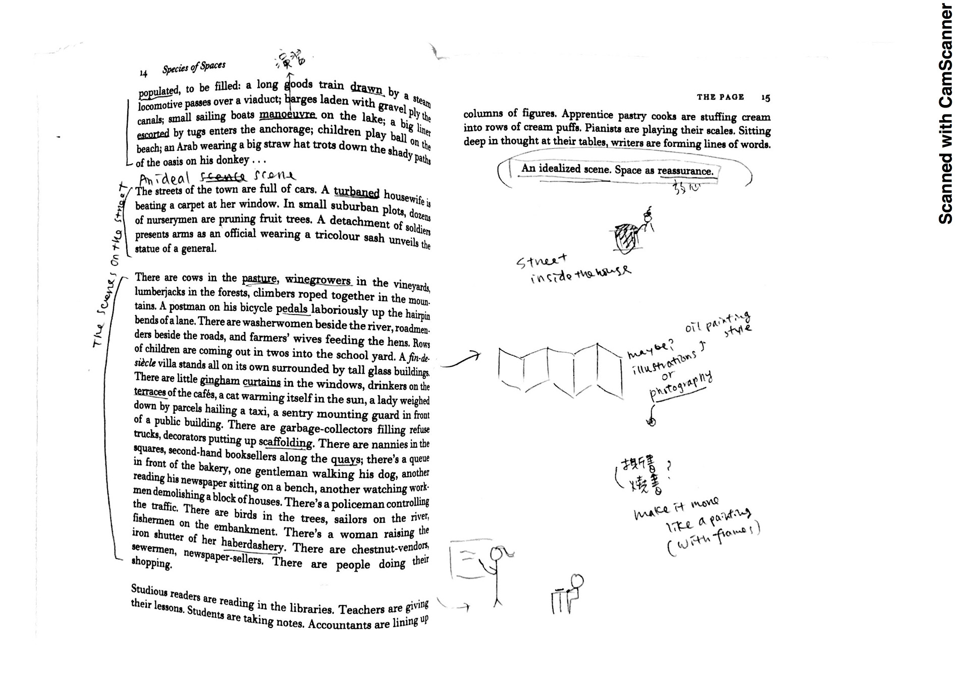
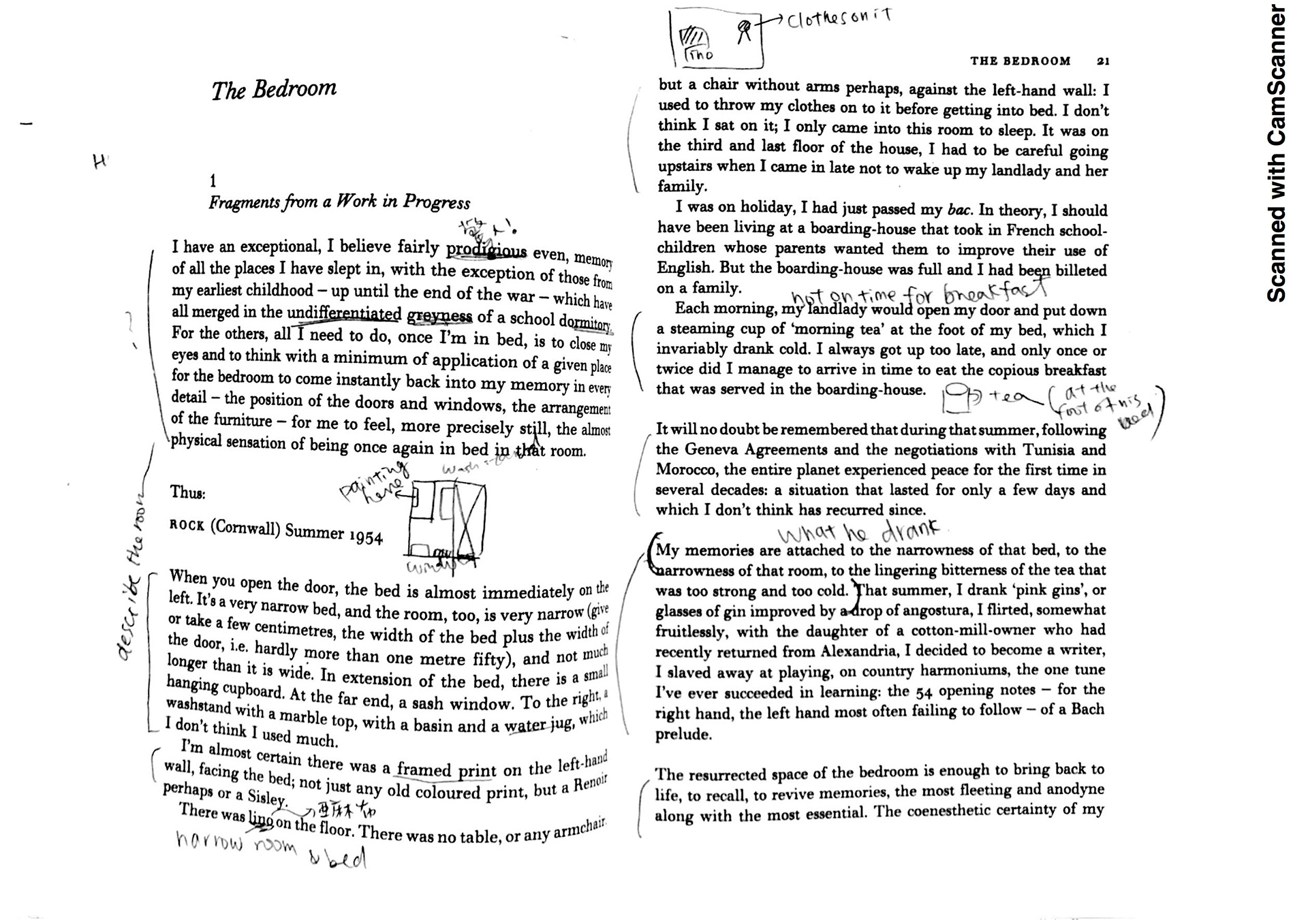
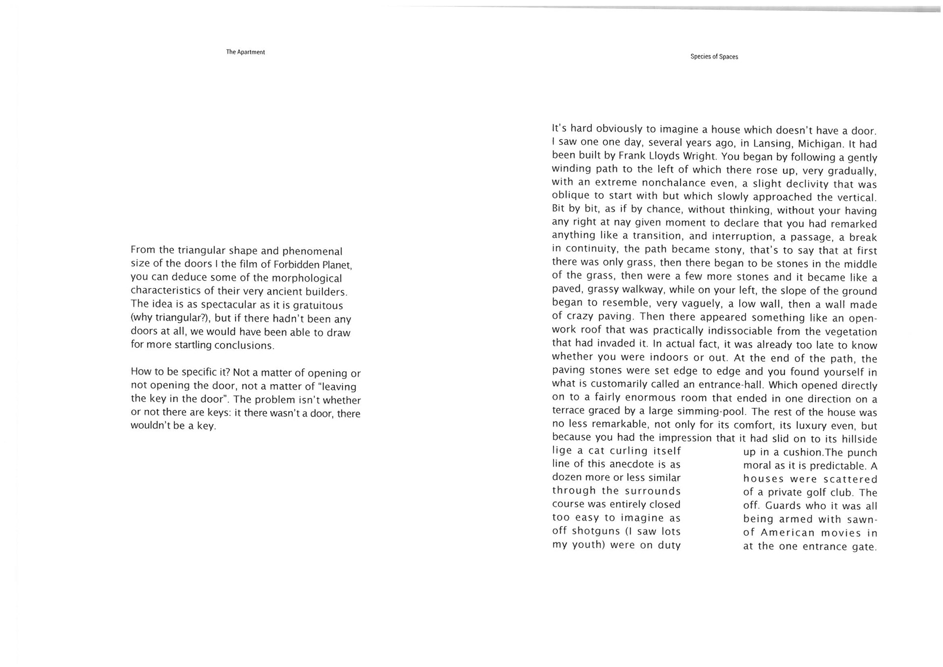
We decided to really look into the book first before redesign it. The book was written by George Perec and it was original published in 1974. The summary of the book was everything in space is changeable. People want things not to change, but space is always changing because of time. If a person try to define space, time will take it away, and the space is no longer the same.

Mood board
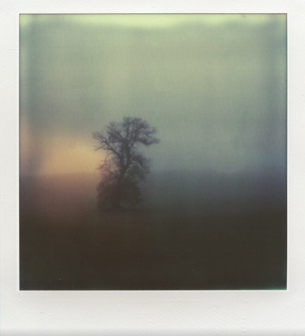
We choose to use blurry and simple image to express the feeling of ‘spaces’ and ‘time’. Also, We discussed that when we read the book we found that there is images appear in our head, and the images were like an old movie. We decided to create images looks like old, black and white movies.
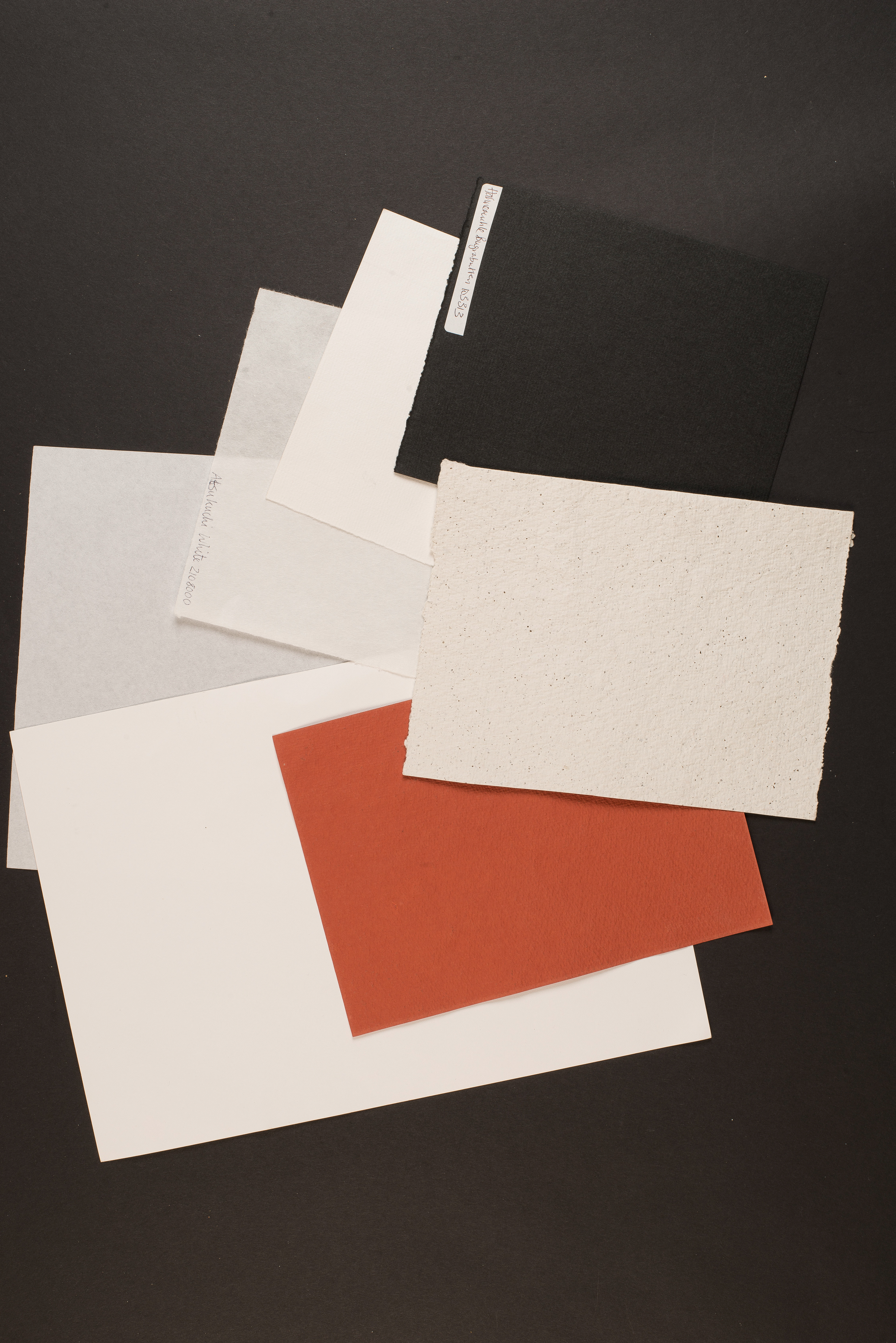
Because of the book was published in 1974, we wanted to make the book more vintage like with papers more yellow and uncoated. With so many ideas on the book itself and images, the idea of the layout is to be neat and simple, easy to read. We also wanted to use different papers to express the feeling of different chapters.

Mockup
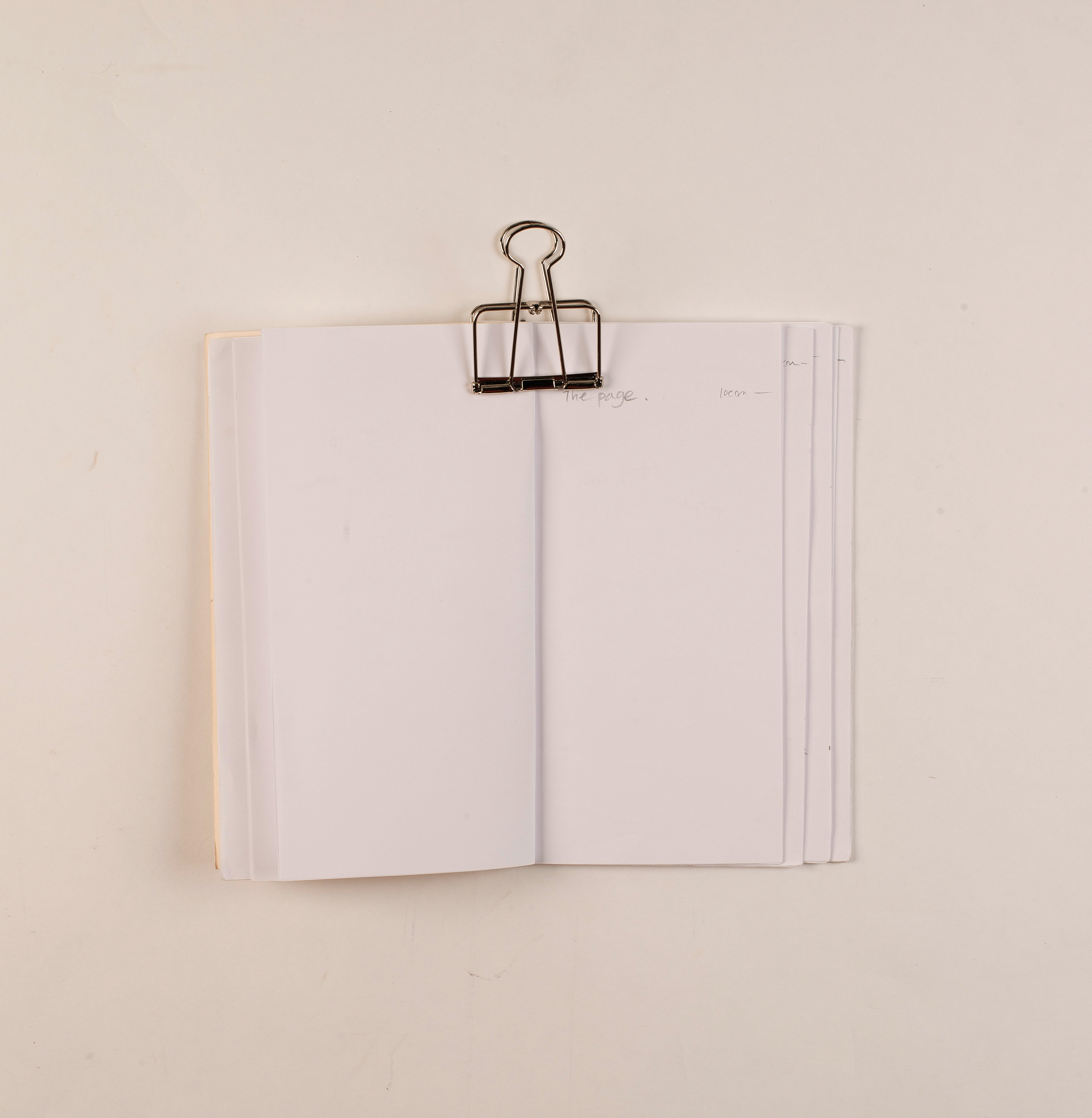
We wanted to have different sizes for every pages.However, the mockups
showed that it would look messy if every pages are different sizes.
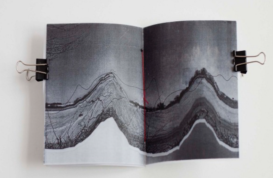
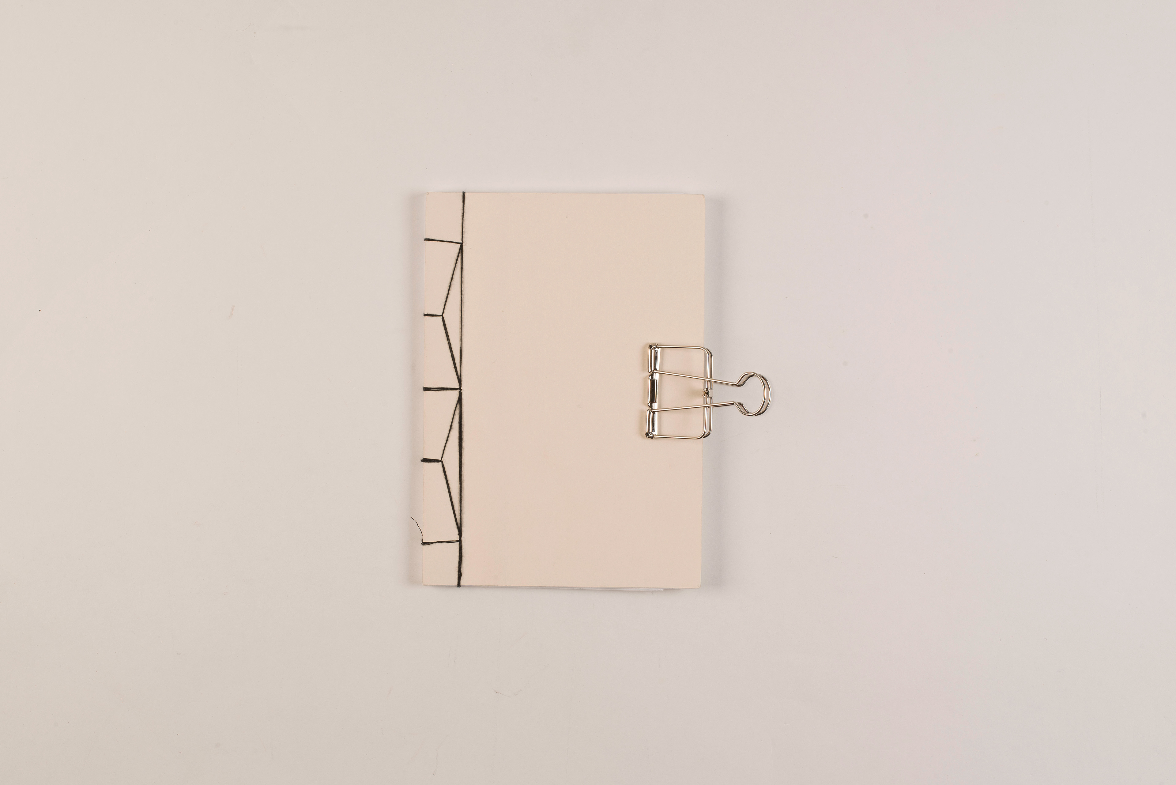
The binding we would like to do is sewing, it could add a more handmade feeling to the book. The mockup also showed that landscape would work better.


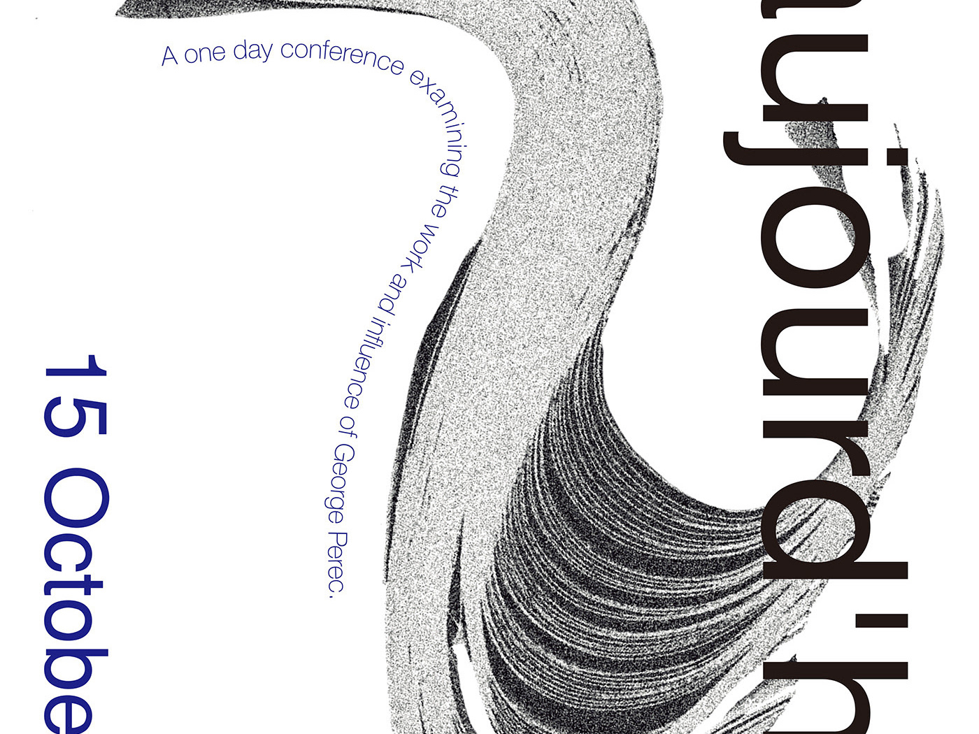
Draft of the covers
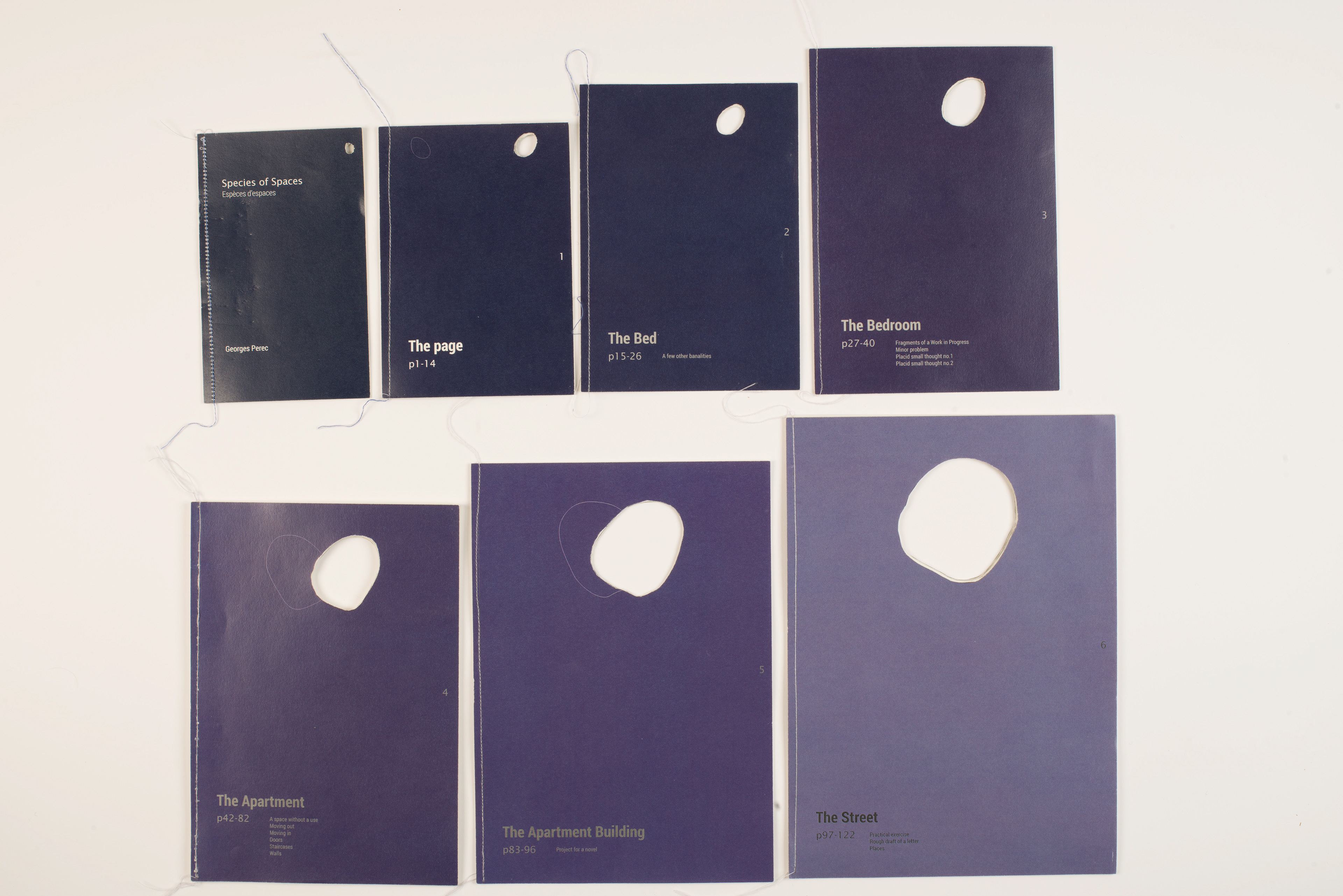
For the image we were supposed to put next to each chapters, we decided to put them on the cover, and because of the book was talking about the city, we use a brick. We used the same image but zoom in smaller chapters , zoom out in bigger chapters, to combine with the book dimention.
Drafts
Each of us was responsible to one or two chapters, depends on how long that chapter it is. We decided to use layouts to show the concept of ‘space’ and ‘time’. Also, we put sone simple logos to support the layout. We each choose many papers to support the feeling of the space in our chapter. However, we feel that idea was too much and it was messy to see too many materials and papers, so we gave up that idea.
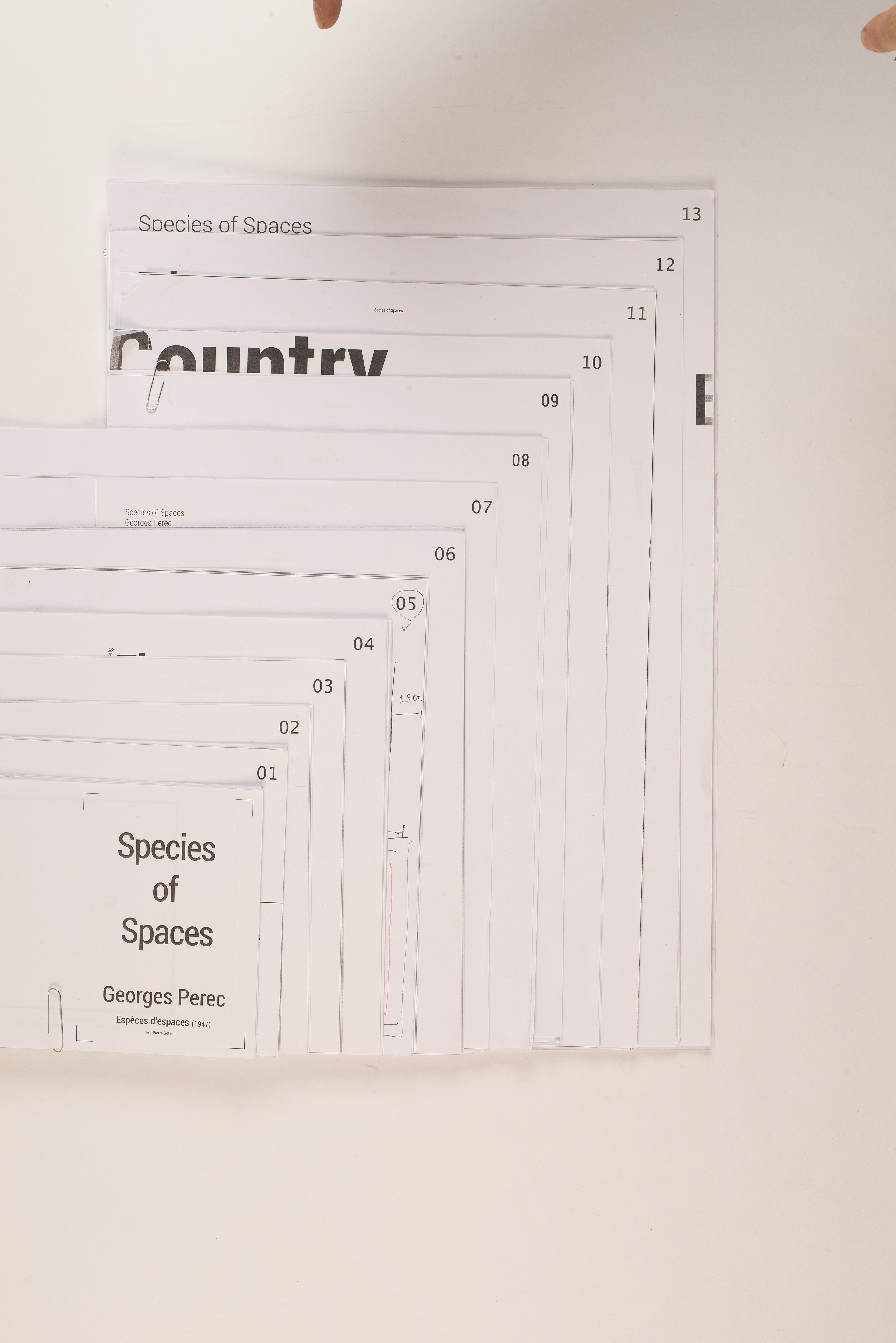
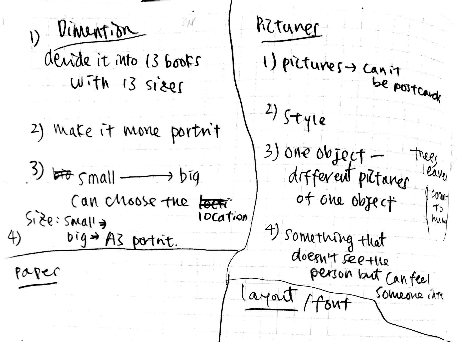

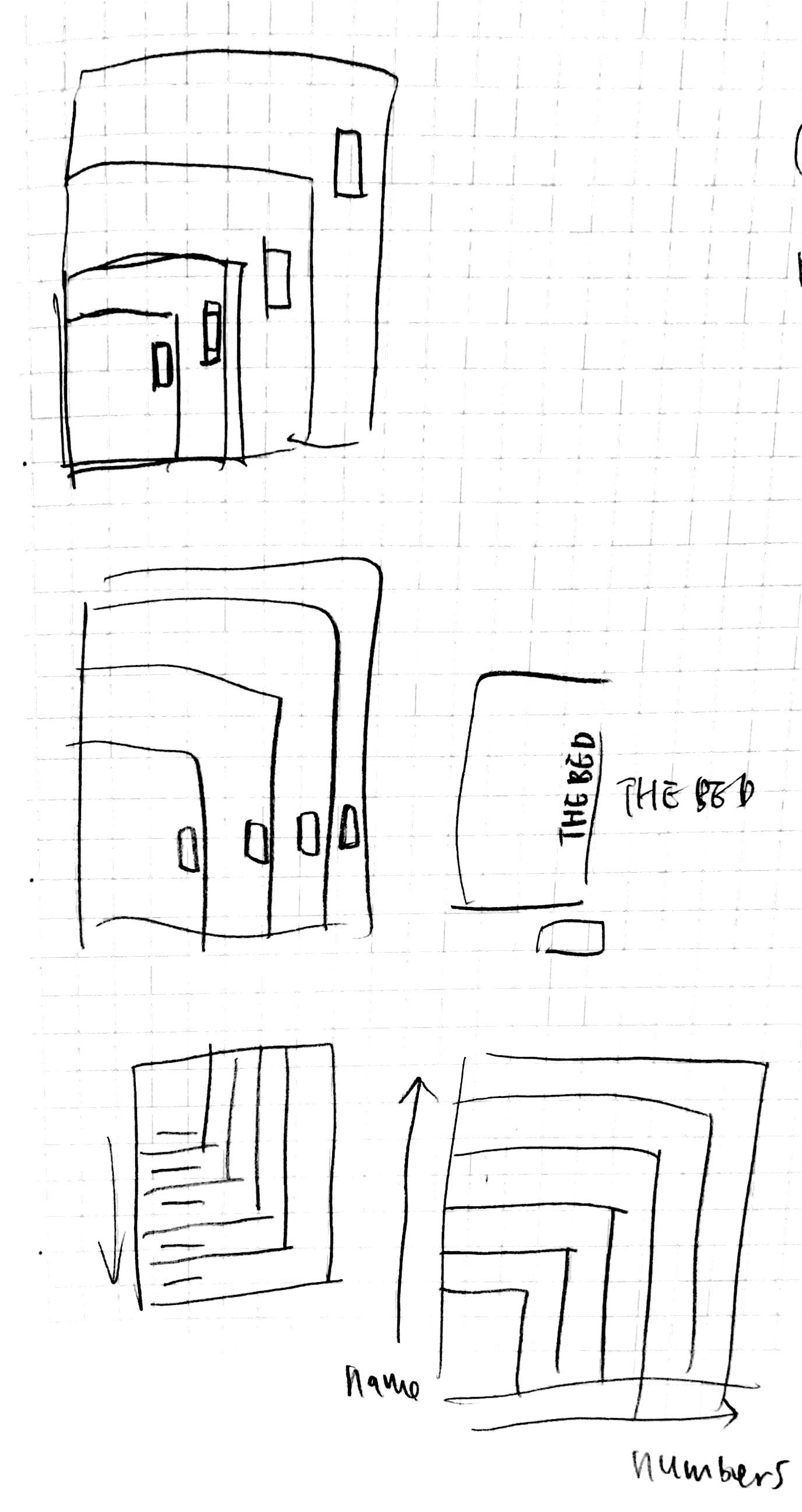
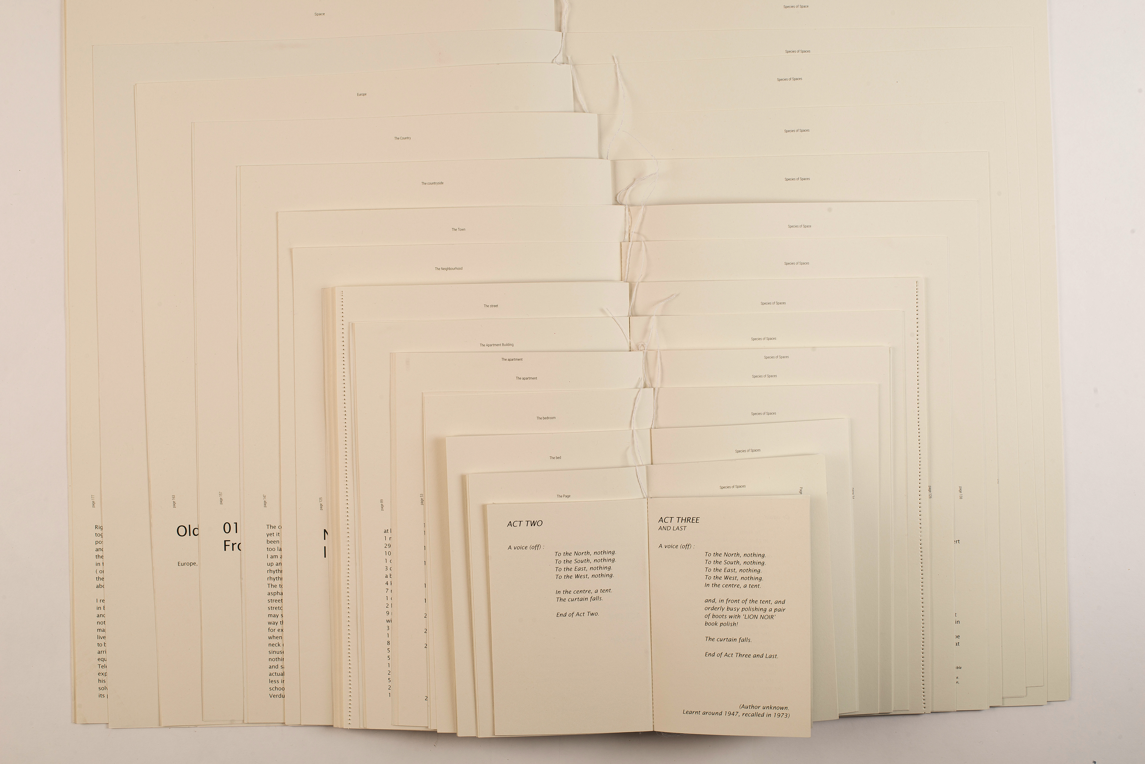
We decided to used different sizes, playful layout and images on the covers, which is truly too much. We changed our direction, built our book around the concept of small to big. The concept of this book is about spaces, so we decided that if we make it into different chapters, not as one book, people could actually read it when they are in that space. For example, they could bring one of the chapters, ‘The street’ to read when they are actually on a street.
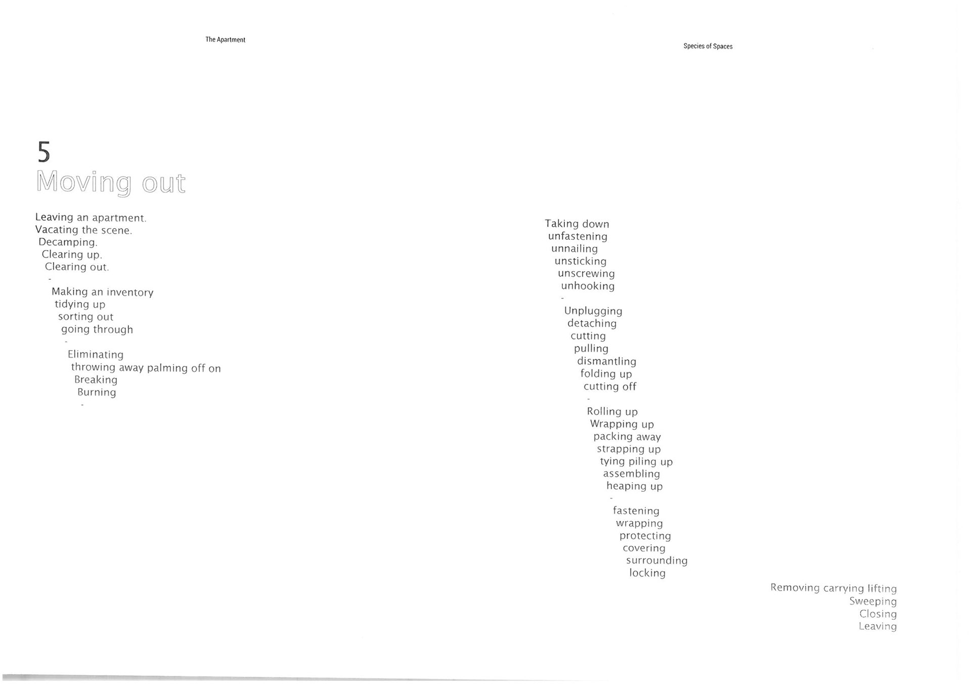
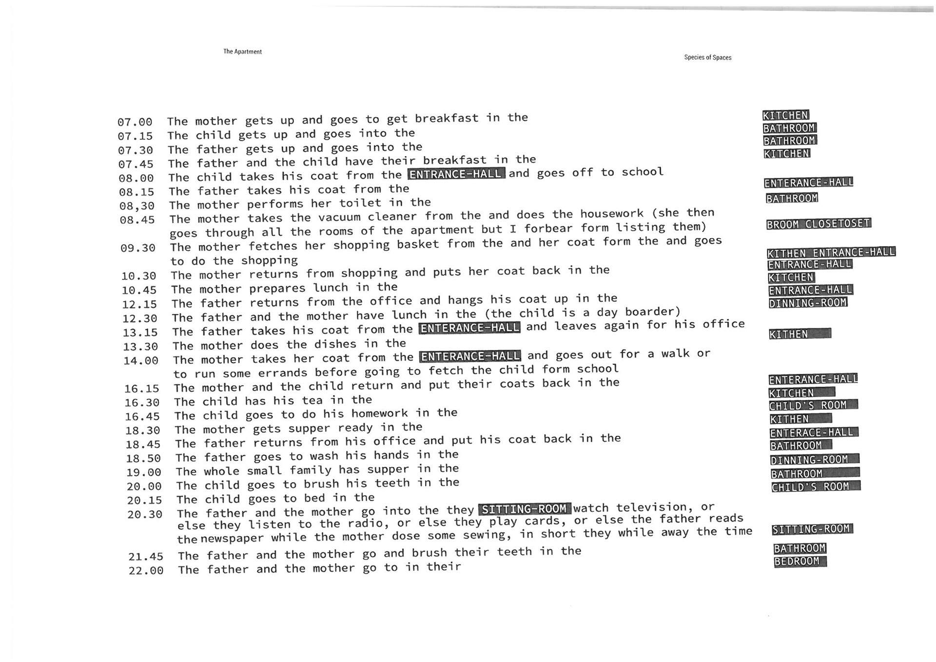
Layout sketches
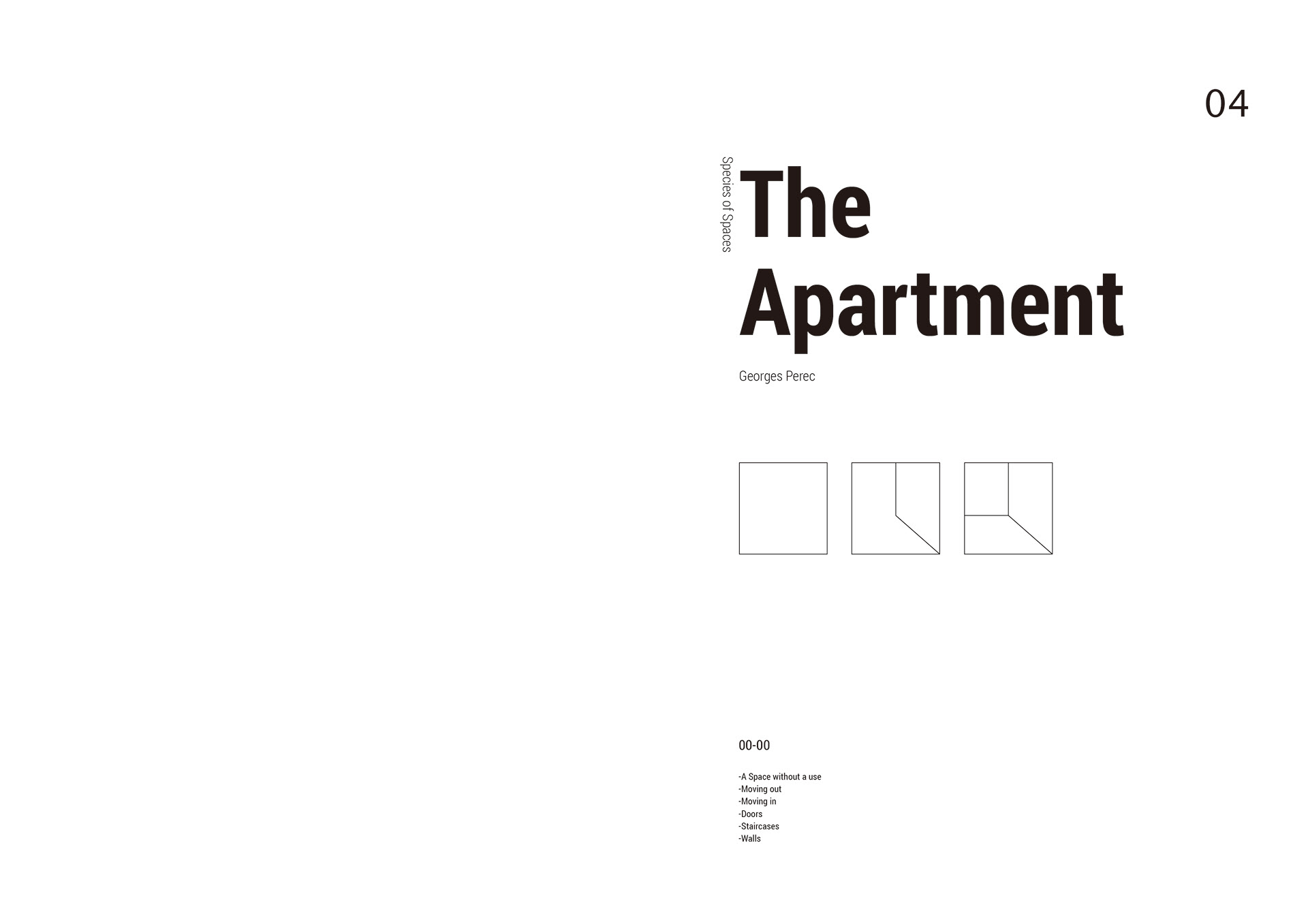
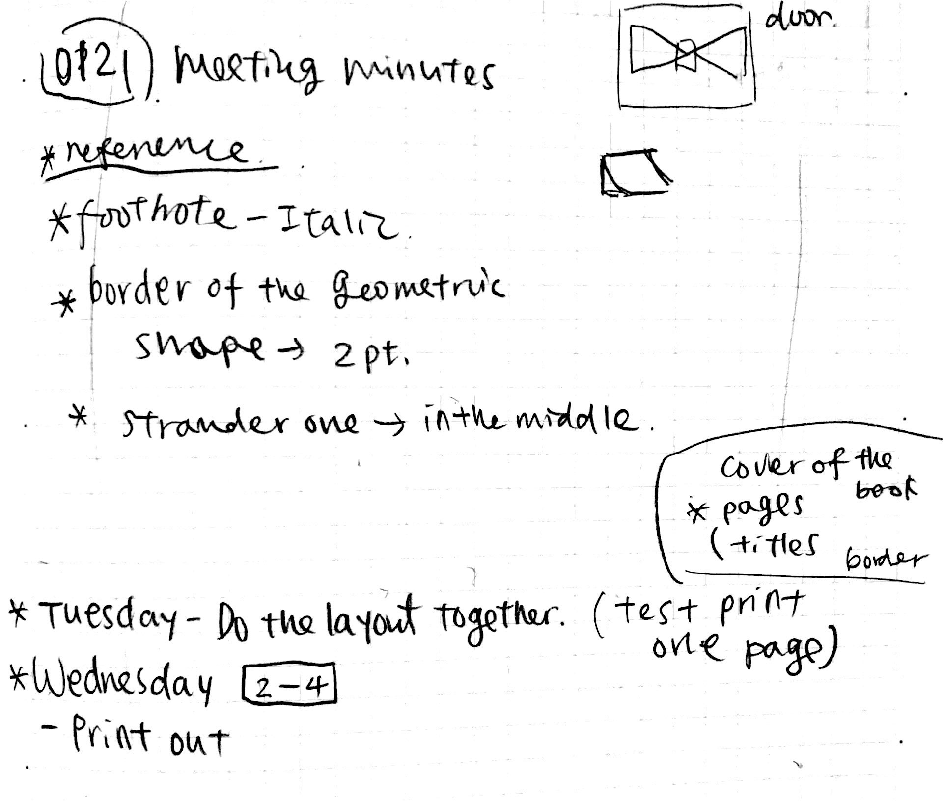
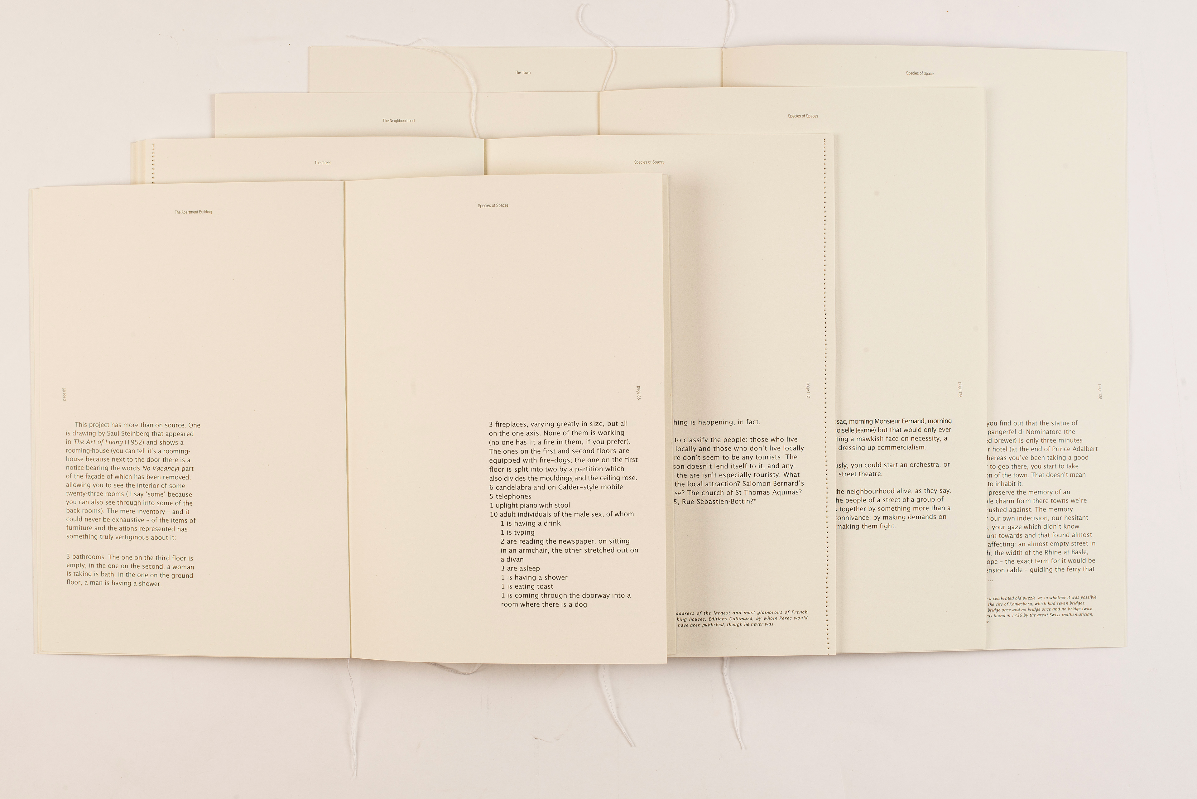
For the layout, firstly, we choose sans serif, which gives the book a more modern look, and at the same time more easy to read. Secondly, we put the columns on the bottom of the book, and each chapter follow the same layout and grids. The reason we put the columns was because the biggest chapter is A3 size, which is hard to read as a book.


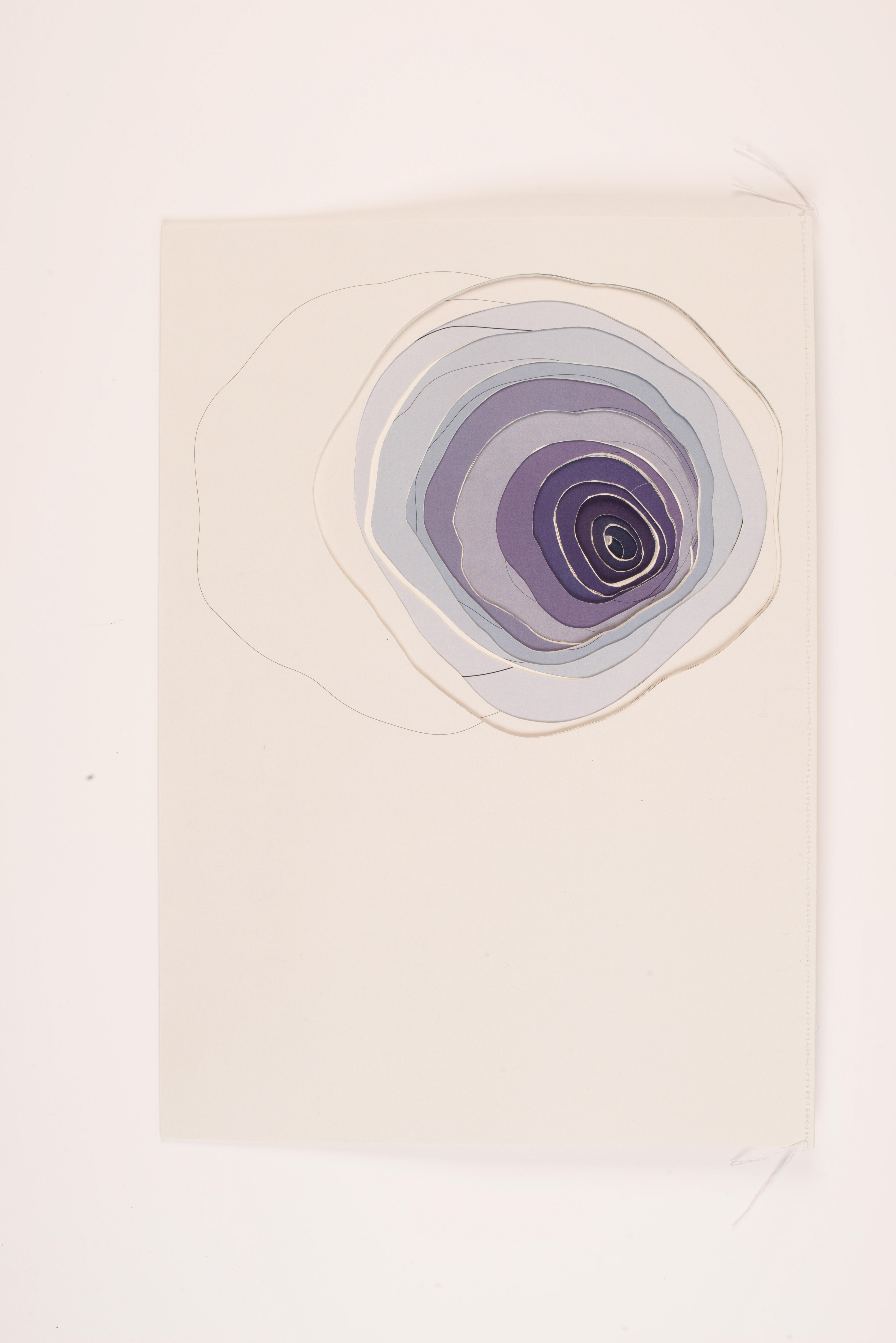
The concept of tree rings
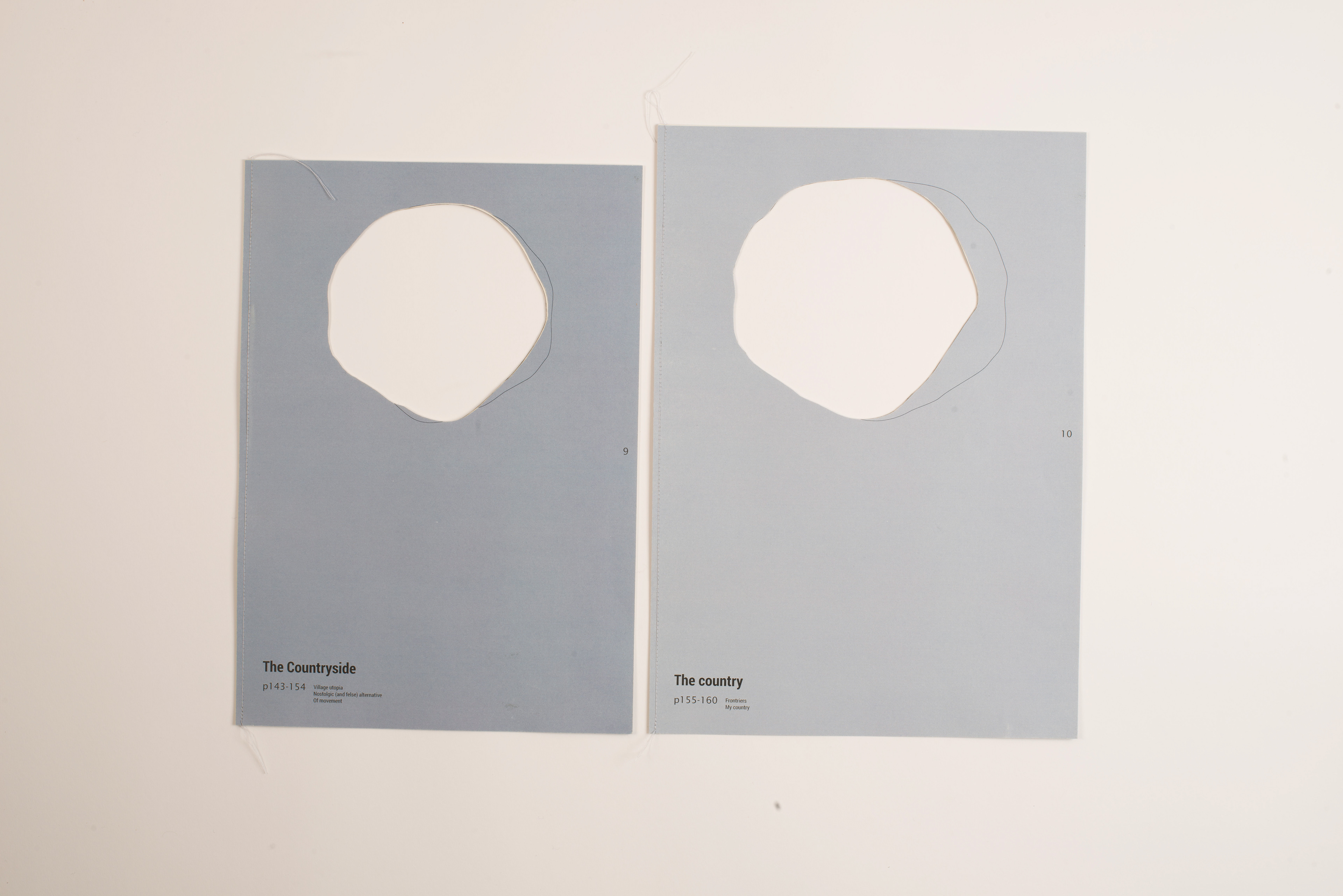
We also hand cut tree rings on the top of the book to tell that how time can change spaces in reality.
First draft
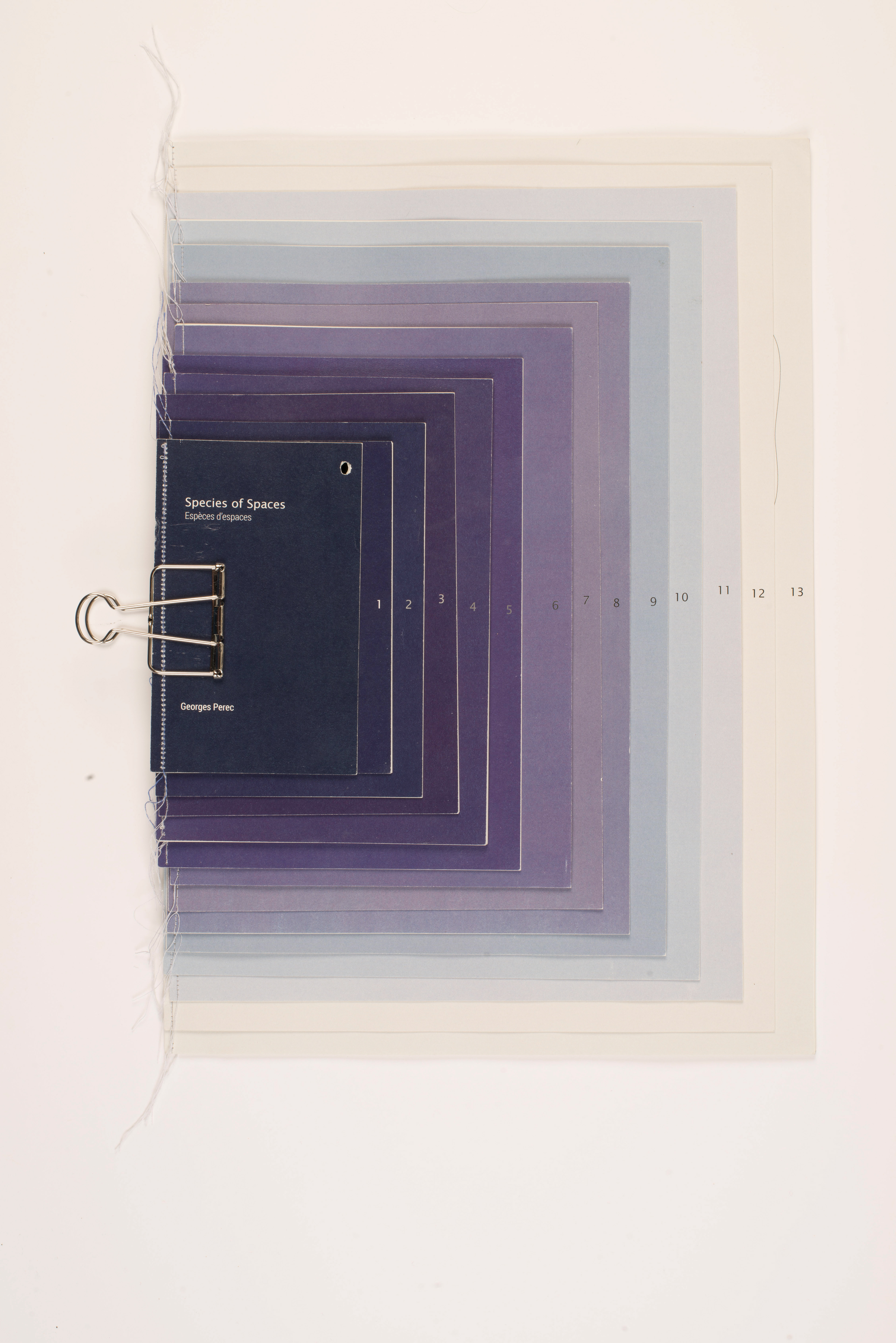
To make the concept of the book more focused, we decided to cancel the idea of using the image, but use colour to represent the concept of space. Because the idea of the tree ring, we align the books in central line.
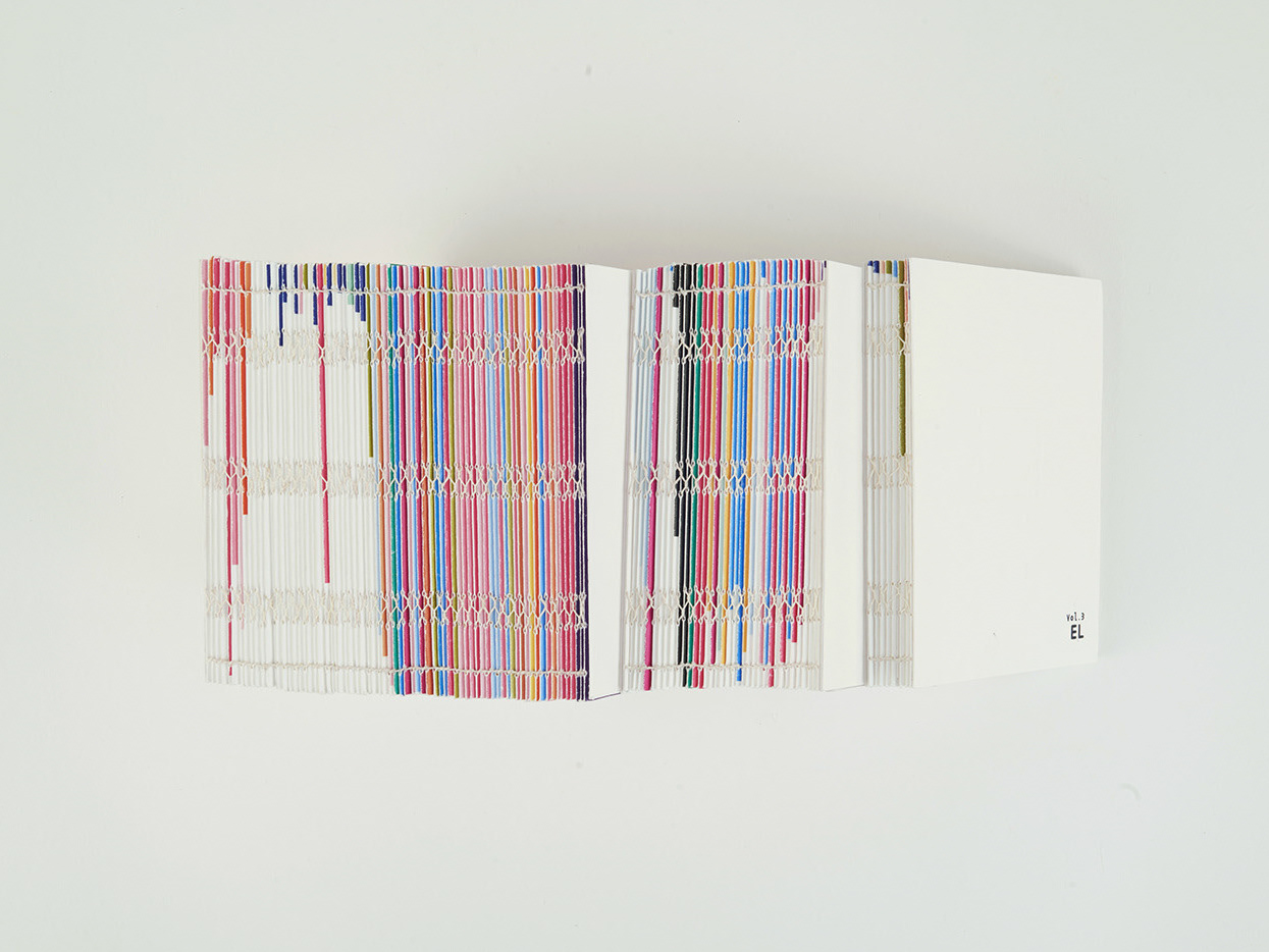
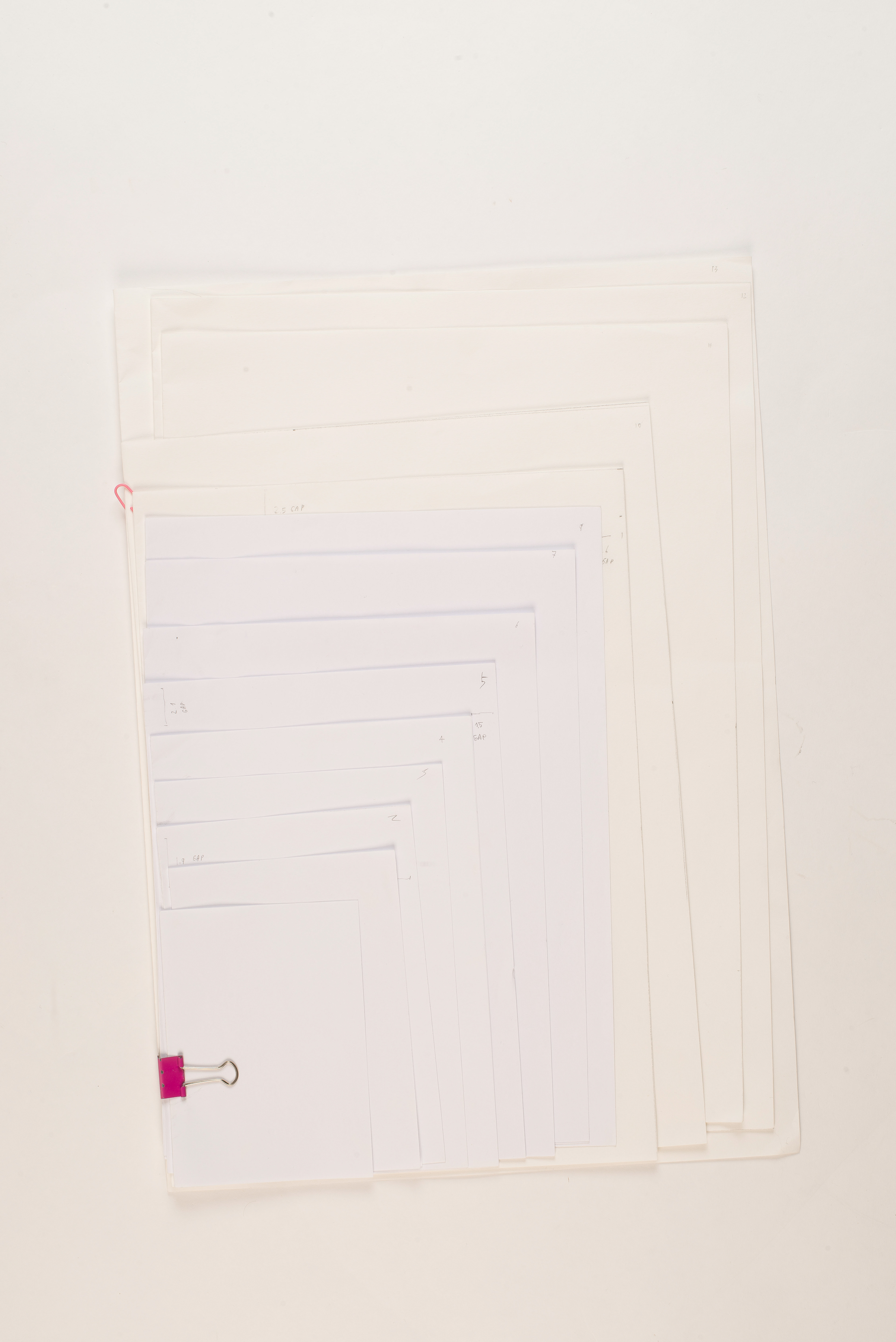
For binding, we used sawing to give the book a neat feeling. We used a clip to put the chapters together. The books with different sizes could be hard to carry, so we also made an envelope to contain all the books.
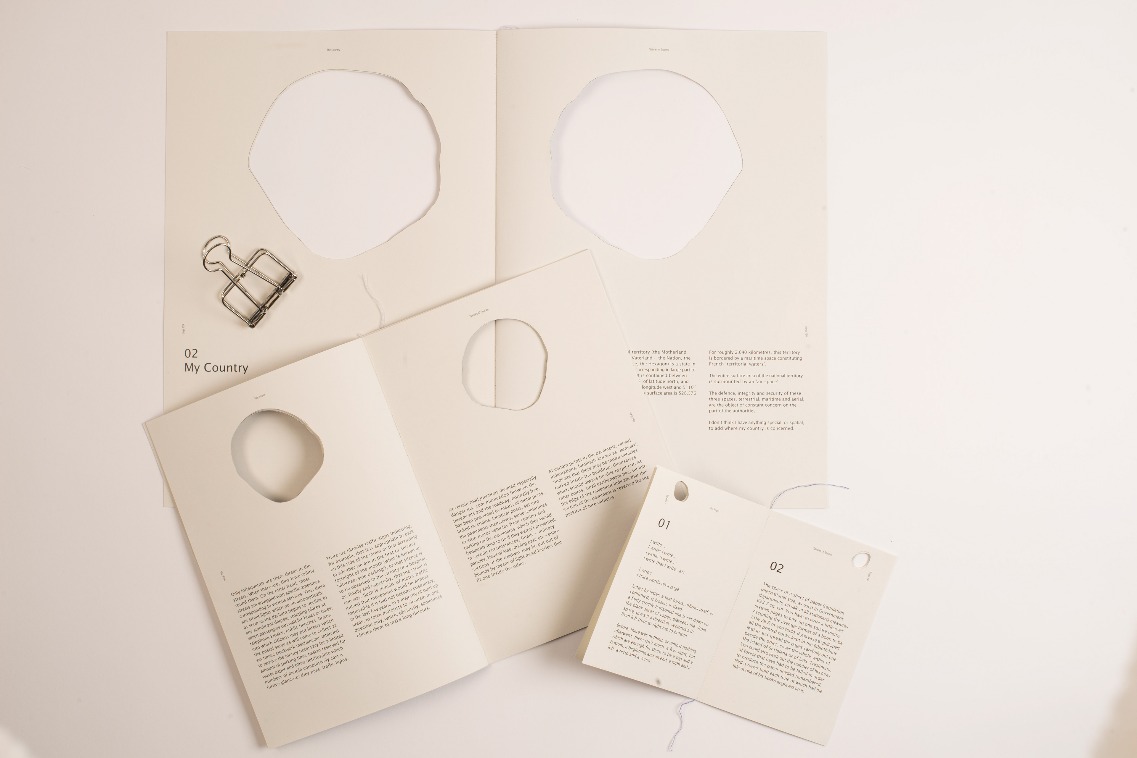
As making all the columns on the bottom of the book, it could be easier to read to the readers, and it makes the empty space of the book gradually become bigger, which is also the concept of our book.
Second mockup
The colour of the cover could be the same series of colours, but the transparency could be different to express our concept.The colour we did not show the concept of ‘ from small spaces to big space’ because the colours we used was too random.The position of the books on the covers needed to reconsider as well. For the words on the cover, it could be all on the edges of each chapters, so it could be easier to be seen.
For the envelope, we decided the clip was enough.
In addition, we thought the position of the book aligning the bottom would make it easier for people to read. I felt the tree ring was a forced idea. The white space itself was enough to express the feeling of space growing bigger. After discussed with the group, we decided to cancel the tree ring.
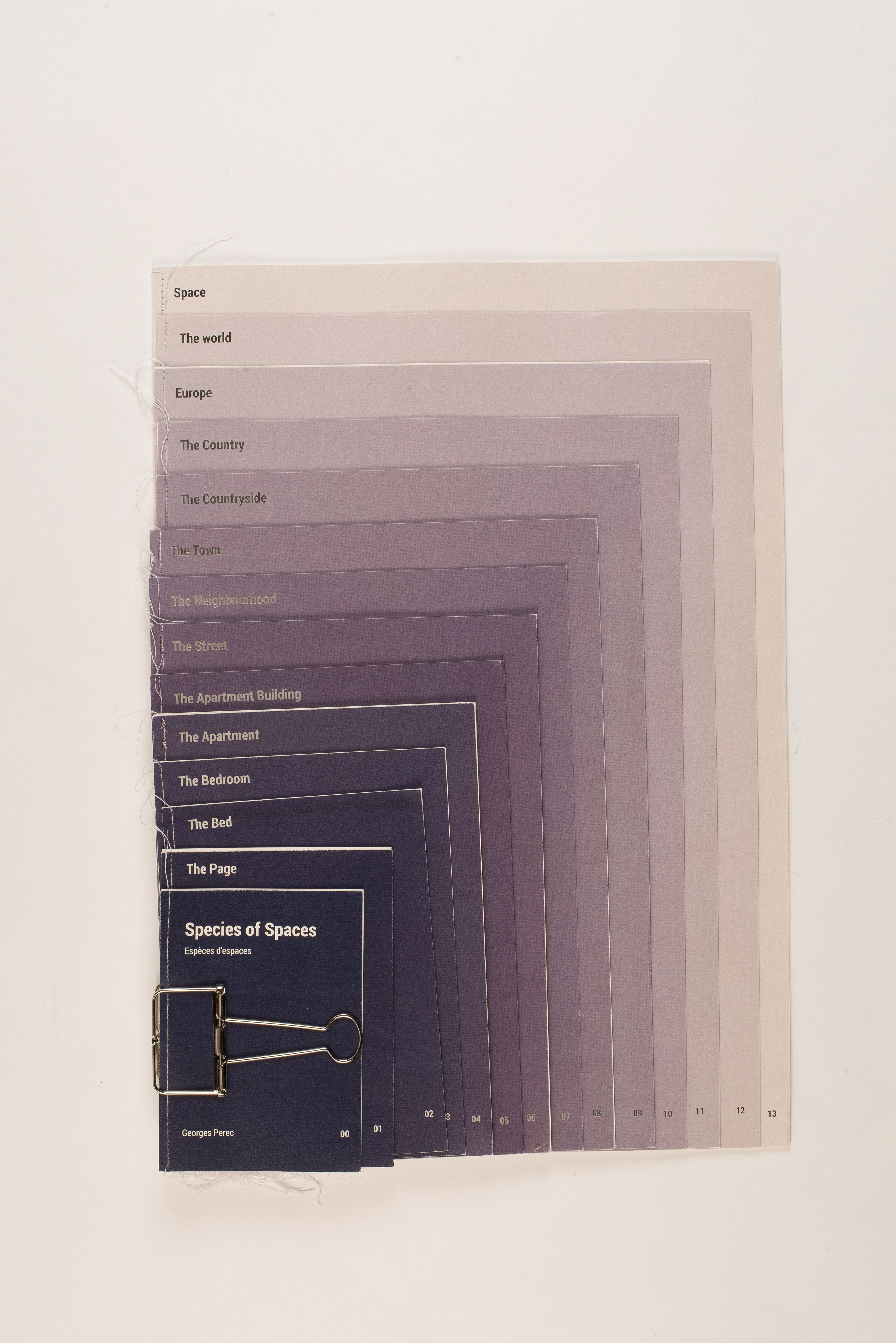
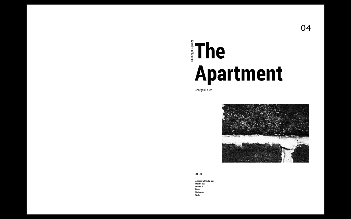
Final Outcome
This is the outcome of our book. The concept of the book dimension is from small to big. Each chapter has it’s own cover, and colours are dark blue to grey. The dark blue represents small spaces, and it gets lighter when the space grows bigger. We also canceled some of the details on the covers. We put the title of each chapters on the top of the book, so it could be more easier for reader to pick whatever they want to read. For binding, we all love the feeling of the sawing with the clip together; it gives the book a more warm and personal feeling.
Colour choice
We adjust the colours into dark blue to light grey, to represent the colour changing from small spaces to bigger spaces. Accroding to Adrienne Chinn in The Basics of Using Colourthe, it said, "Receding colours, cool colours are receding colours - they appear to go away. The paler versions of these colours are particularly useful in helping to create an illusion of space.”
(Adriennechinn.co.uk, n.d.) We choose the colour dark blue to light grey to create the feeling of space.

"The relationship of negative -positive, one of the most important encounters between opposites in all design work, arises automatically. The space in between, which is a by product, is just as important as the element producing it."
-Armin Hofmann, Graphic Design Manual
The typeface of layout is Lucida Sans, it has a bit of round feeling on the corner of the words, which create a more playful atmosphere to it, but when readers see each pages, it is still simple and clean. I have checked the book 'Layout now', as can be seen on the upper image, using sans typeface would be easier to read.