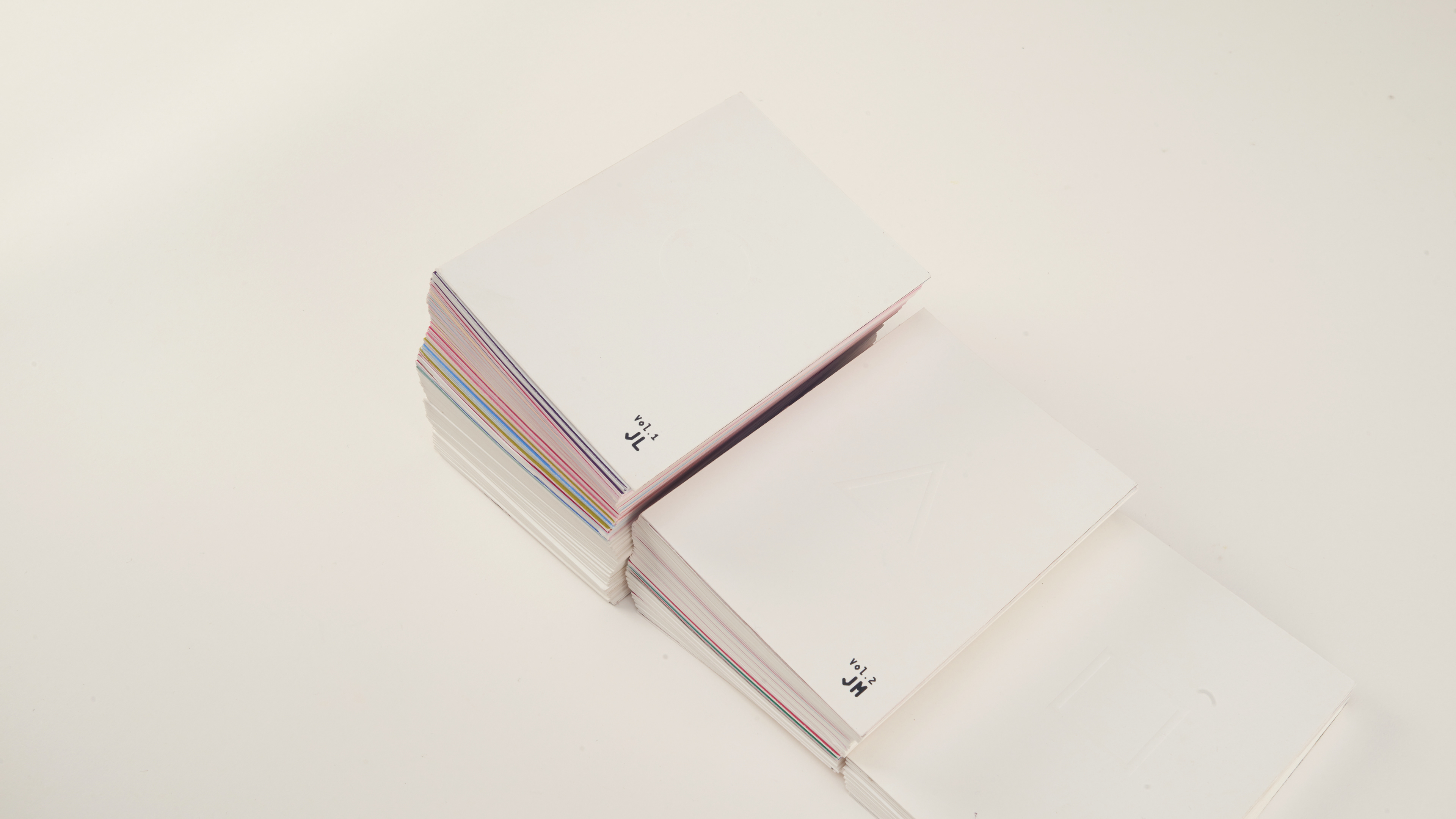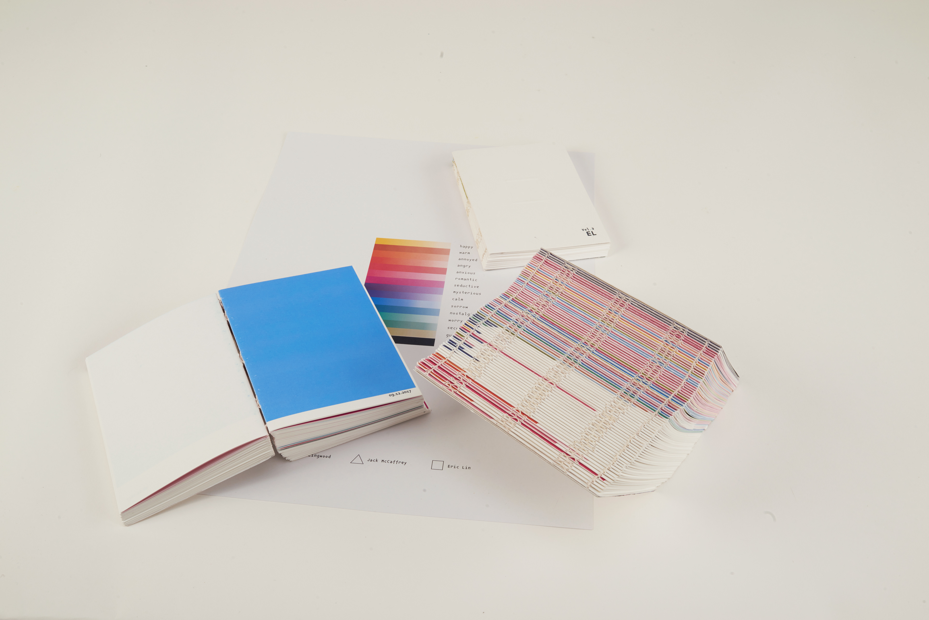
LOverlap
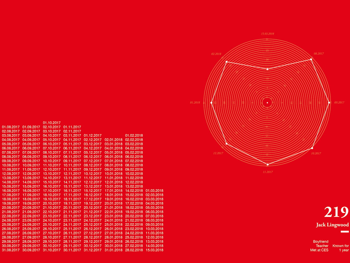
The project uses colours based on colour psychology to reflect the mood of 587 days of love affairs with three books and a colour guide.
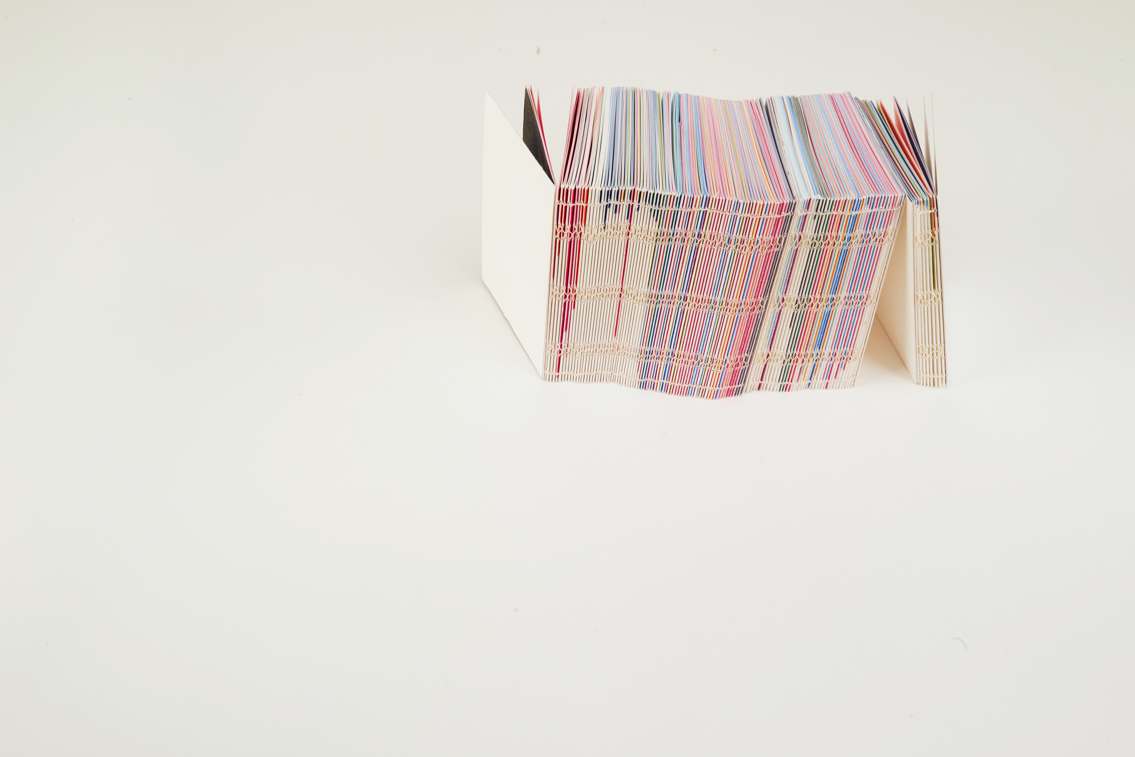
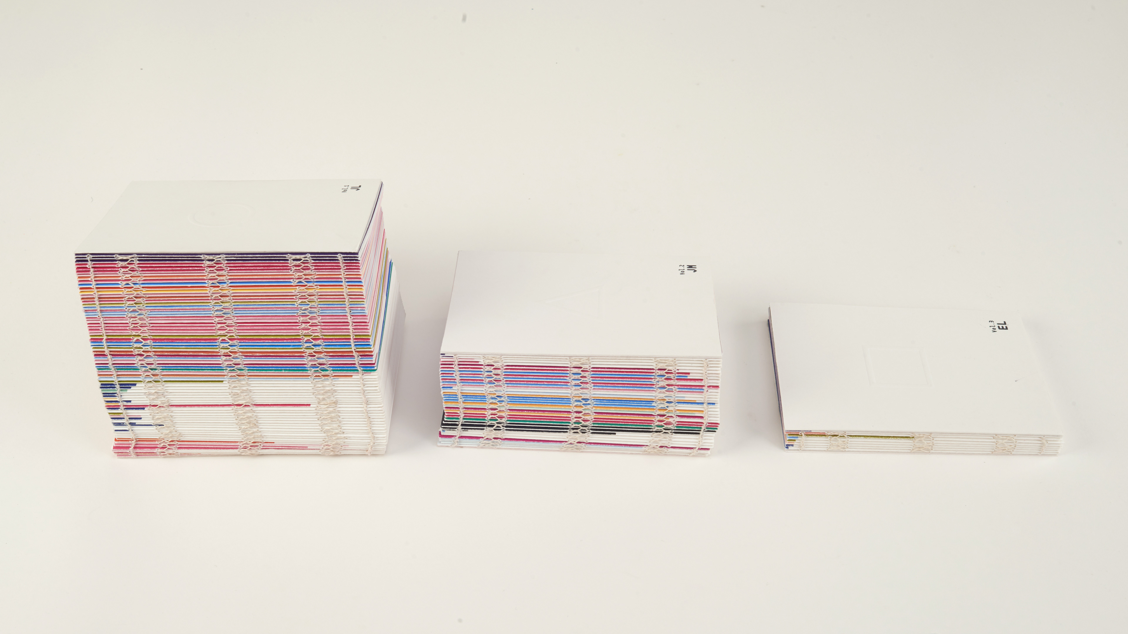
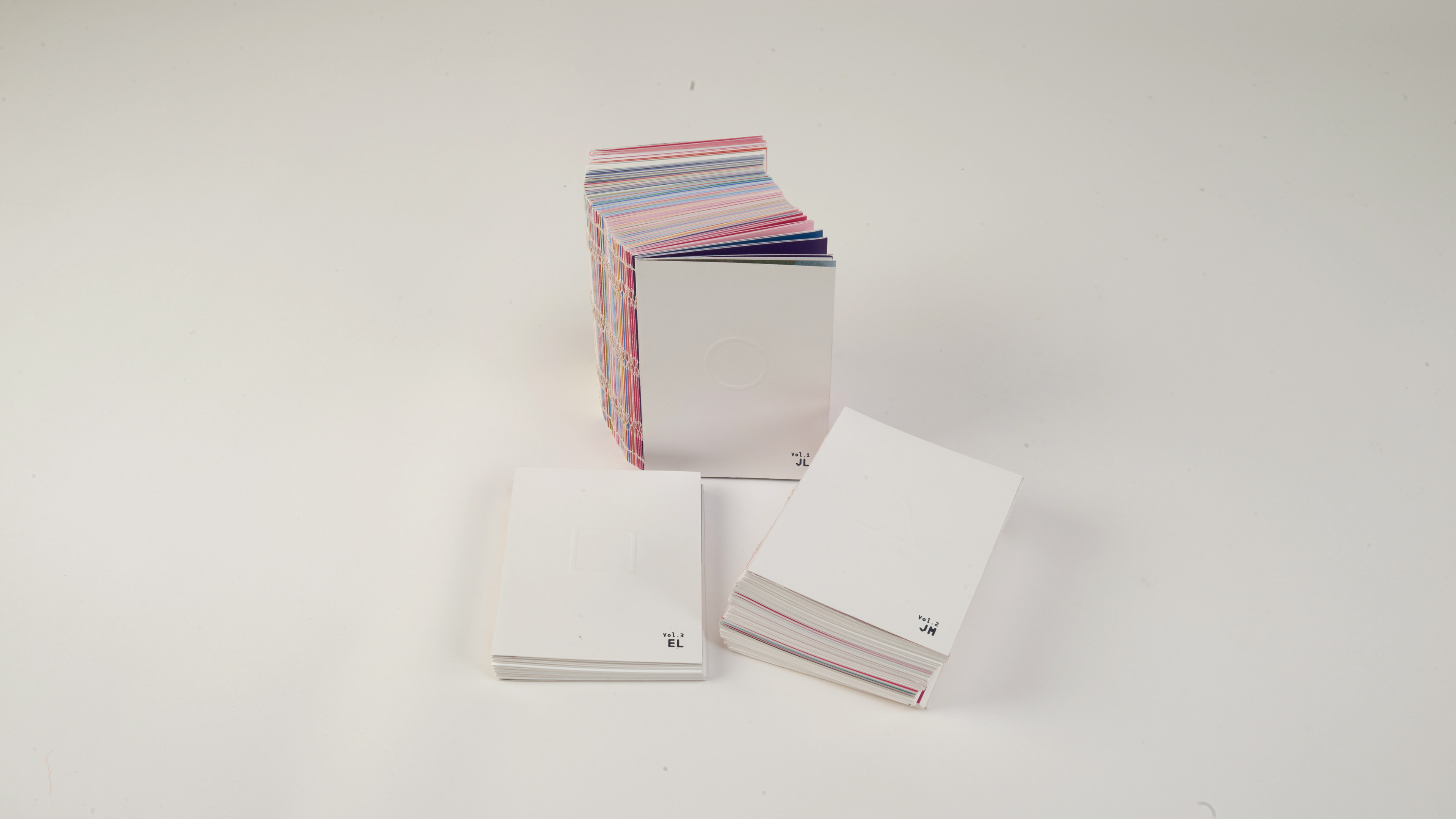
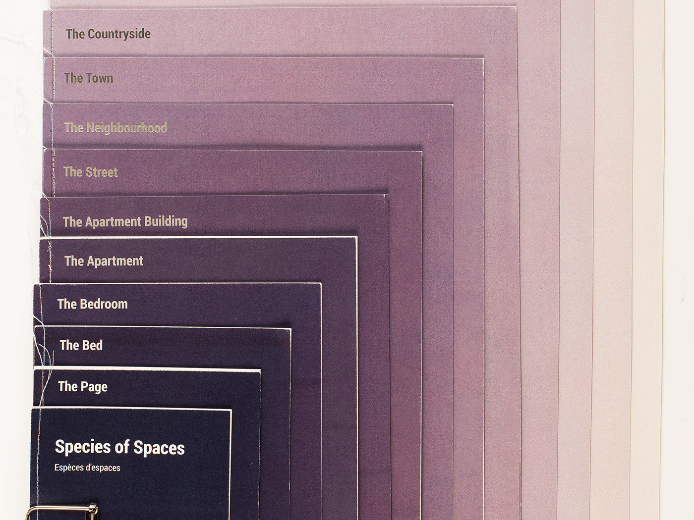
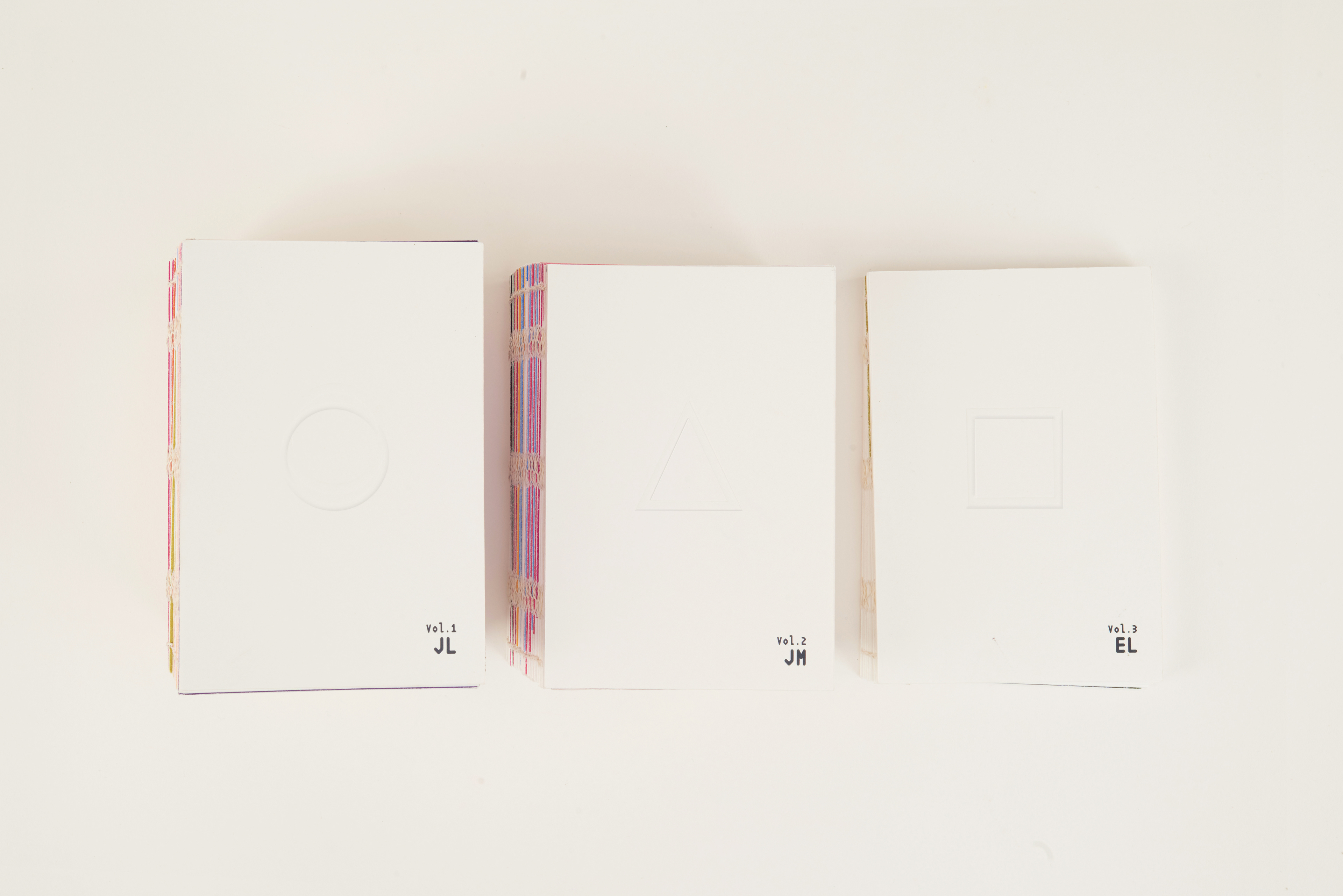
The three books show the emotional changes of my love affair one day per page so that the thickness of the book
represents the length of the relationship. They are a series of same sized, with same layout, books and made the books into A6 size. By making the books smaller, it would hopefully give the books a more personal and private feeling.
The Symbols
"The brain gives general meaning to many different shapes in a consistent way"
-Ramachandran, VS & Hubbard
For making it more clear that the three books are connected, I choose three geometric shapes to represent the three relationships. The shapes are also shown on the covers so that viewers could easily understand what these three symbols are representing.
The symbols also show up inside the inner pages in a particular time that another person appeared, to give a hint to the audience that these three books are linked together.
The Concept of 'secret'
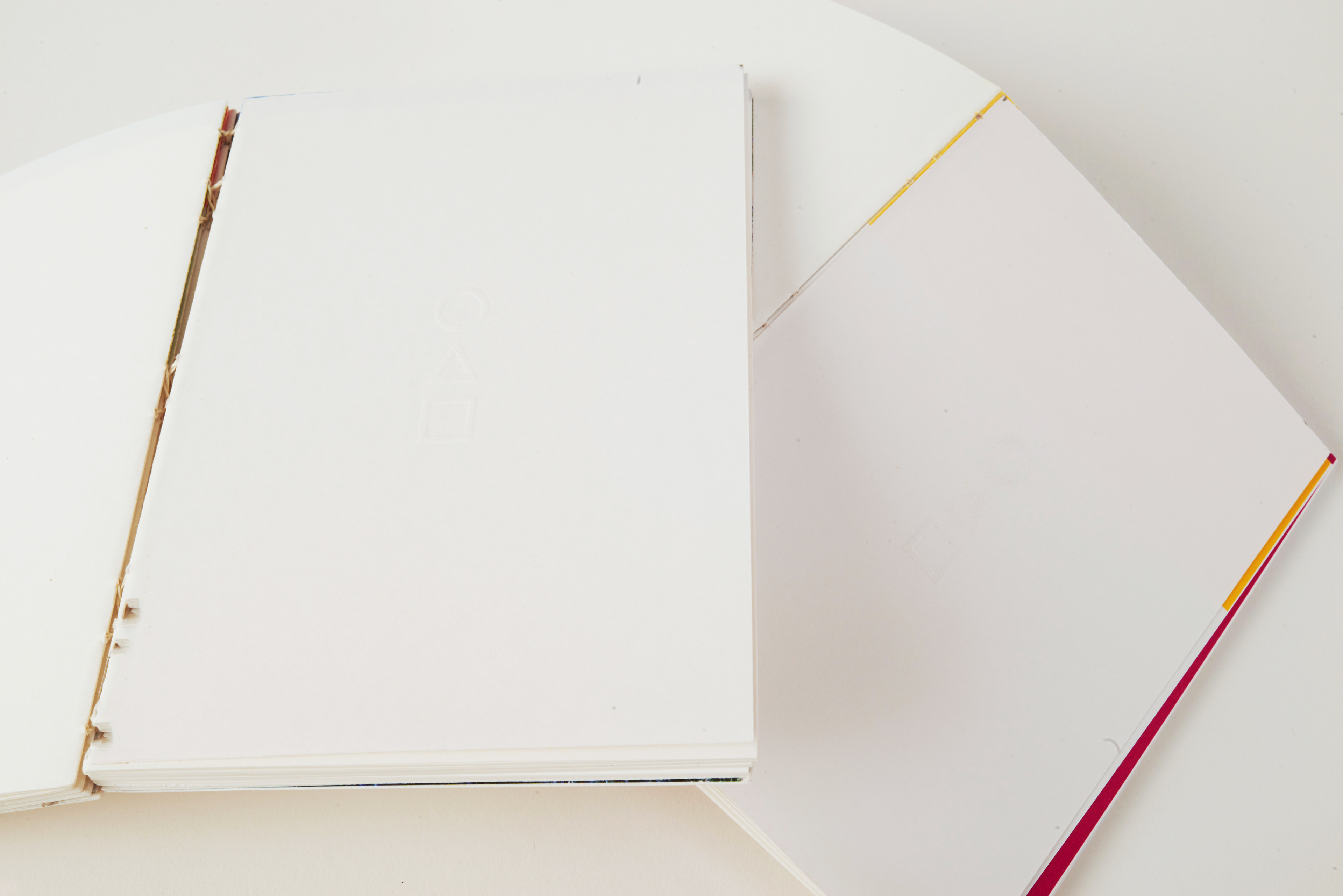
One of the important elements in my books is the hidden message, so I decided to maximise that feeling. I decided to do embossing on the geometric symbols. In this way, it could express more of the feeling of simplicity and the sense of mystery and add more depth to the outcome with more different techniques.
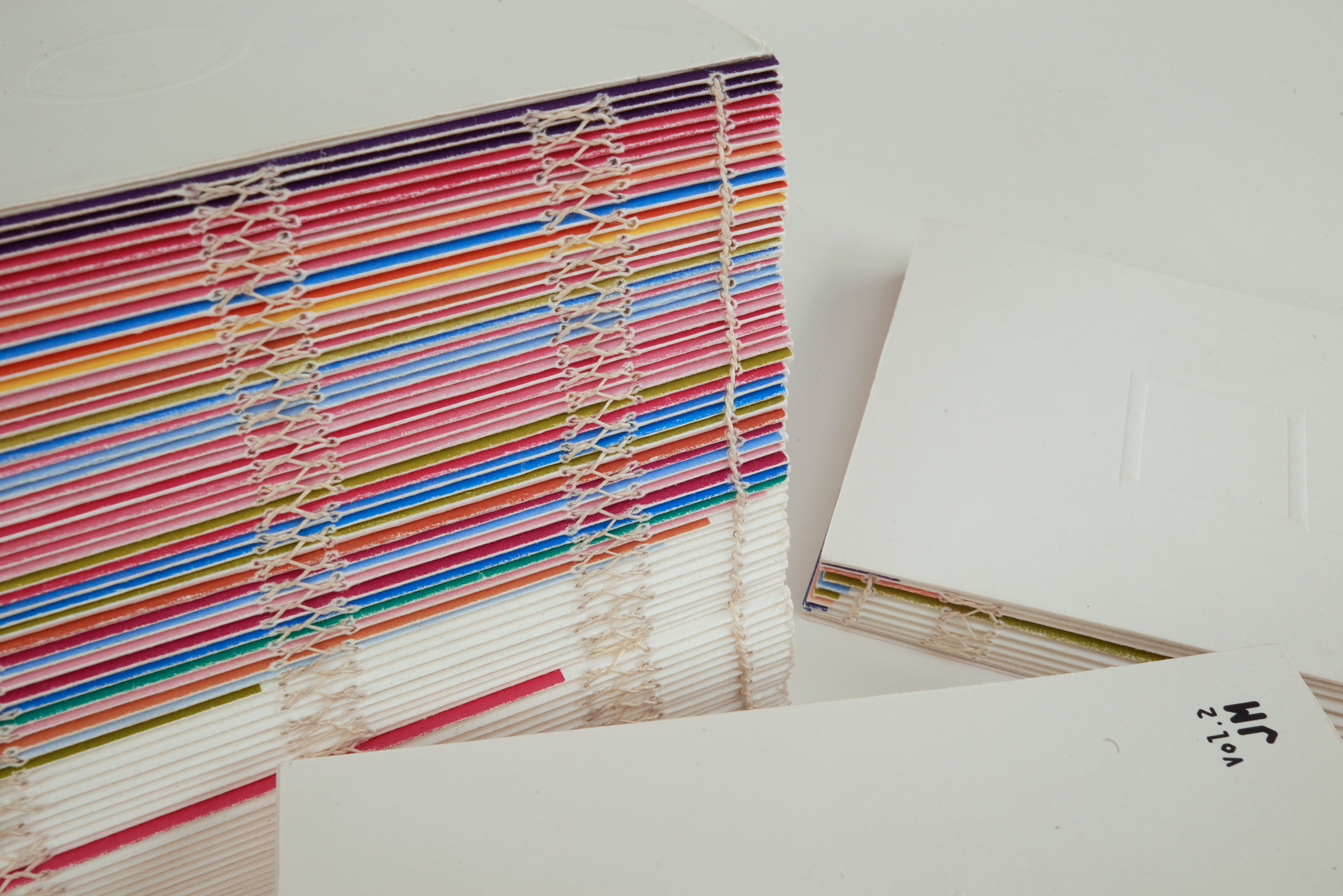
The Layout
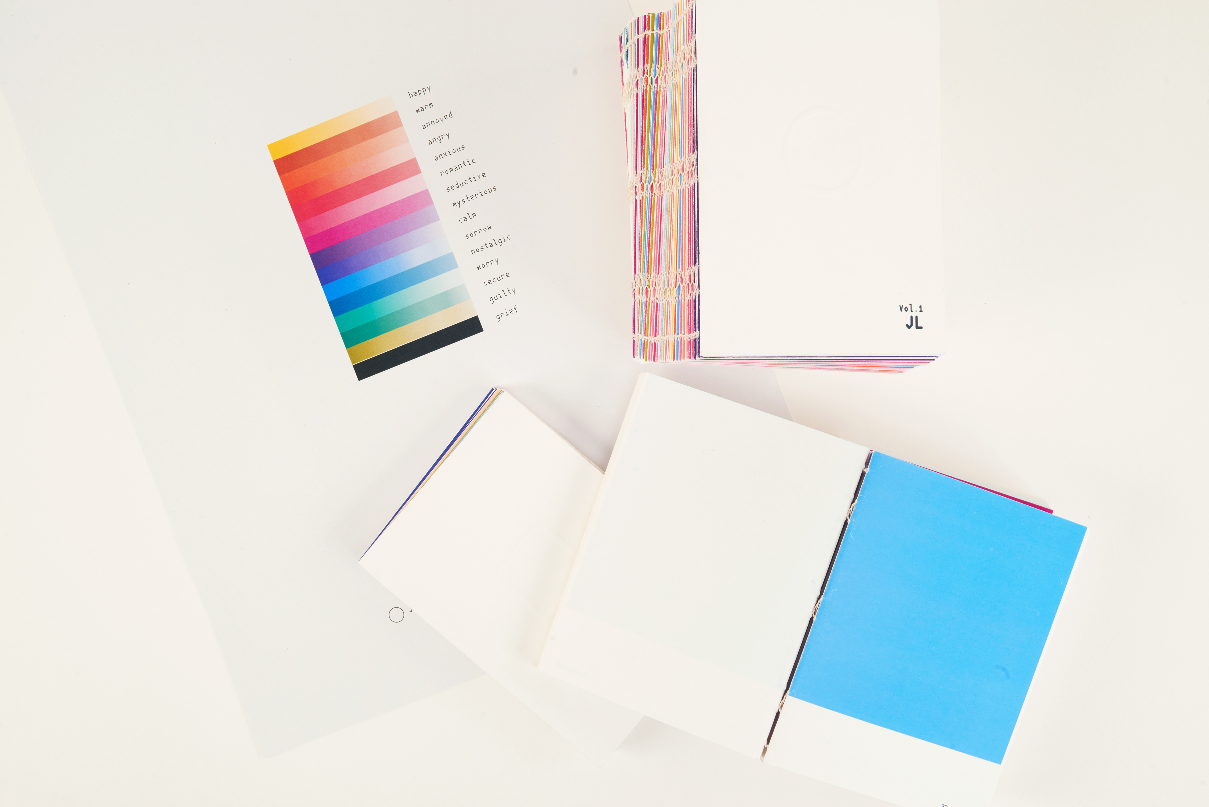
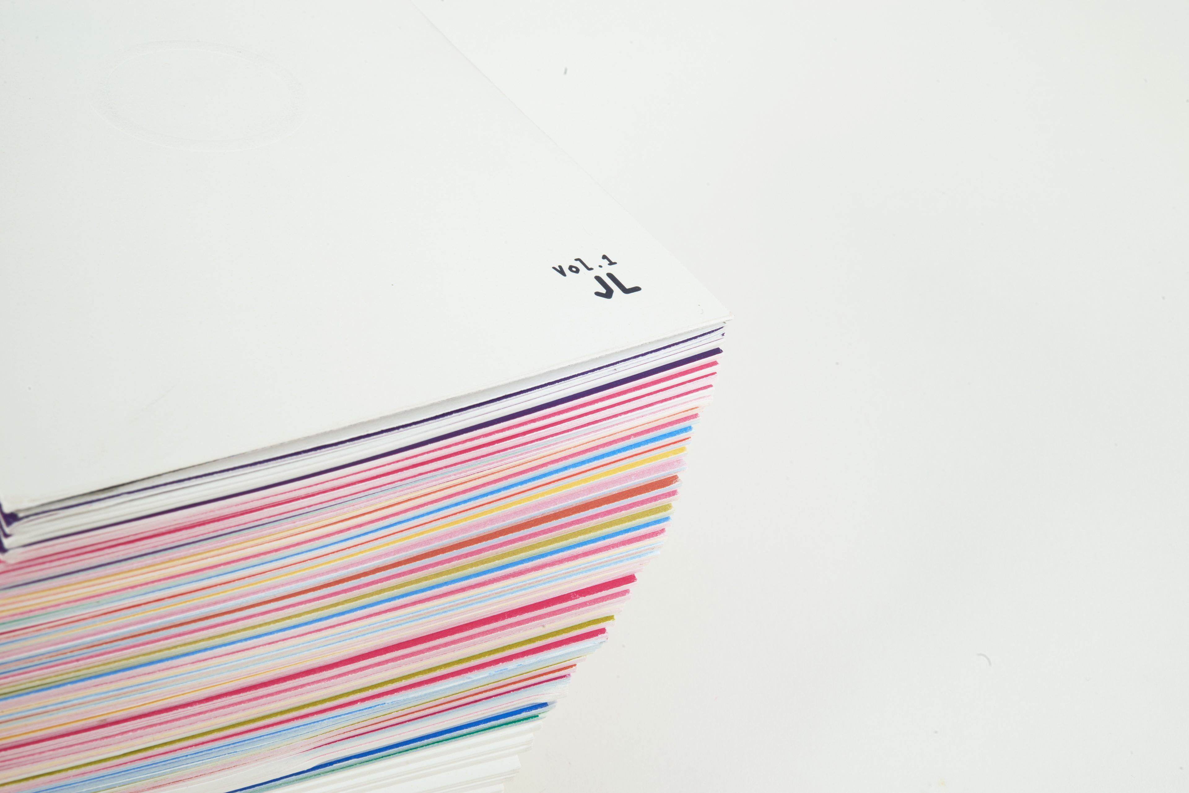
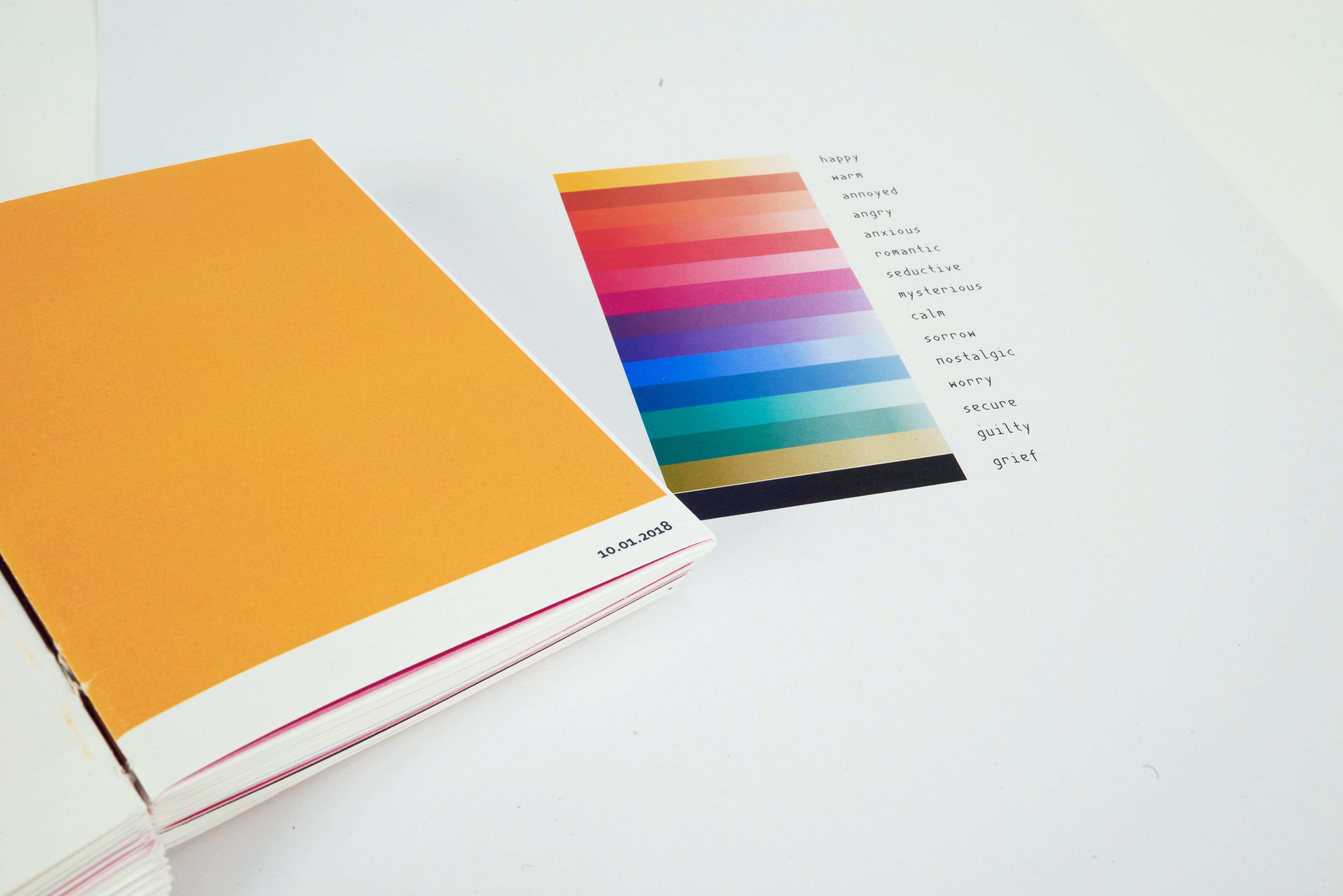
First of all, I made a scale, which shows the information of each colour representing each emotion. The fifteen colours were chosen from the research I did on colour psychology.
I also found that due to the simplicity of the colour blocks of the pages, it could be suitable to have a more bold style to match the feeling of the book. To achieve this, the paper of the pages I chose is uncoated, and whiter.
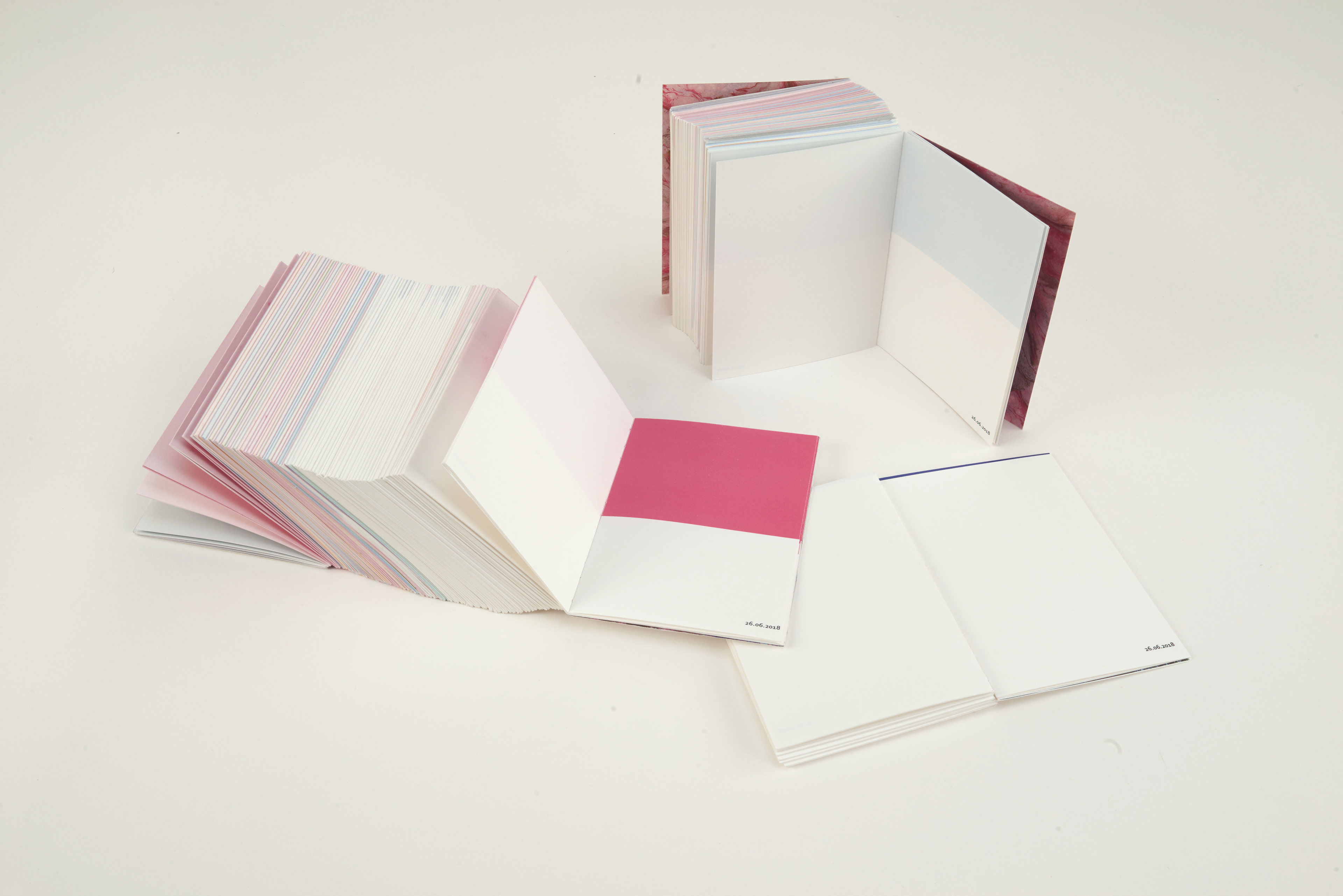
With a colour blocking inside the box to make the sizes of the colour block as the time I spent on the person so that a viewer could compare three books and see the difference between the three books. Also, adding symbols and changing the number of days into dates to remind the viewer it is a love affair. The scale of each individual is represented as a proportional value so that if one boyfriend is dominant in the emotional scale, it will reduce the value of the other two. In this way, a viewer could compare each day of the three books easier.
The End Paper
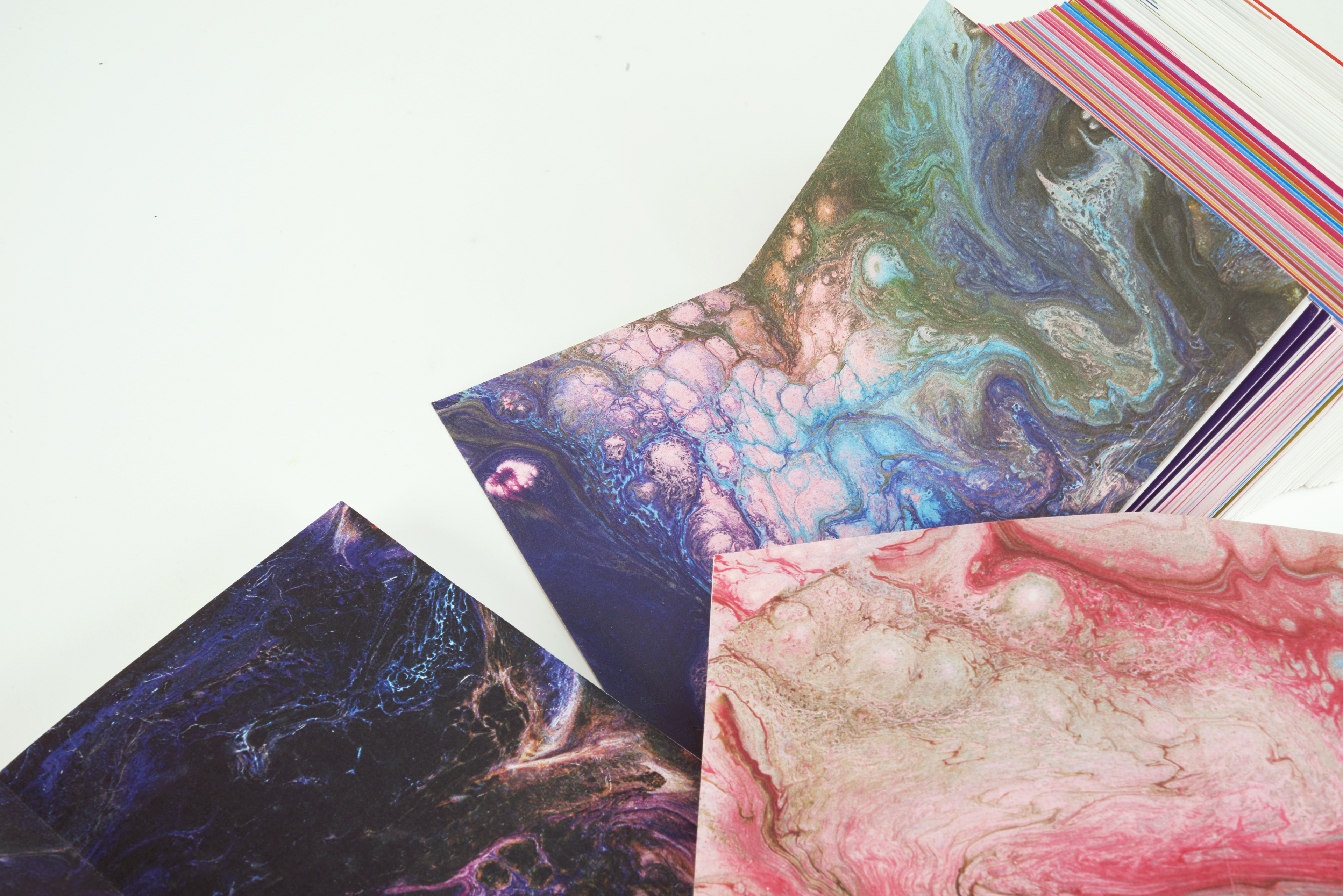
The marble art is the emotional summary of each book. It gives the project a more sensitive feeling, and make it as endpaper. As end papers, it could really make the colours pop when a reader opens the first page of the book.

Binding Mythology
In terms of binding, I decided to use copied binding. With double pages and sewing, even though one of the books is thick, it could still open nice and flat. Additionally, by involving myself within every step of binding the books, I could learn more in terms of layout arrangement of different ways to bind the book and to have more control of the details. The resulting book eventually looked like three art pieces rather than a book form that people are familiar with.
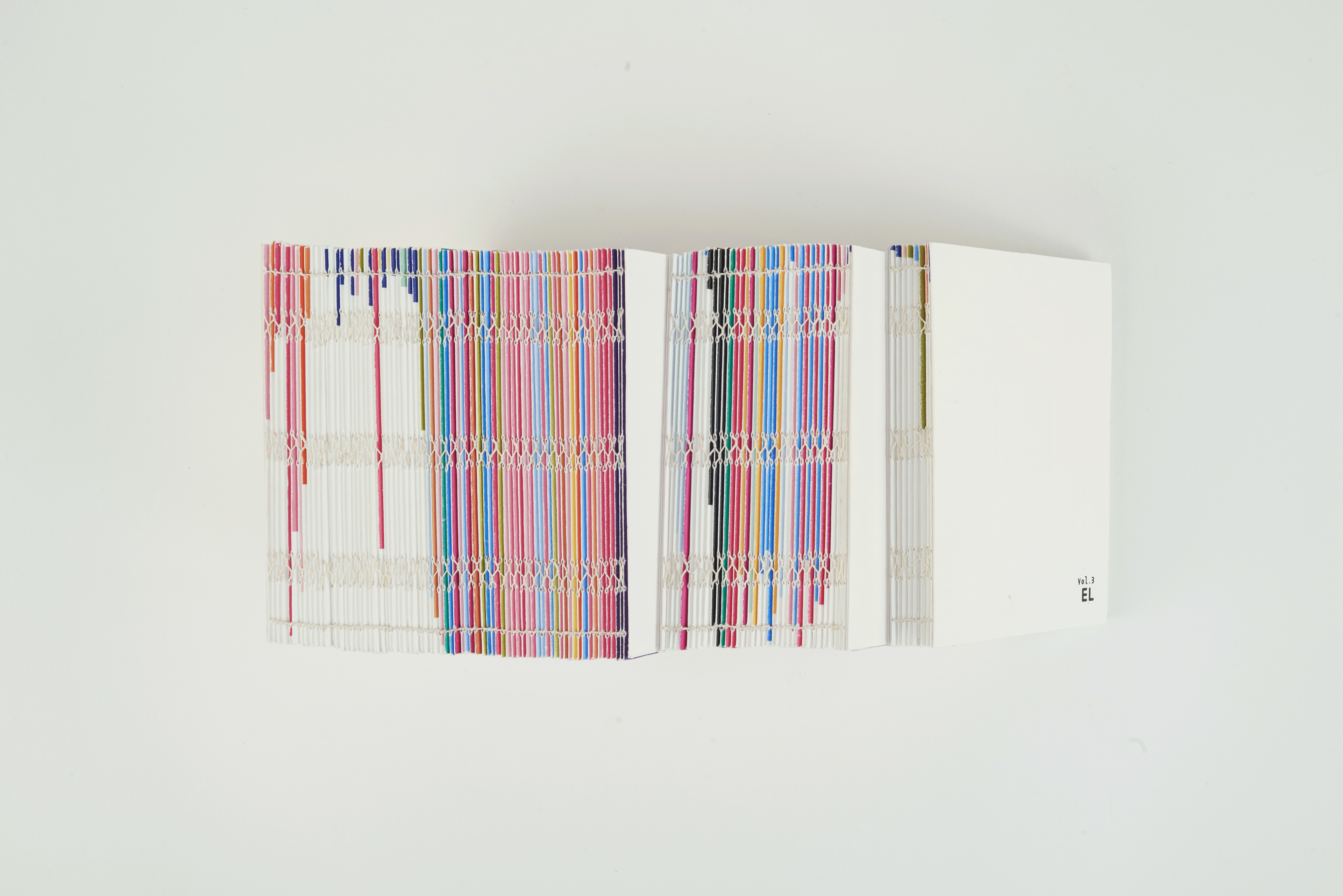
Moreover, I found that the spine can actually show the colour changes, so I decided not to cover the spine and use white thread so that the binding would not affect it.