Perec aujourd'hui
Poster design
Brief:
-Make a poster for book lover who love George Perec
-Start with a one day workshop
-Can only use Helvetica
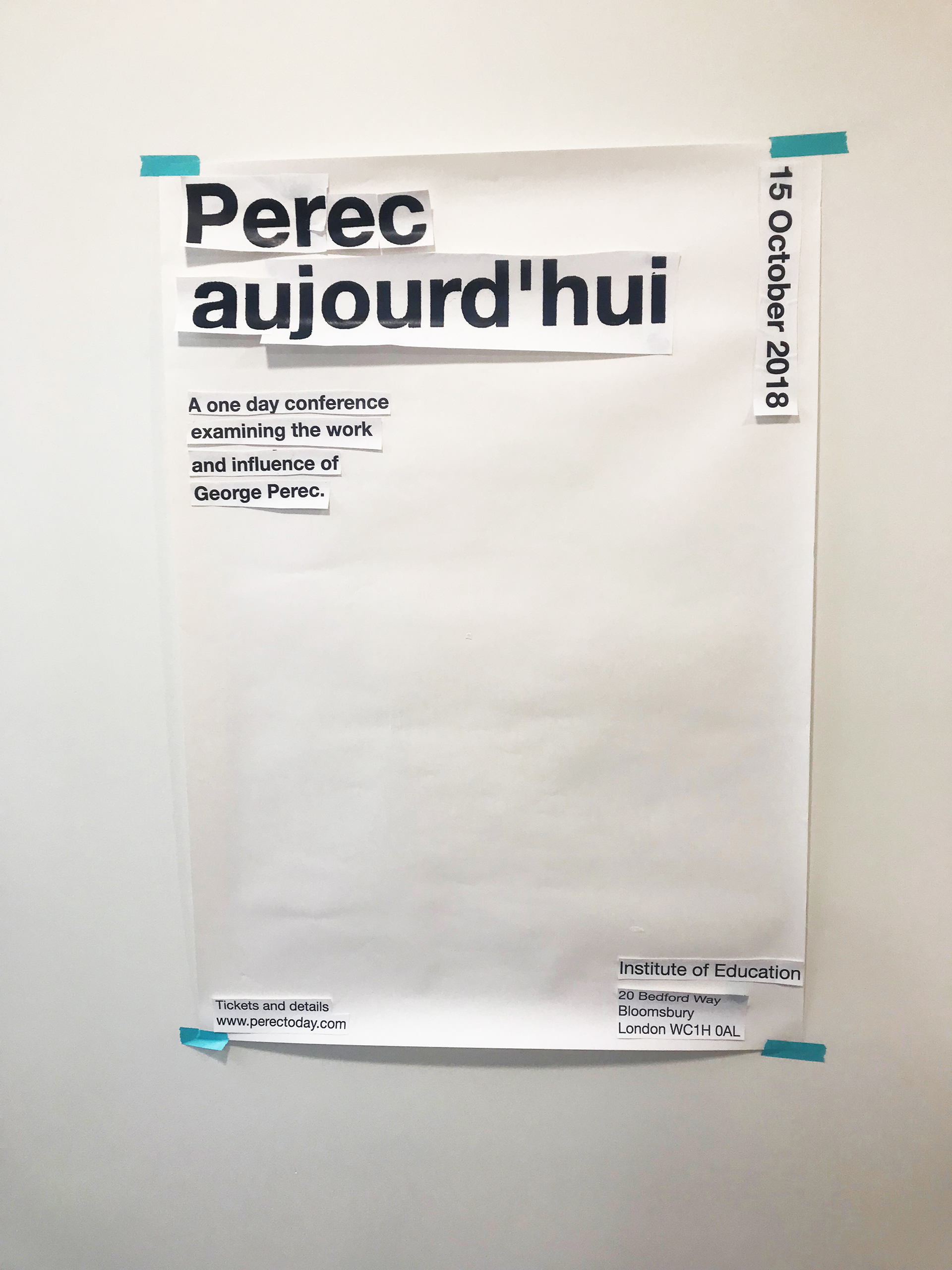
The poster workshop
The poster started with a poster workshop. We also use words with different weight and sizes to create posters, black and white, words only. I grouped the information first too like I always do, however, I found the outcome of my poster was too boring. I can see the information very clear, but the poster itself did not stand out enough.
First draft
The second time I tried to do my poster, I still found it difficult. I directly think of the author’s picture, and how I put it on the poster. Even though we could use images and colours, I still found it hard to find a focus on my poster. It was muddled, but still quite dry.
The change of direction
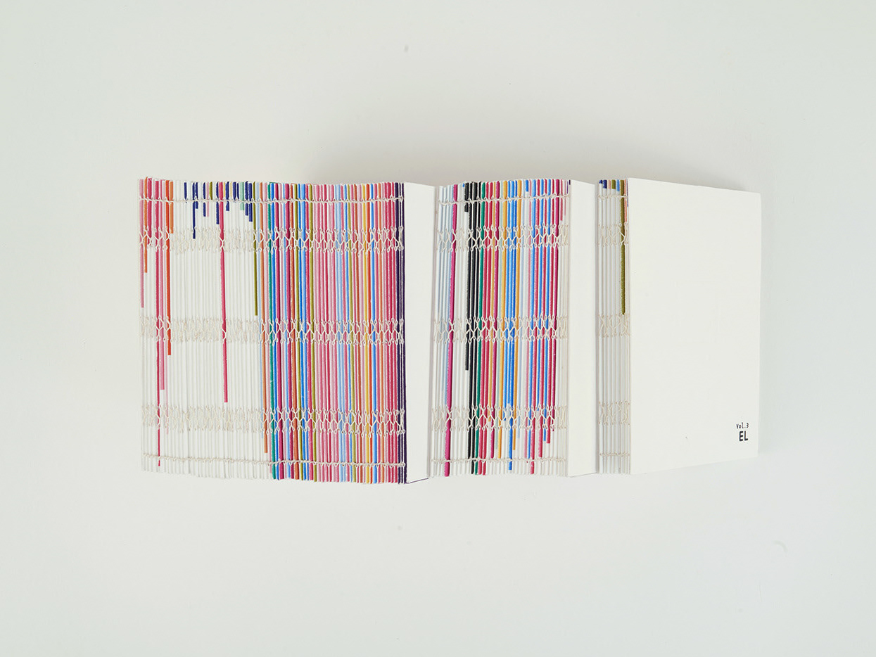
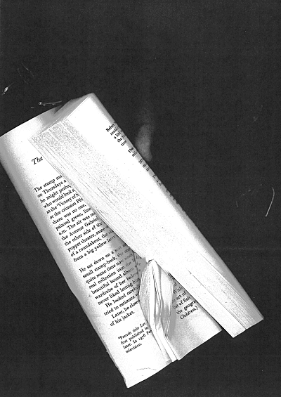
I tried to think about the poster in a different perspective. I found that whoever was going to see this poster and would be interested in, must be those who would love to talk about book and already know about George Perec. After analysing the audiences and the purpose of the poster, I found the picture of George Perec himself is not necessary. The idea of discussing a book is more important. I came out with an idea using a book written by George Perec, folded into different directions to make it into interesting shapes. I tried to fold the book into different shapes and copied them. I choose the one that did not actually look like a book but got a stream feeling to it, and at the same time, could still see the texture of the pages.
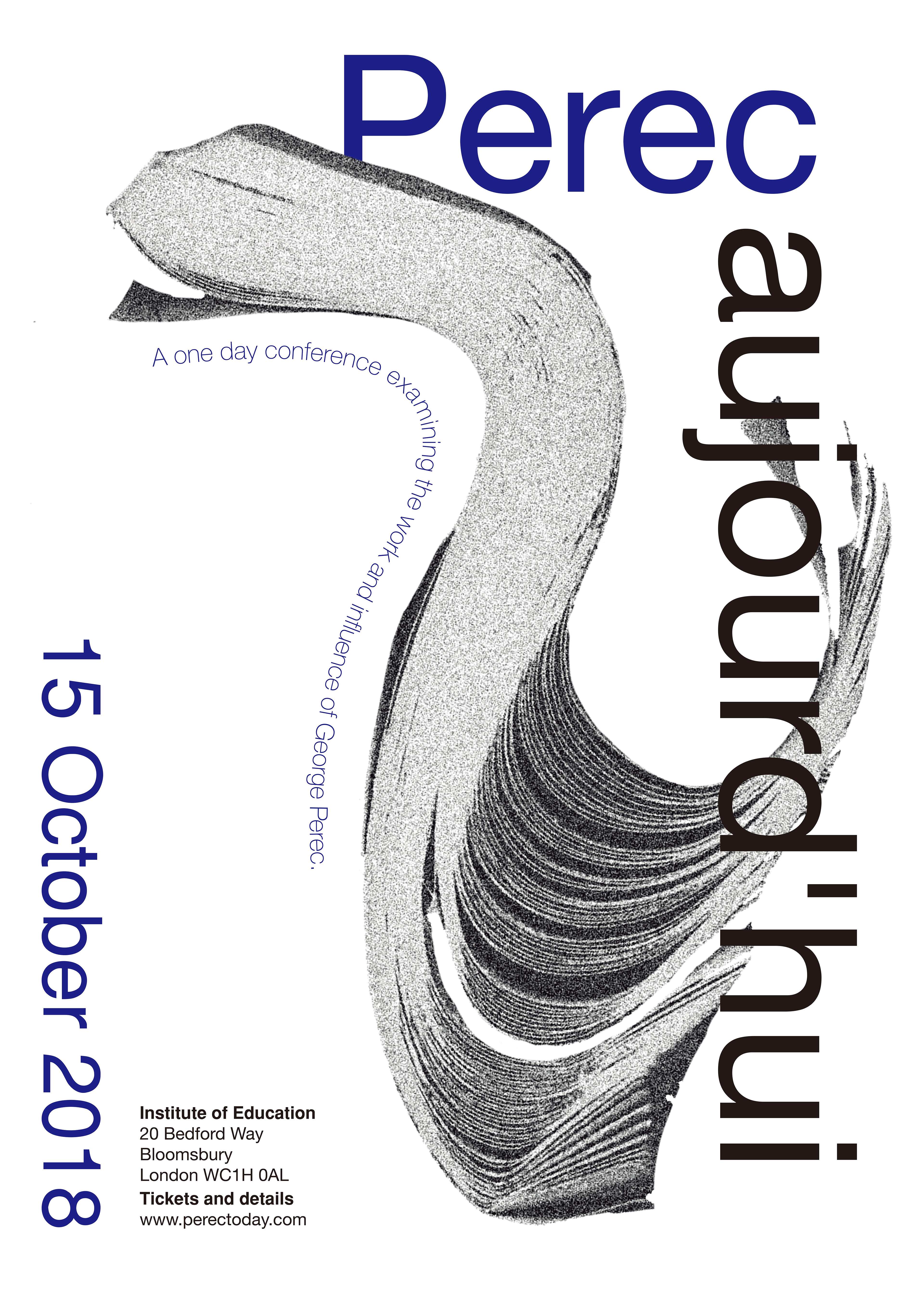
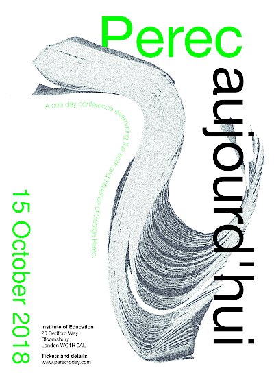
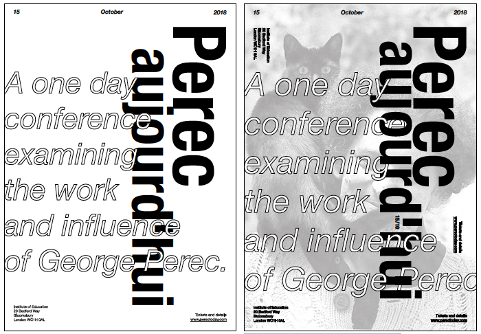
Final outcome
For the rest of the poster I just went with the image. Helvetica is a more neat and modern typeface, so I decided to make the poster simpler, without too many other images or shapes. For grouping the information,
the title should be the most important one, and reacting with the image. The subtitle could be in a more interesting shape and play with the image, but still readable. The second important thing on the poster should be the date, because when a person see a poster, once they saw the title and understand what the poster was about, they would look into dates first, then details about location and tickets. The details of location and tickets, I put them into the same weight. Both of them are the same importance.