Mapping the City
Brief:
-Research and think about a city.
-Create a map or series of maps that explains, reveals or even hides an aspect of a city.
-Can be a conventional map, but it could also be a totally new form.
The city is the reflection of your relationship.
The first time I knew the work will be a map, I immediately thought of many ideas, however, when I really thought into it, I found that the knowledge I had to create those ideas was not enough. I started to think about what does a map means to me, what makes me remember those trips, or a place. I thought of relationships I had in my hometown, Taipei City, and what was special for me was not just the places I have been lived in but the life I built around the people I have met there. It was a place that most of my families lived in, and a place I met most of my friends. The value of Taipei was not the place itself, but the relationship I have built there.
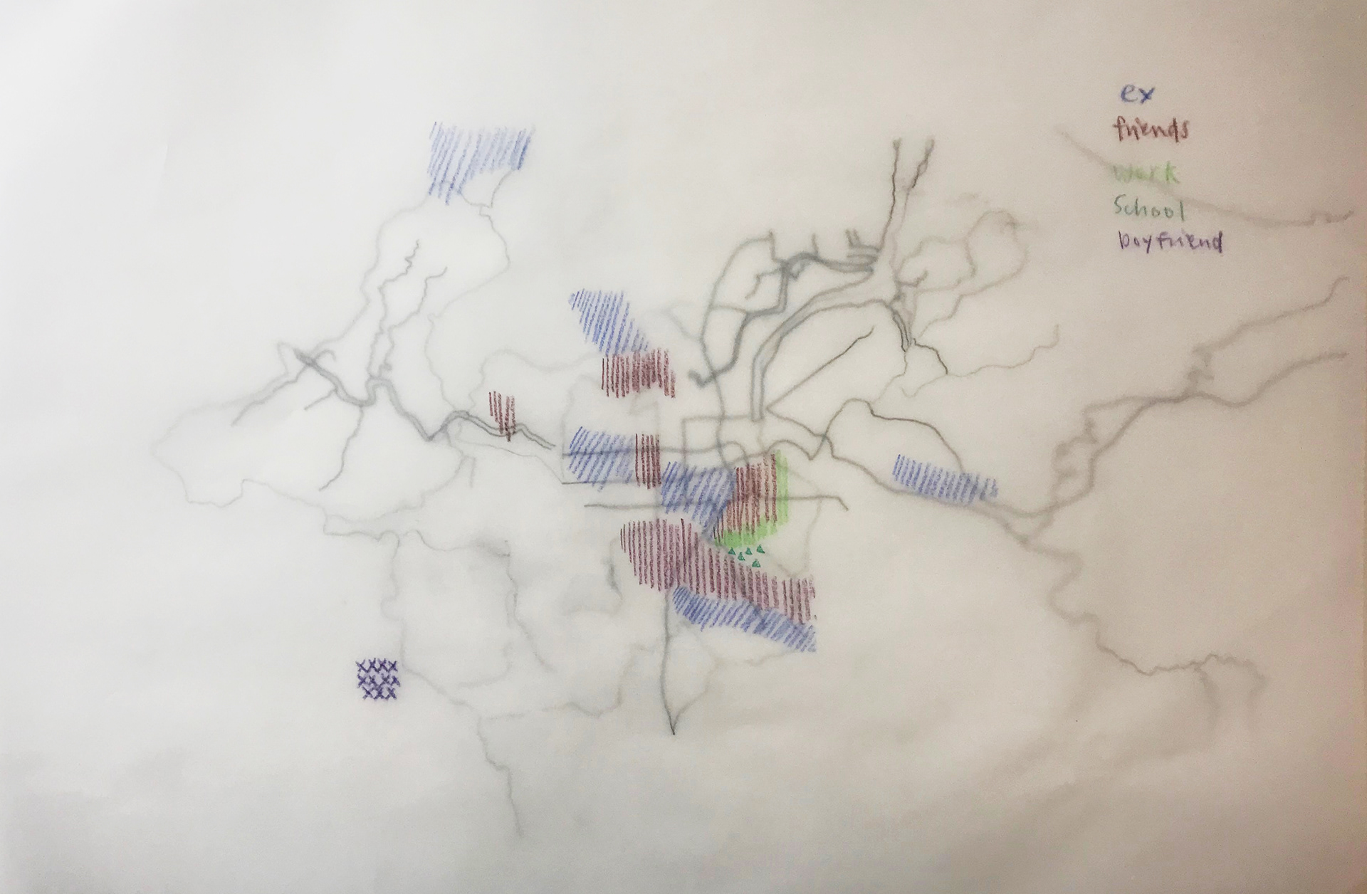
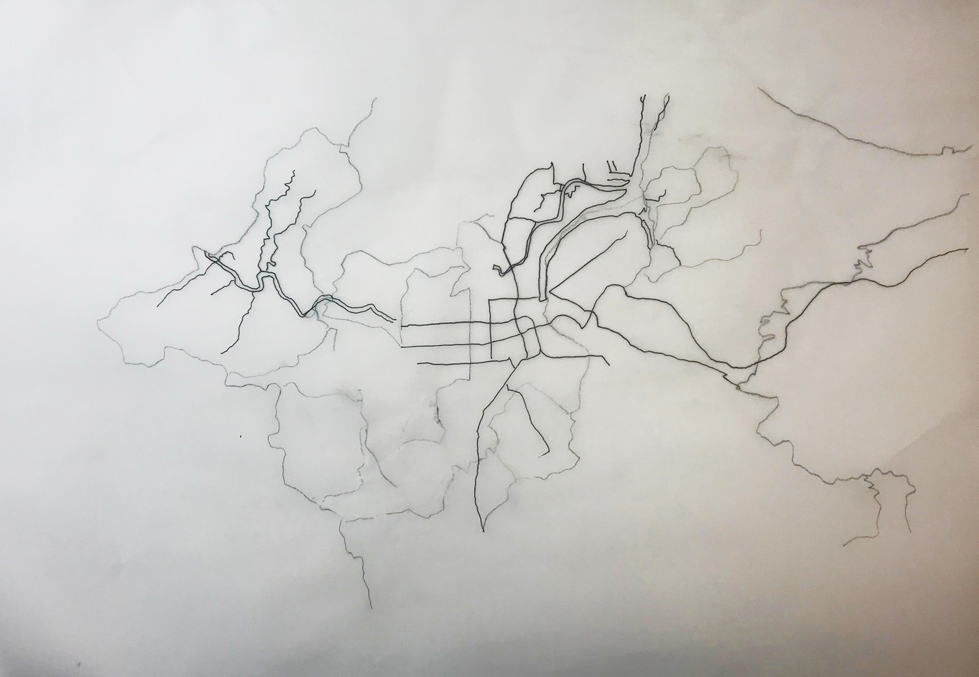
First sketch
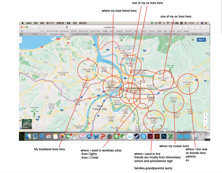
Initially, I wanted to show the relationship between people I met in Taipei, I used Google map as base, and started to draw the relationships with different colours and patterns, divided by who they are as groups, for example, my friends, families and colleagues. It did show that I known some of them in certain places, but it did not say enough. I feel the information was boring.
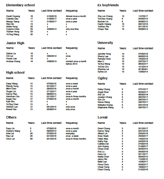
Research
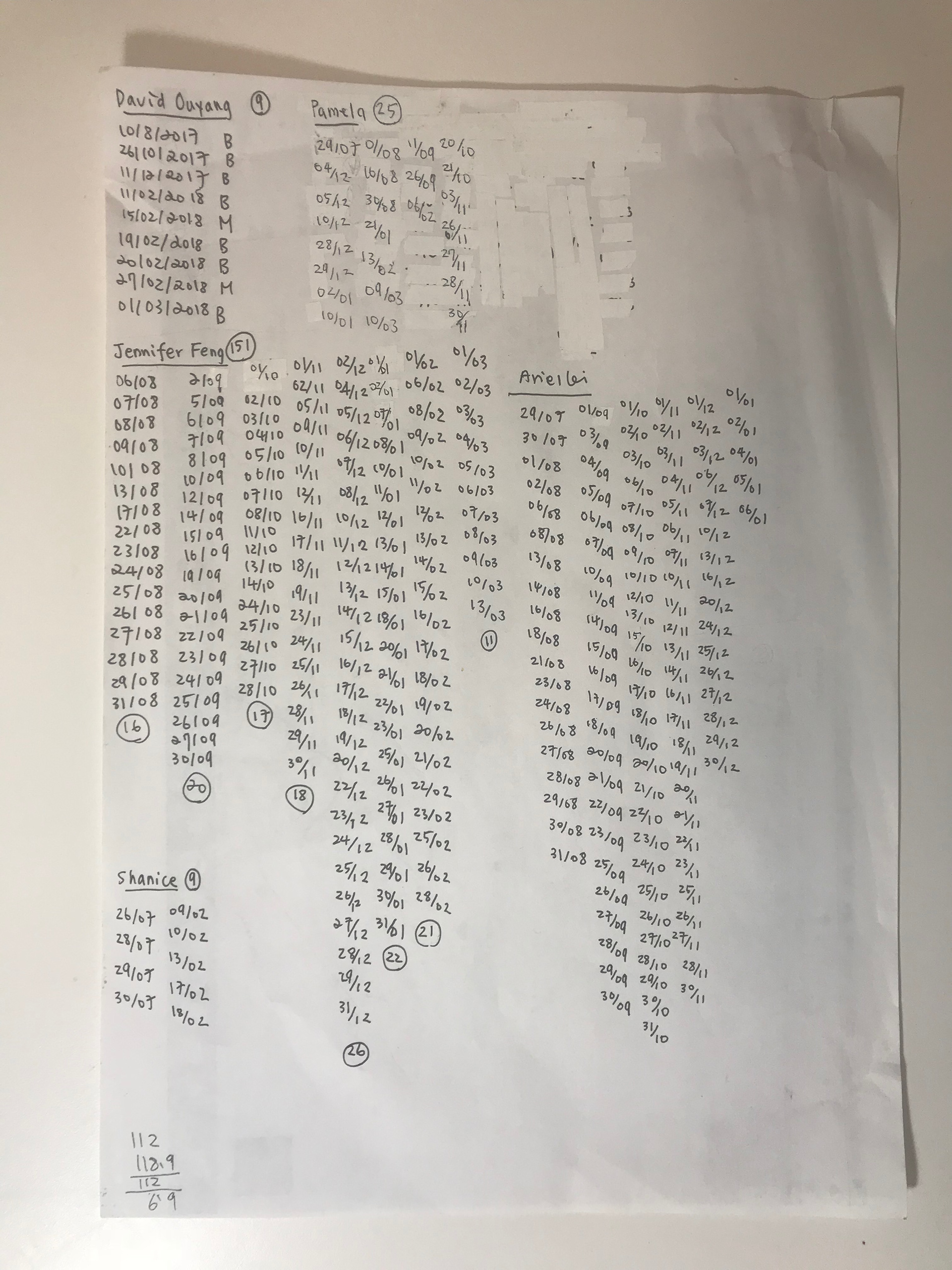
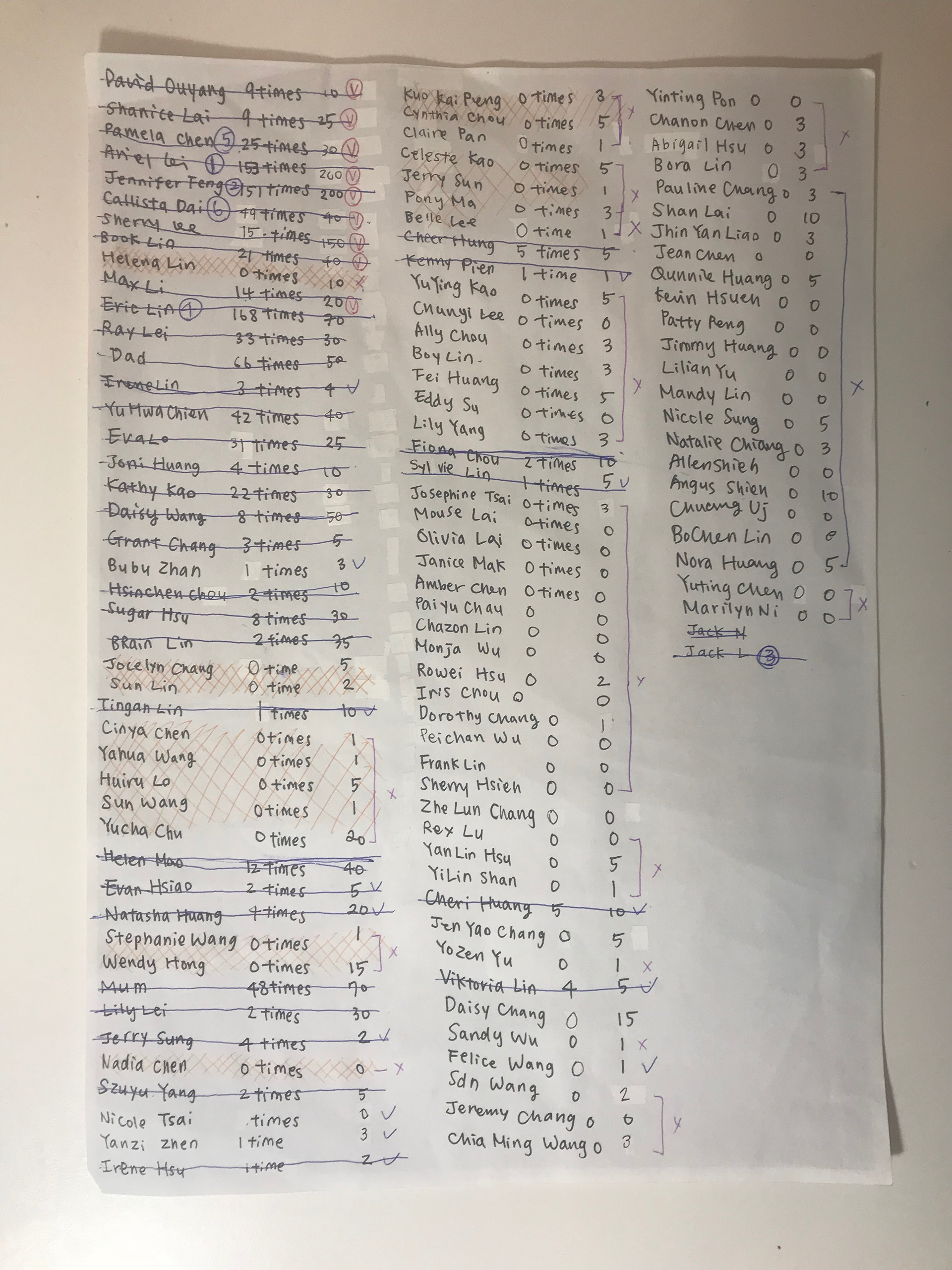
I started to list everyone I know in Taipei, and when I started to make them into a list, I found some of them I did not remember anymore, and that was because I have not contacted them for a long time. I started to collect the last time we have contacted each other based on social media. I looked into the conversation I had on Line, Facebook, Whatsapp and Instagram of each person, and listed them. Also, I thought another important thing is how long I have met the person. If I have known them for a long time, it could be harder for us to keep in touch.
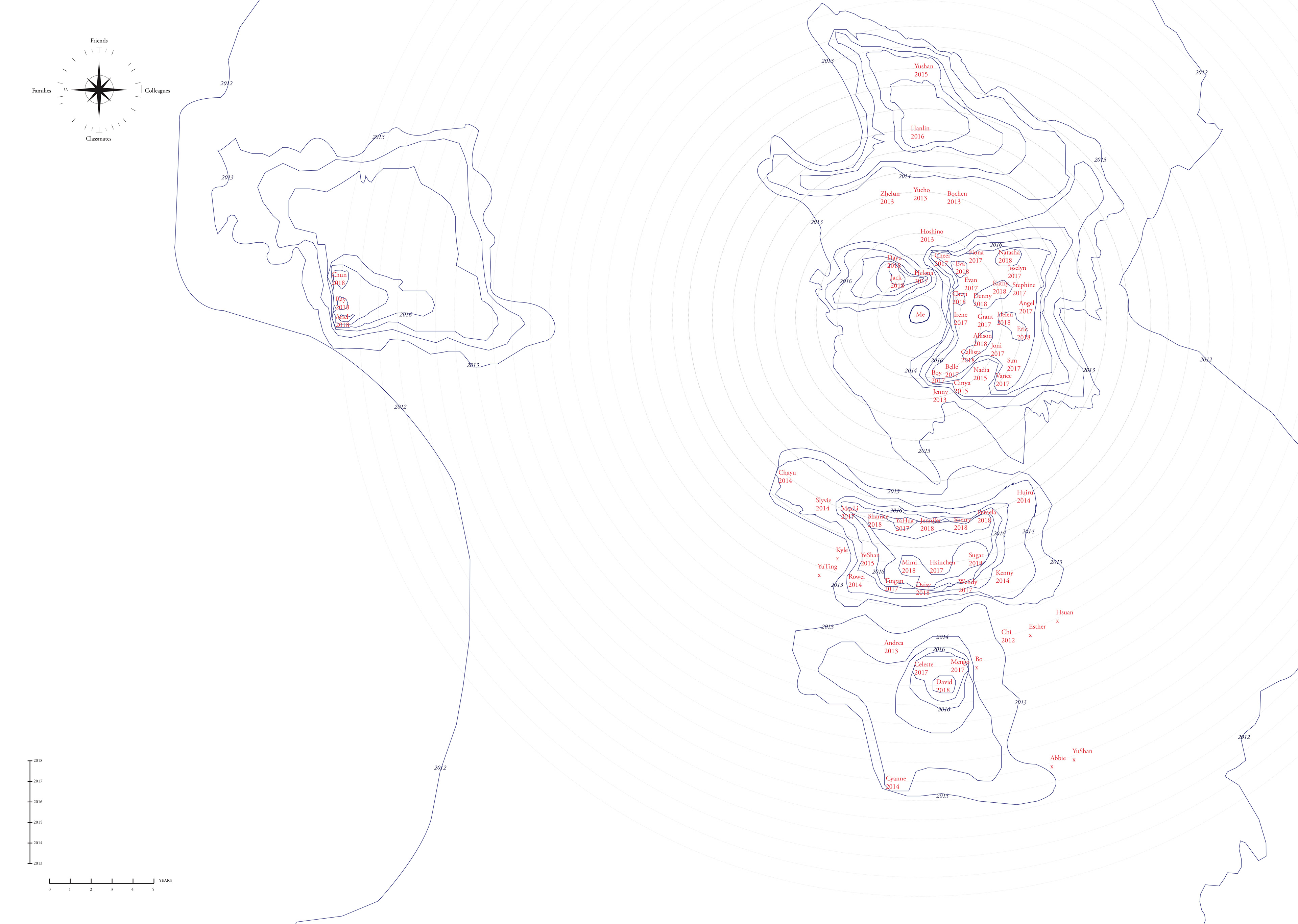
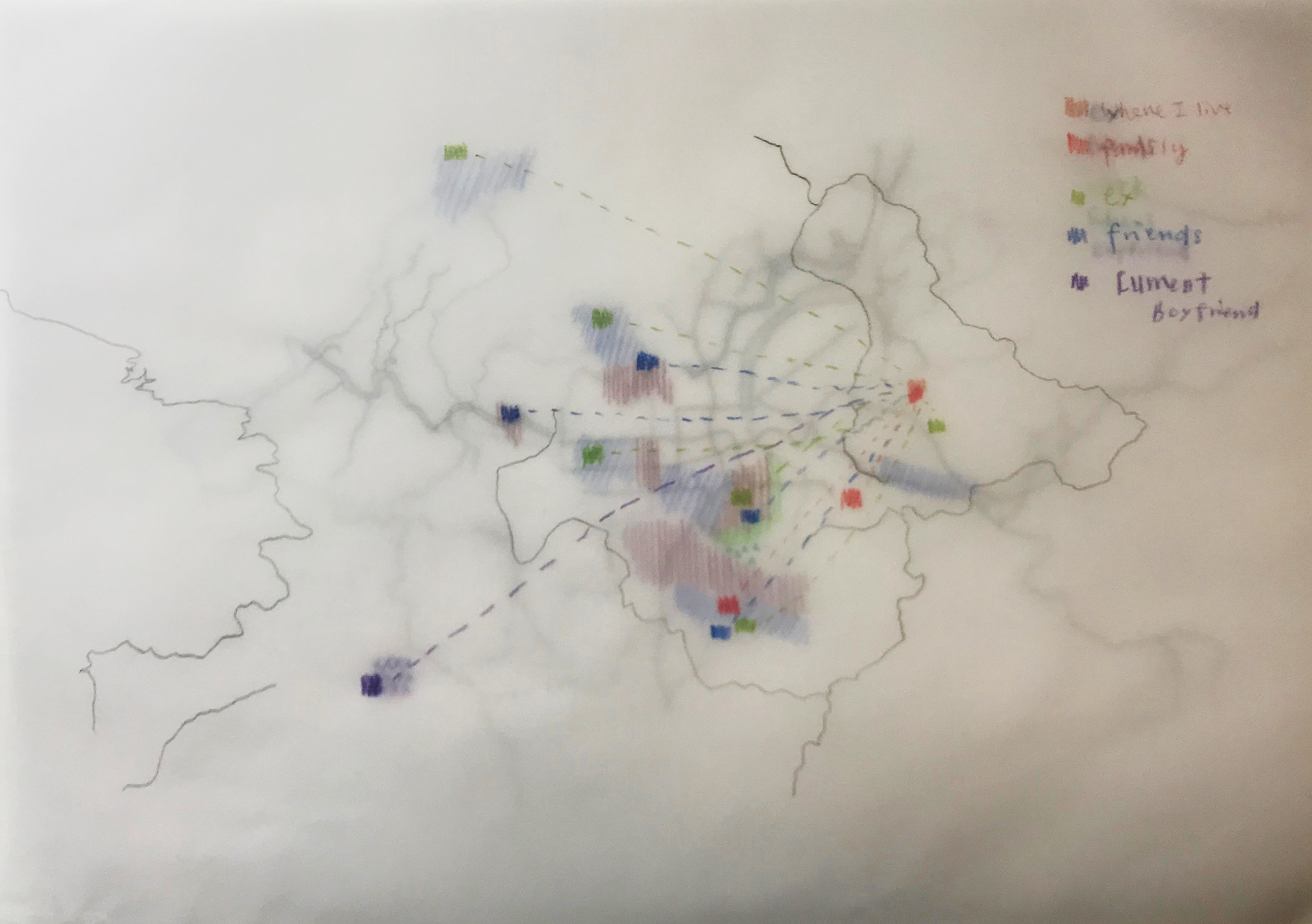
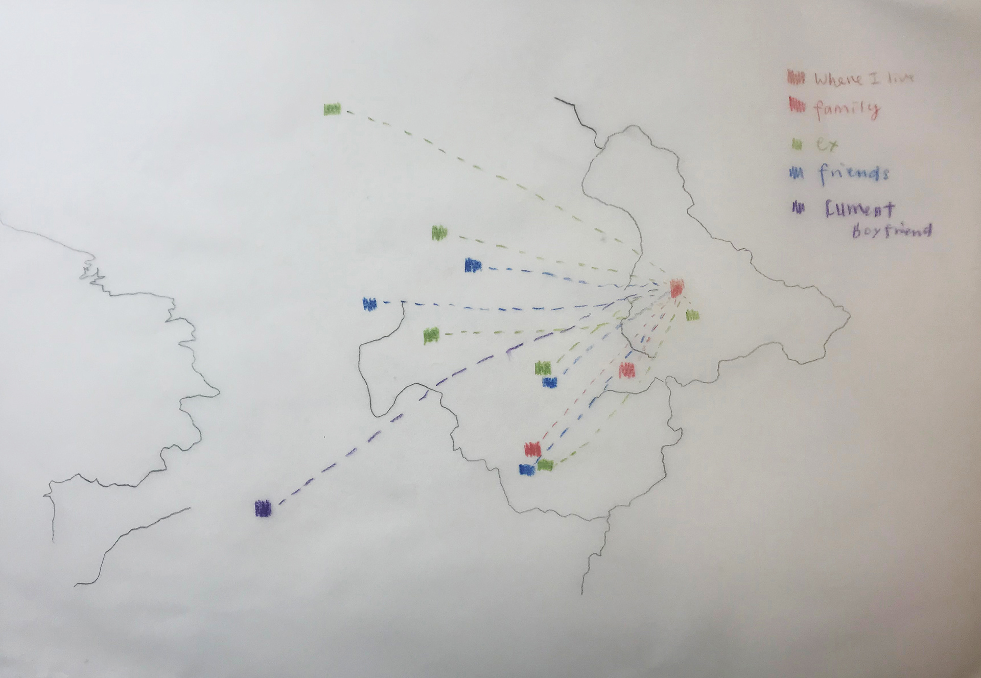
Second draft
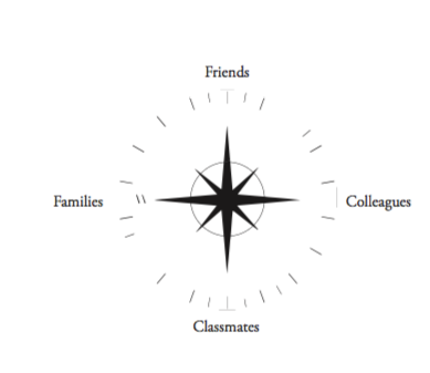
The compass pointed 4 directions, represented the groups of my relationships.
The scale was 1 cm as 1 year, to measure the years I have known the people I met in Taipei.
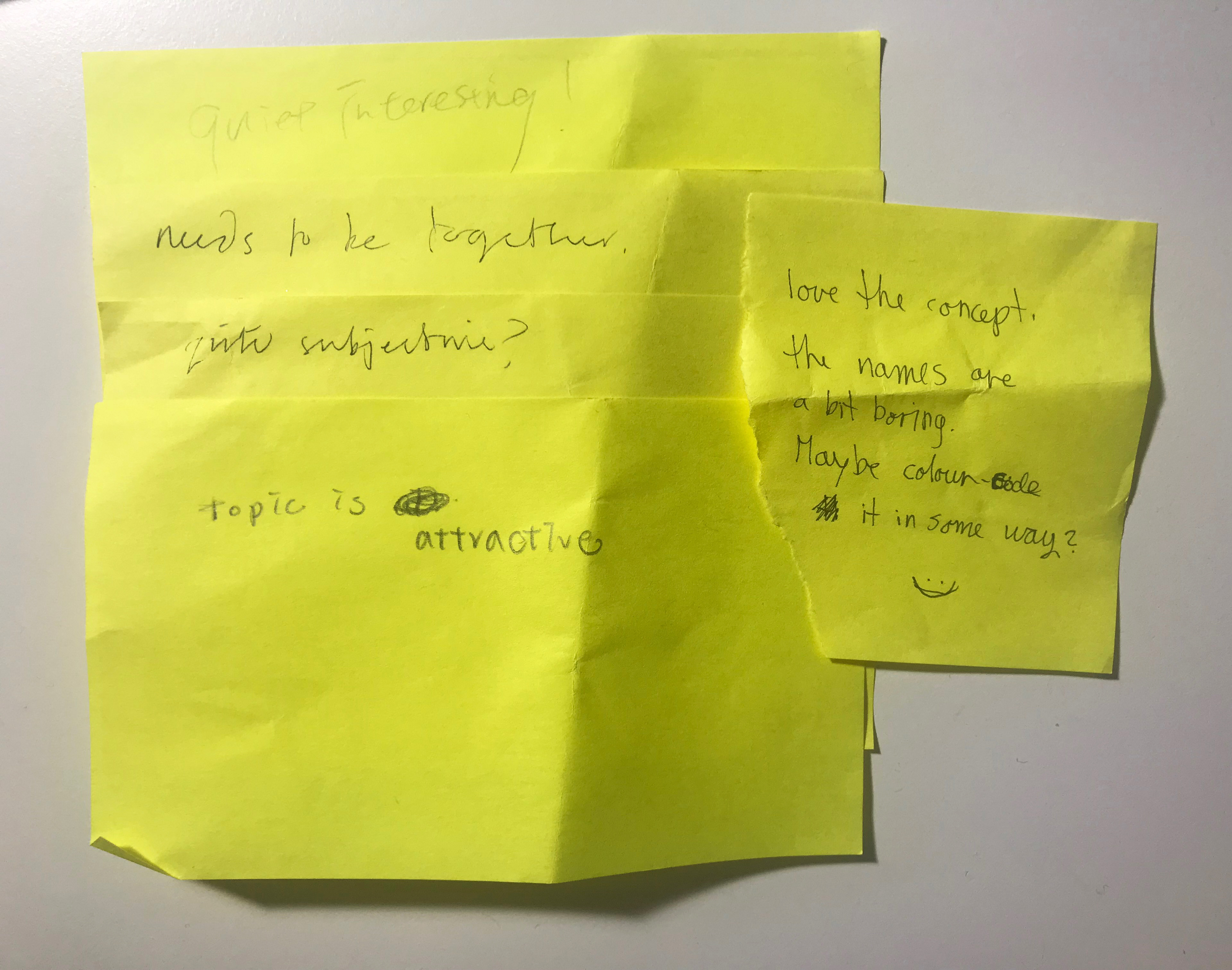
Feedback
The tutorial this time we had was in a group. My classmates gave me many feedbacks, one of it was too
subjective. I asked my classmates about their opinion, and after I explained to them they could start to understand the concept. I did not think my map was too subjective, because I had actual data to show on the map. My tutor said that the combination of a real topographic map and my personal map would mistaken him to think that was actually the location of the people in Taipei. This was the time I found there were problems in my map. I wanted to make a map that speaks itself, but if I had to explain it so many times and before they could give me any commons, maybe I should find a way to make it clearer.
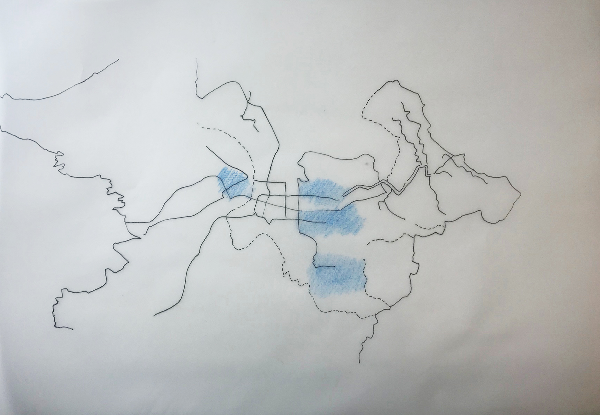
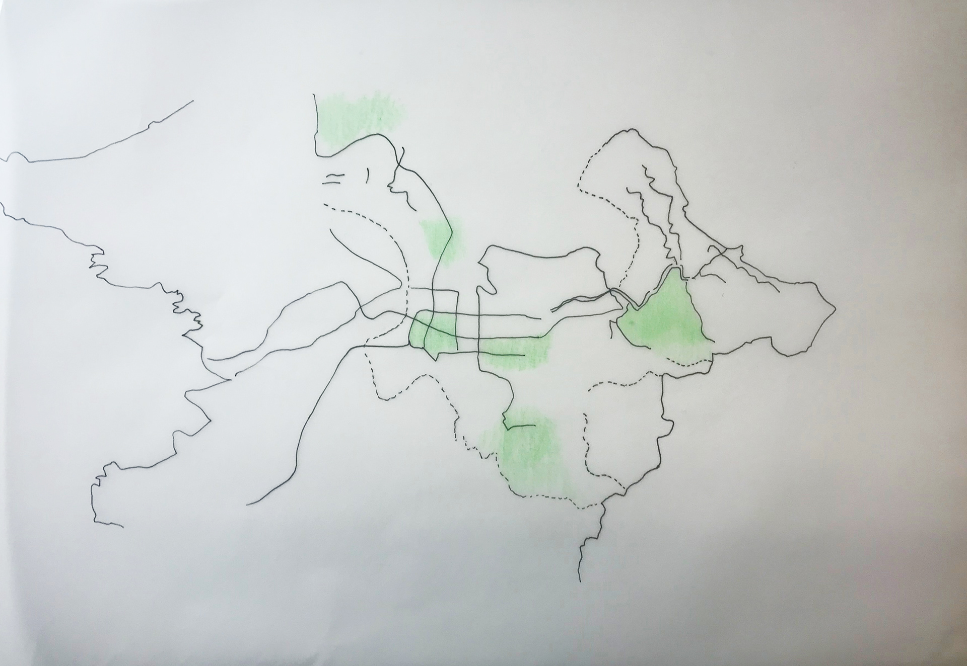
A new wat to express it
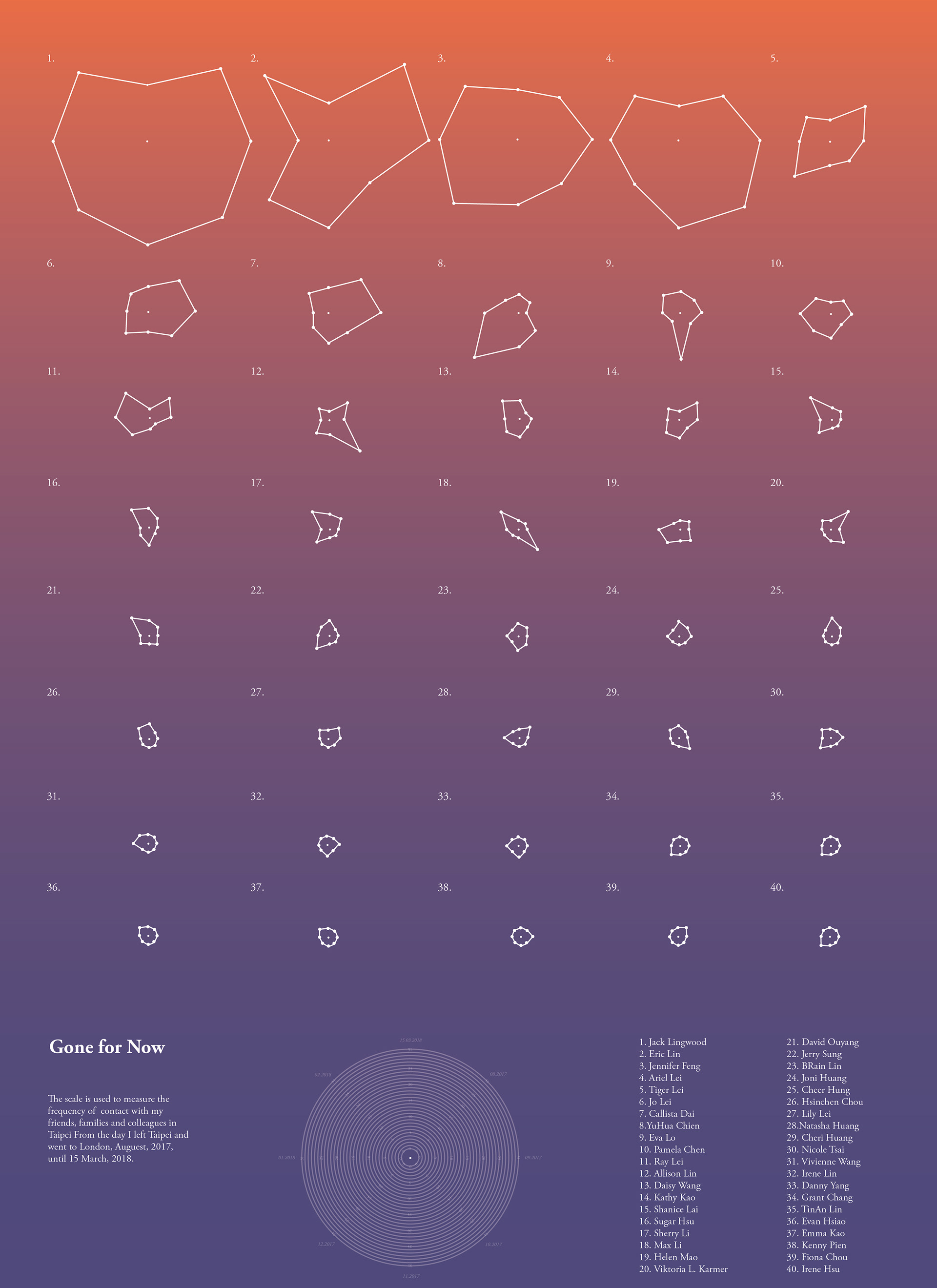
I started to think the map in a different way. I felt I put too many ideas in one map. I rethink the concept of ‘value’ of those relationships to me. I found when I was in Taipei, I could see them more easily, and not truly necessary to use social media to contact them. However, once I came here to the U.K., I only used social media to talk to them. Some people I did not even think of speaking to them since I came here. I wanted to see frequency of us contacting each other, and that could tell the real relationship between us, or those who I should have contact more. I collect the date of every conversation I had with people who I met in Taipei, since I came to the UK into months.
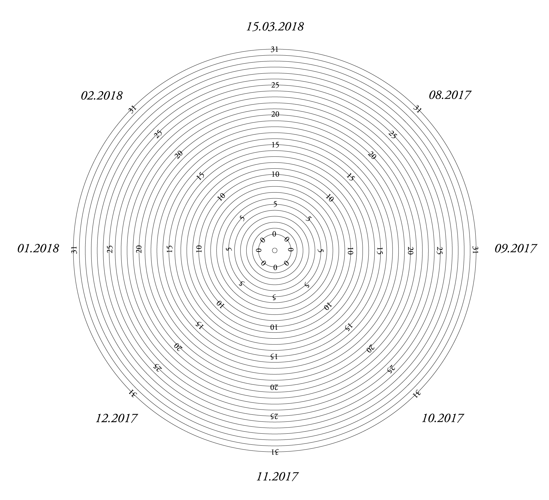
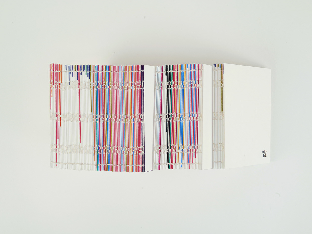
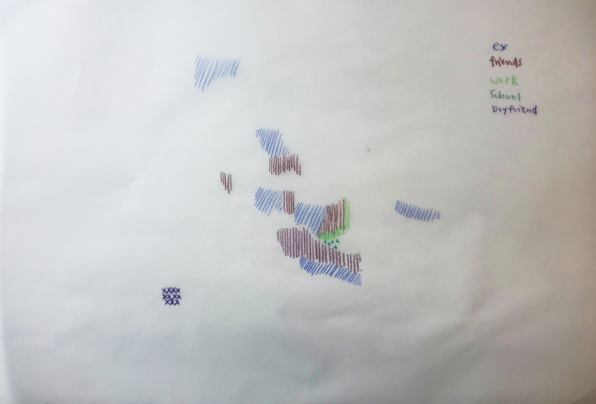
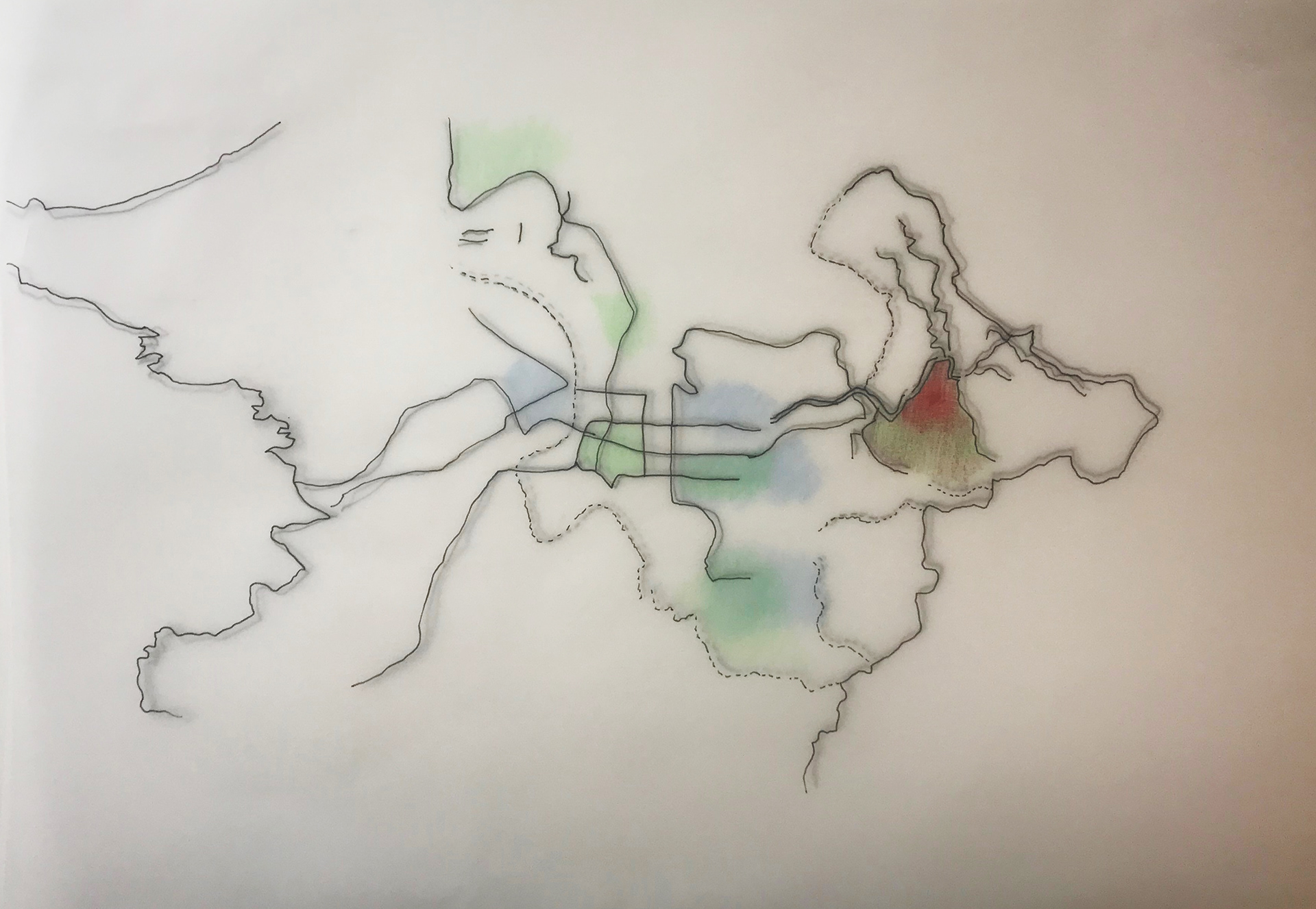
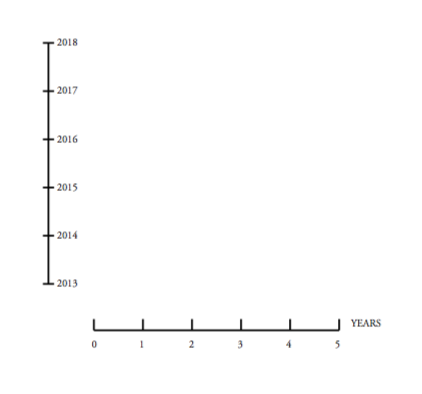
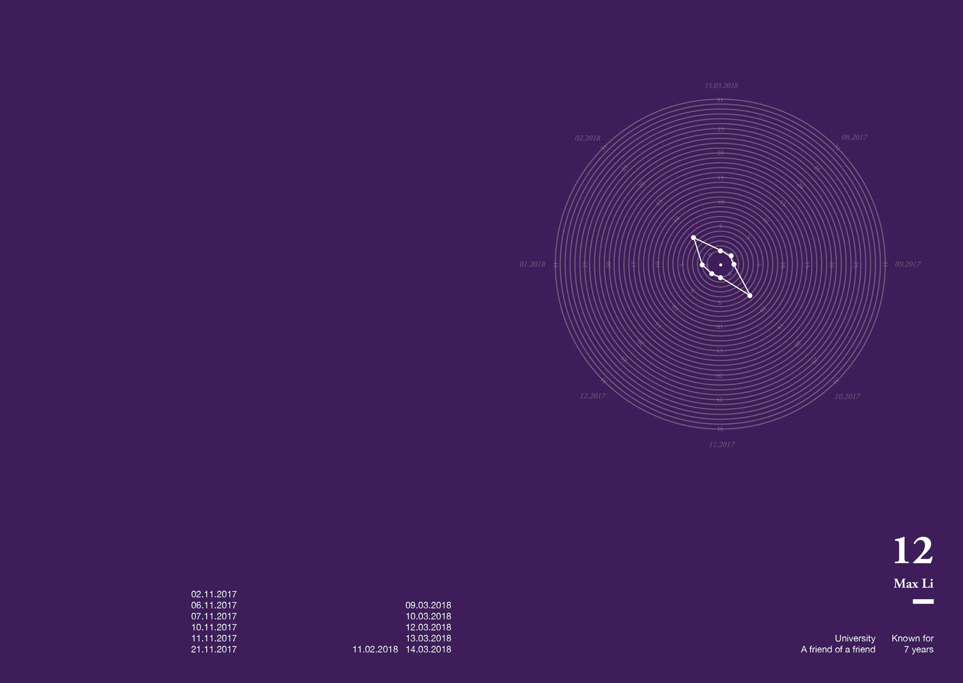
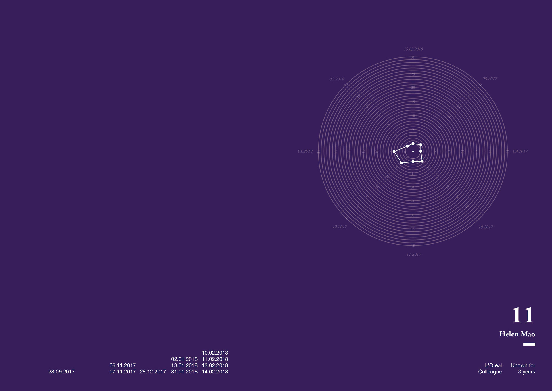
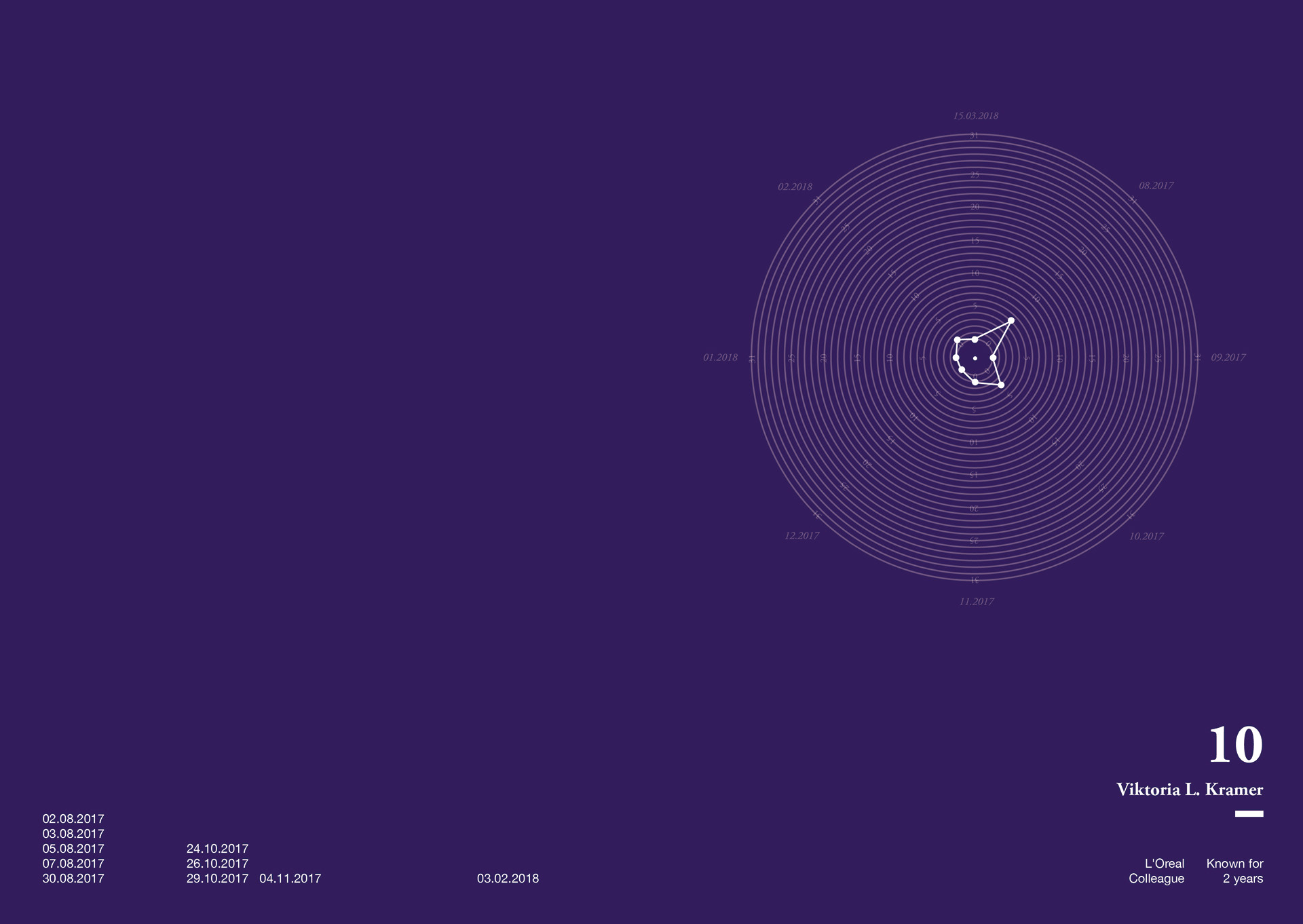
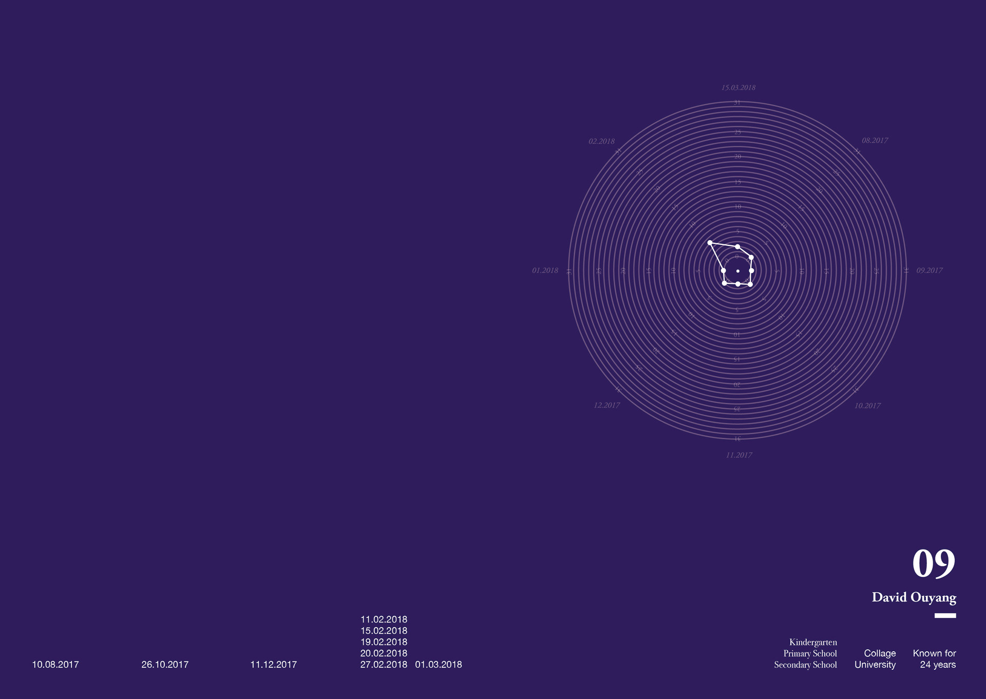
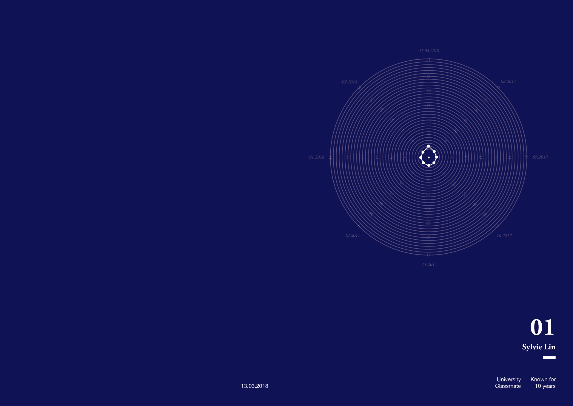
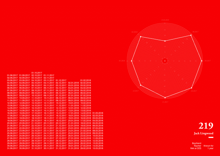
Scale
Counted by month, from 08,2017 to 15.03.2018.
The numbers represent the frequency of the people in Taipei and I contacting each other.
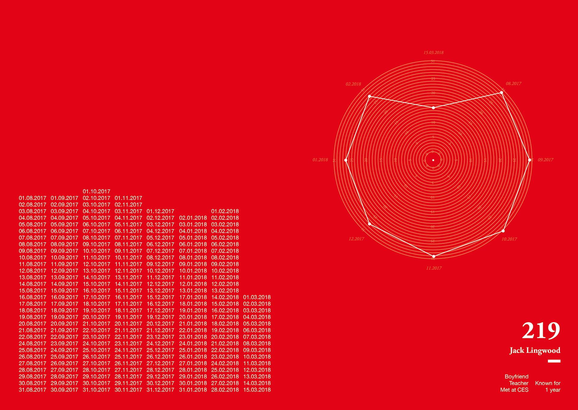
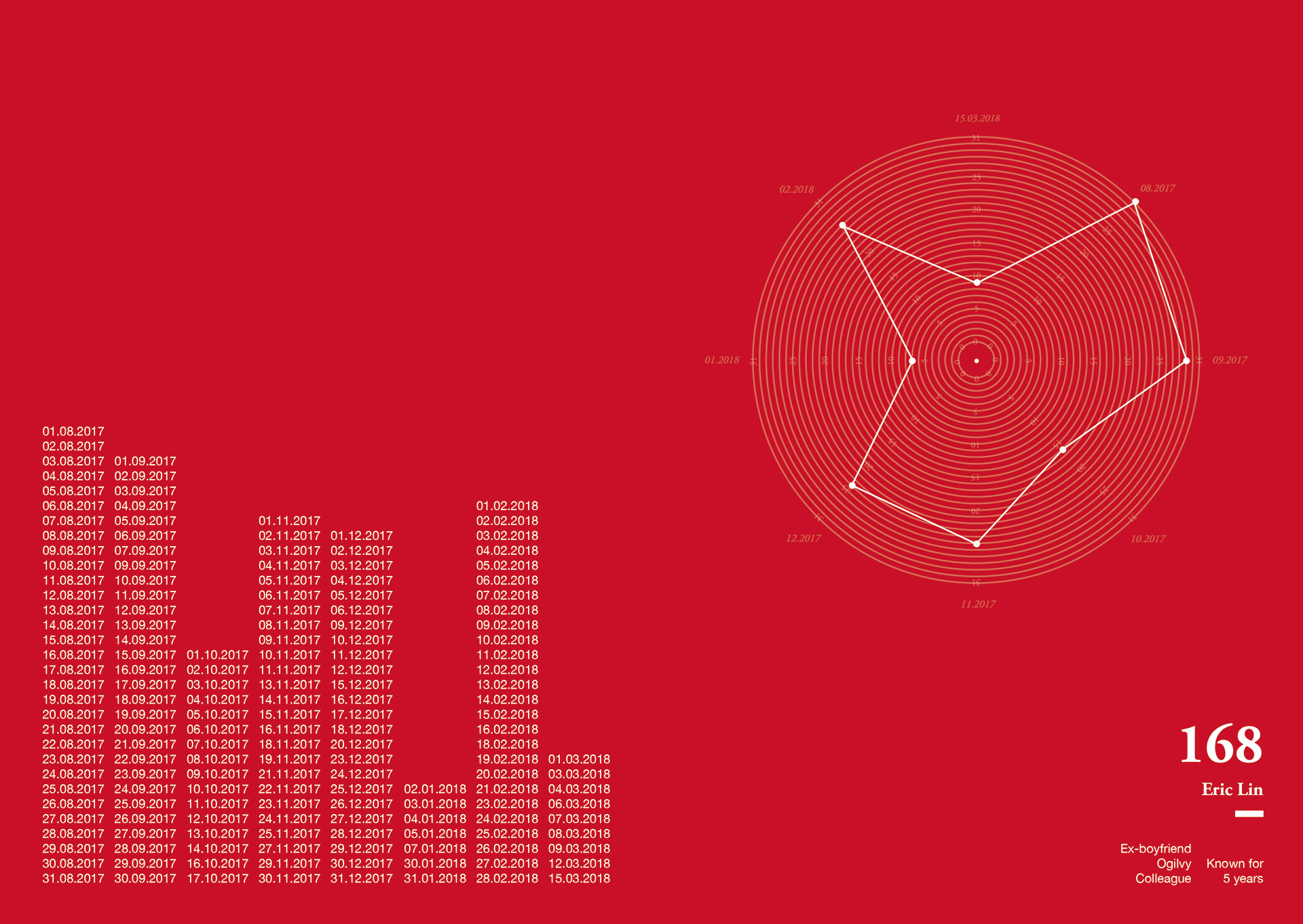
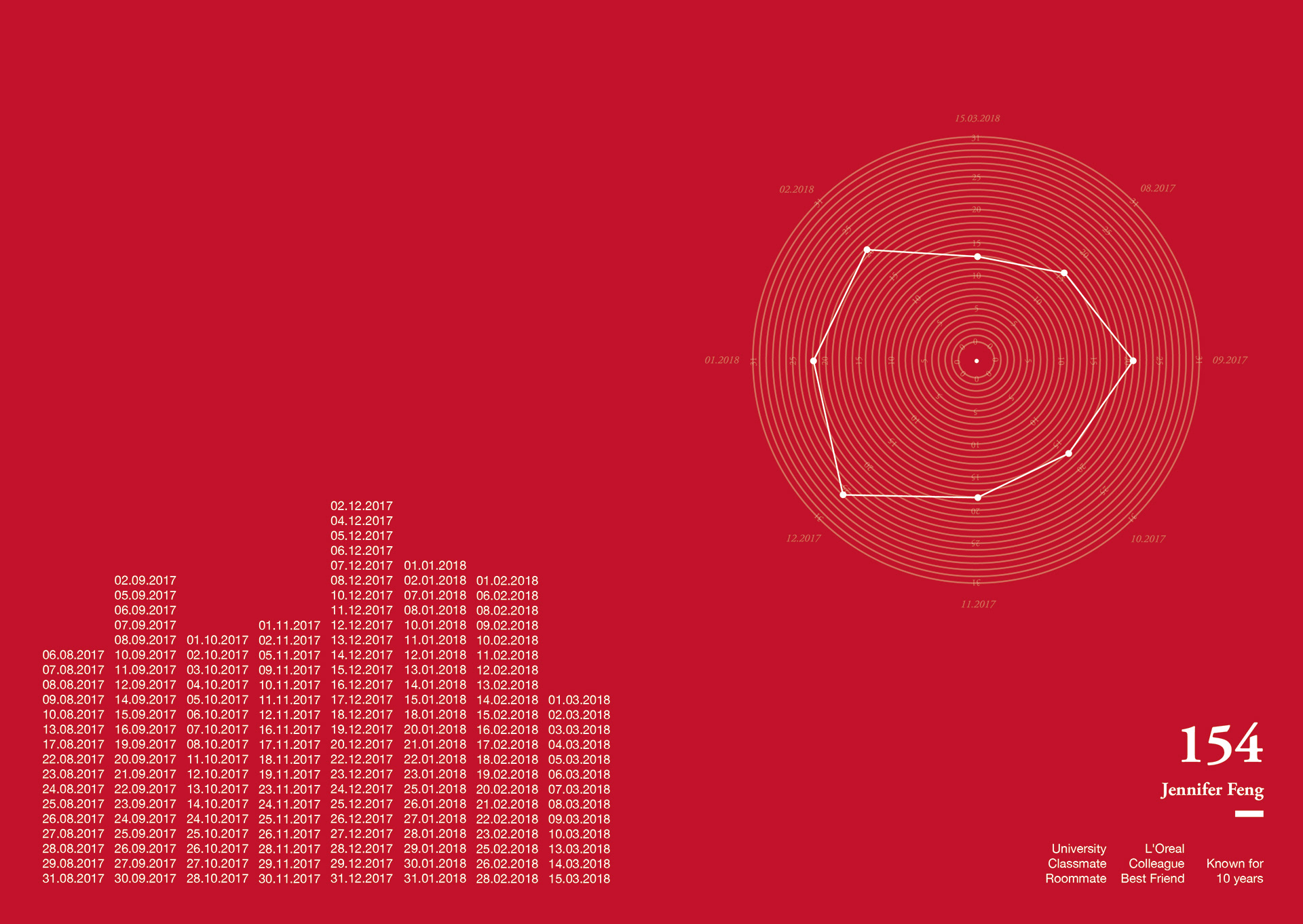
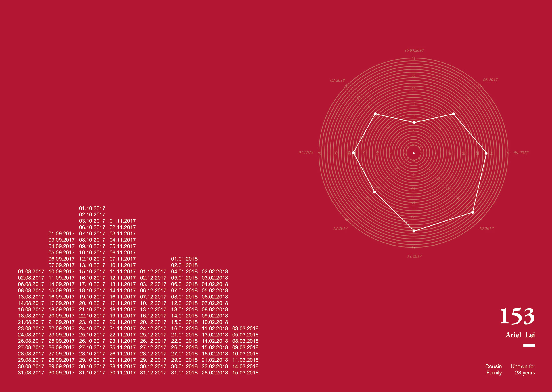
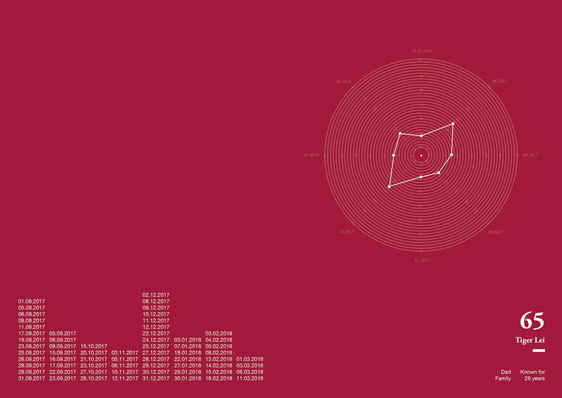
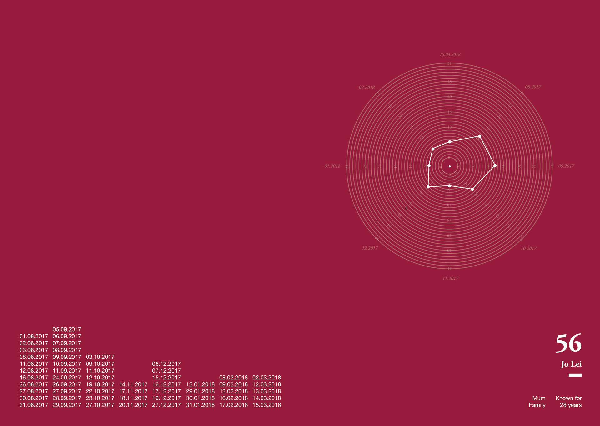
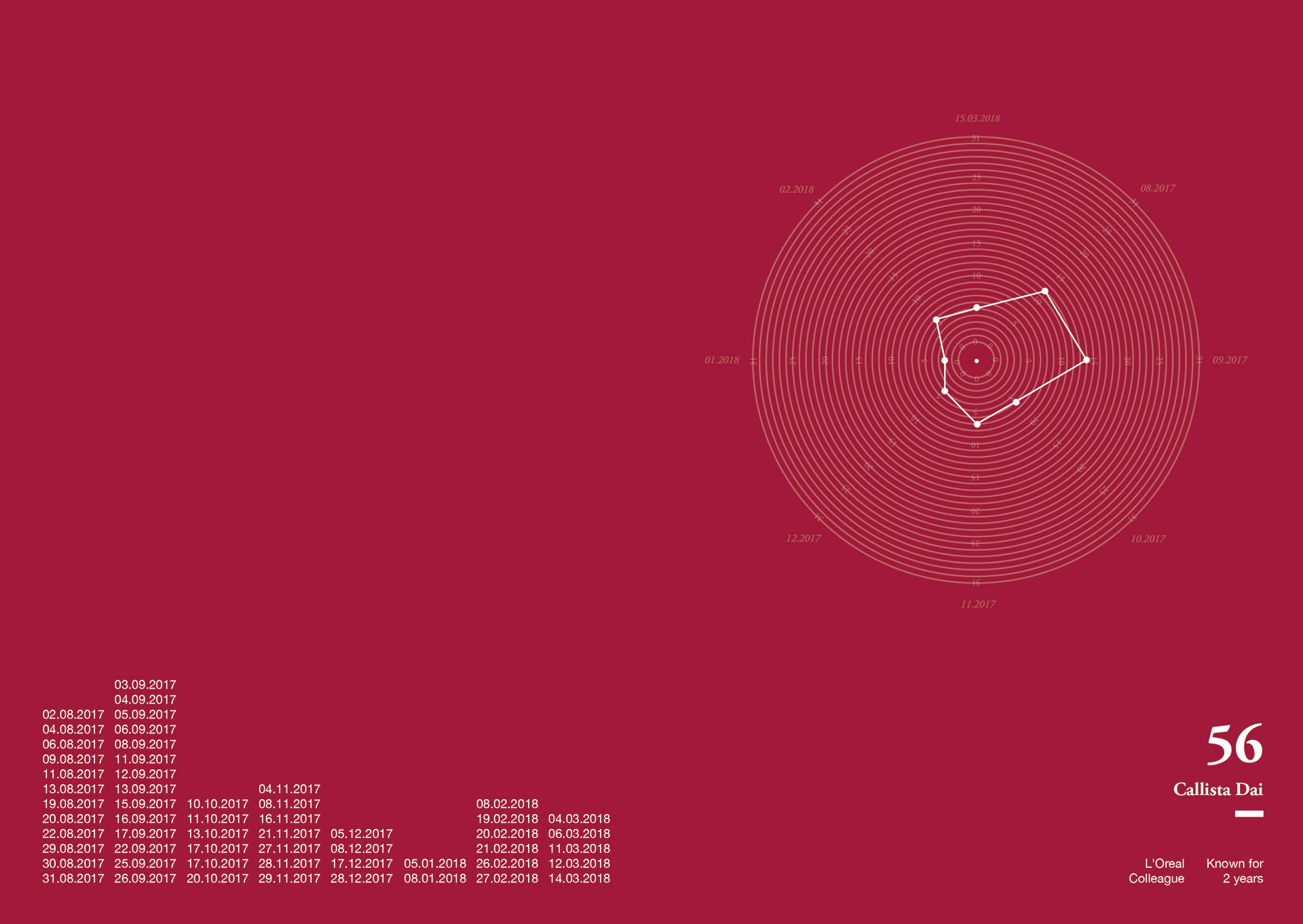
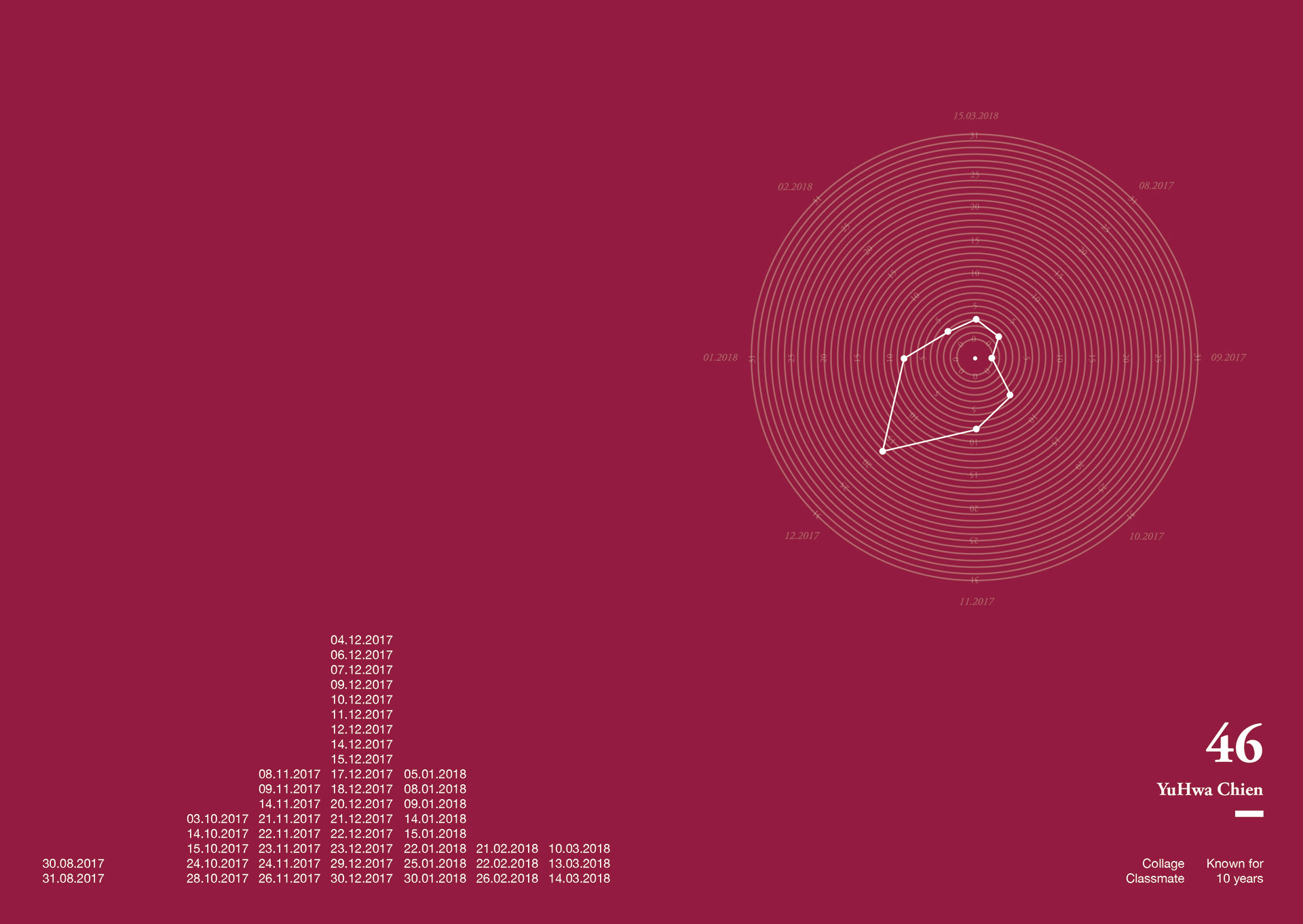
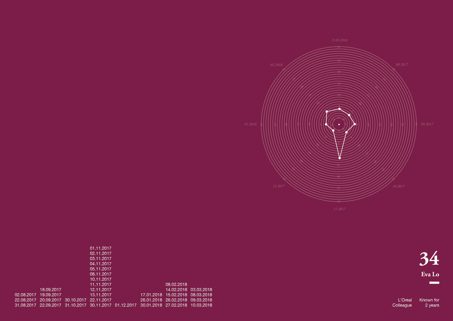
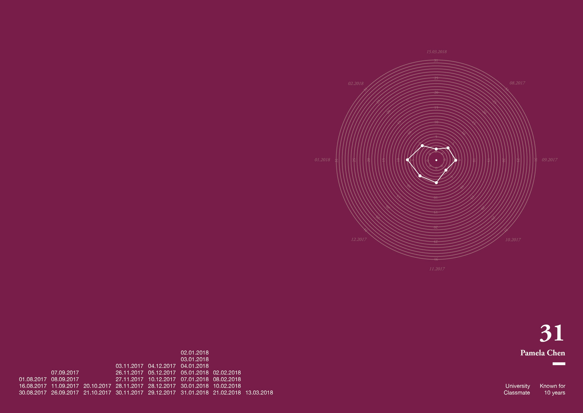
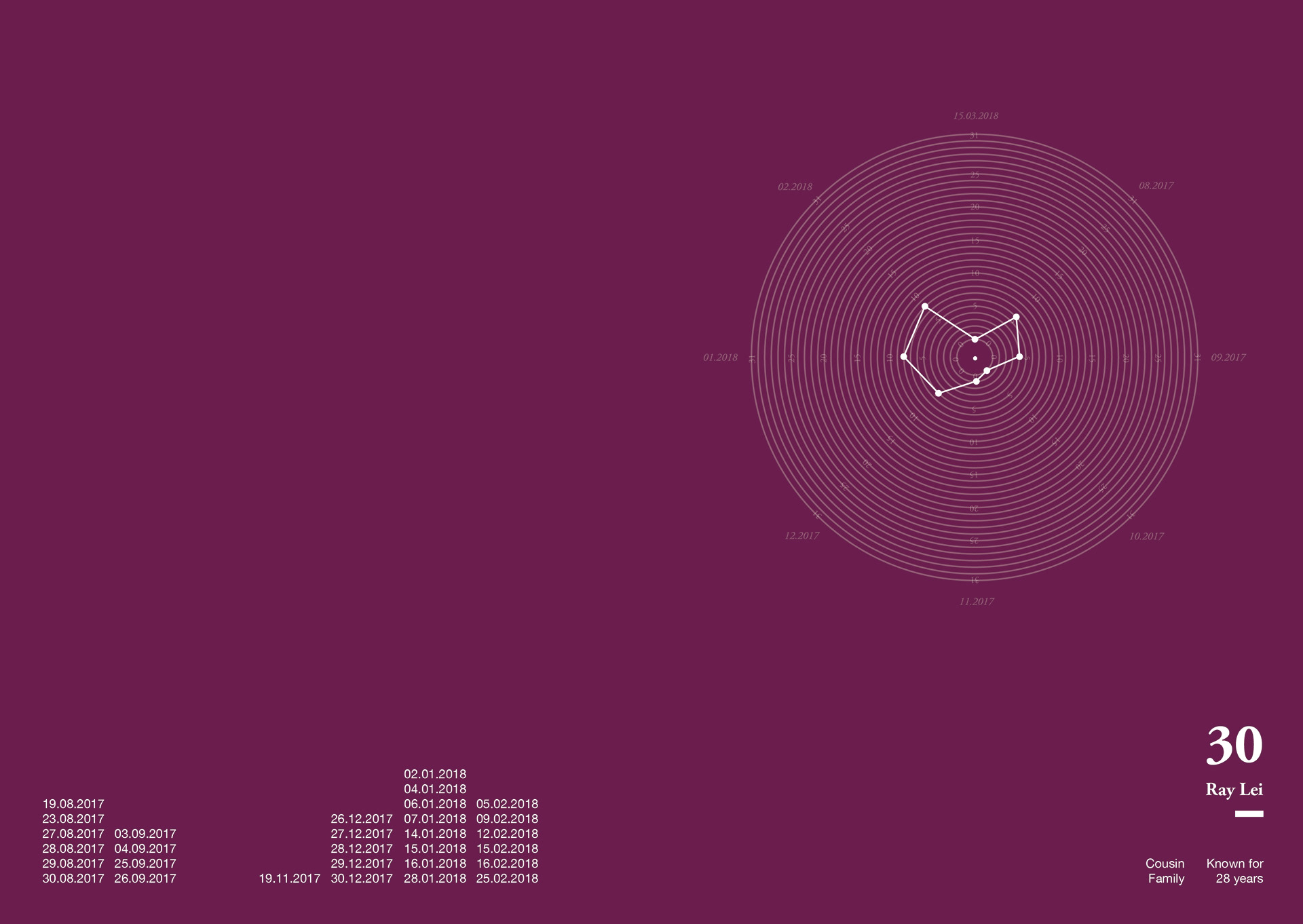
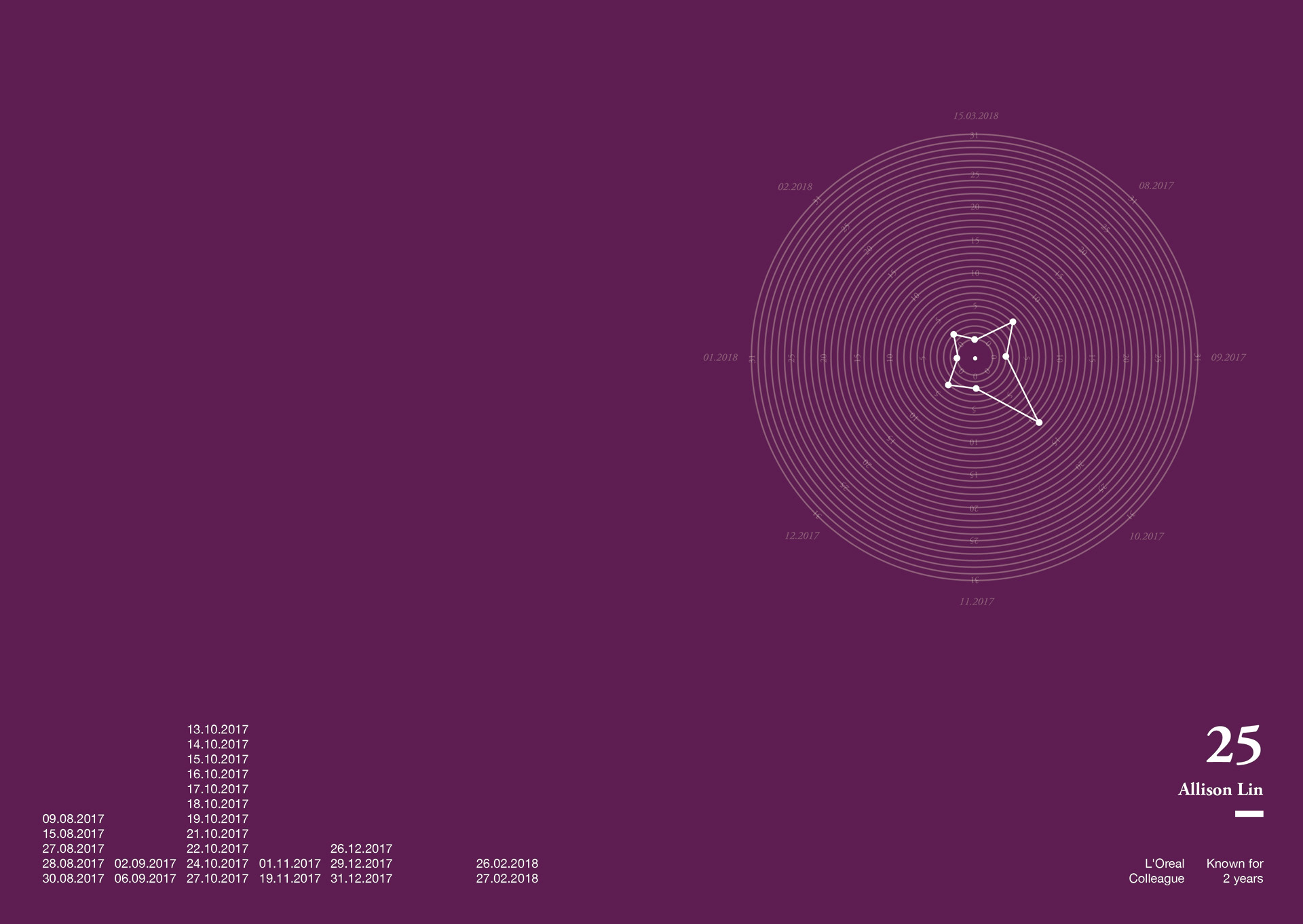
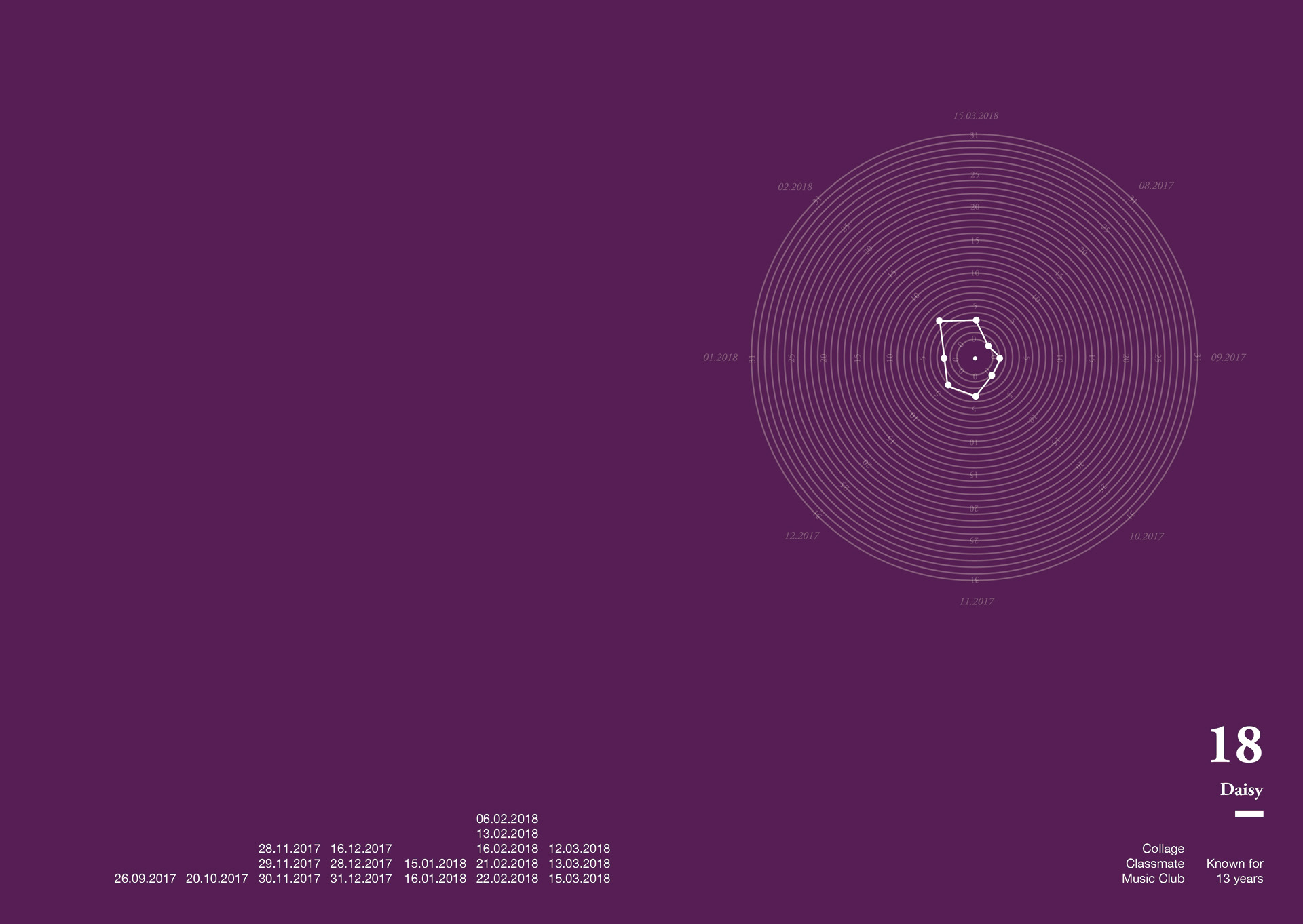
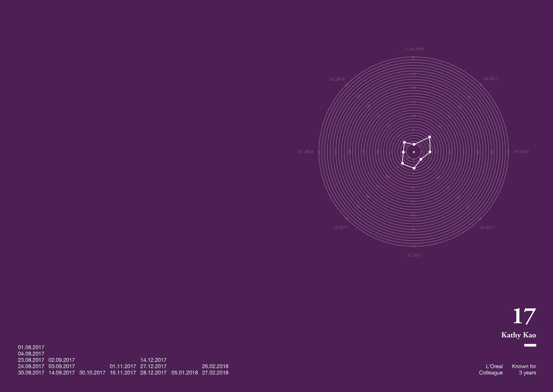
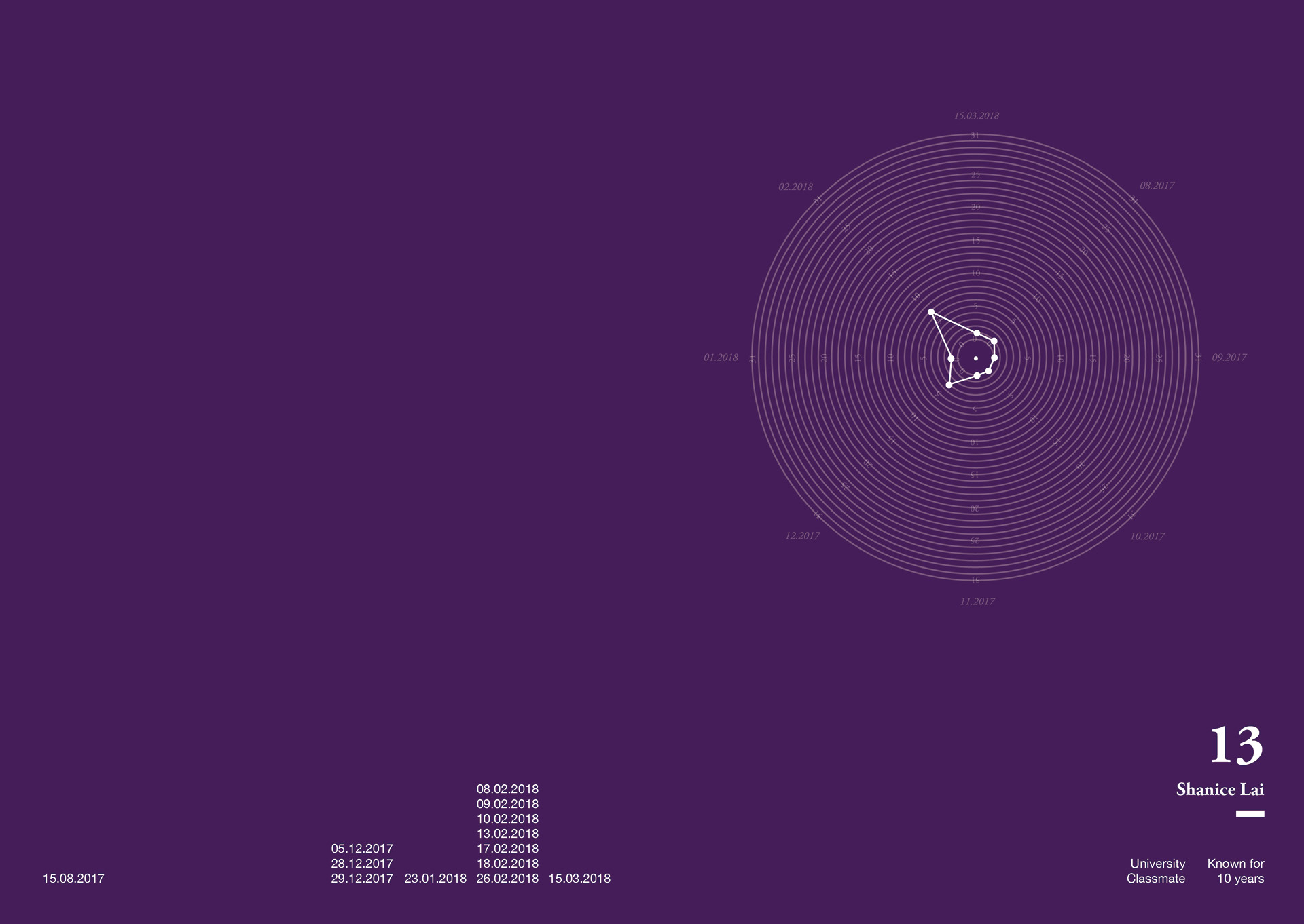
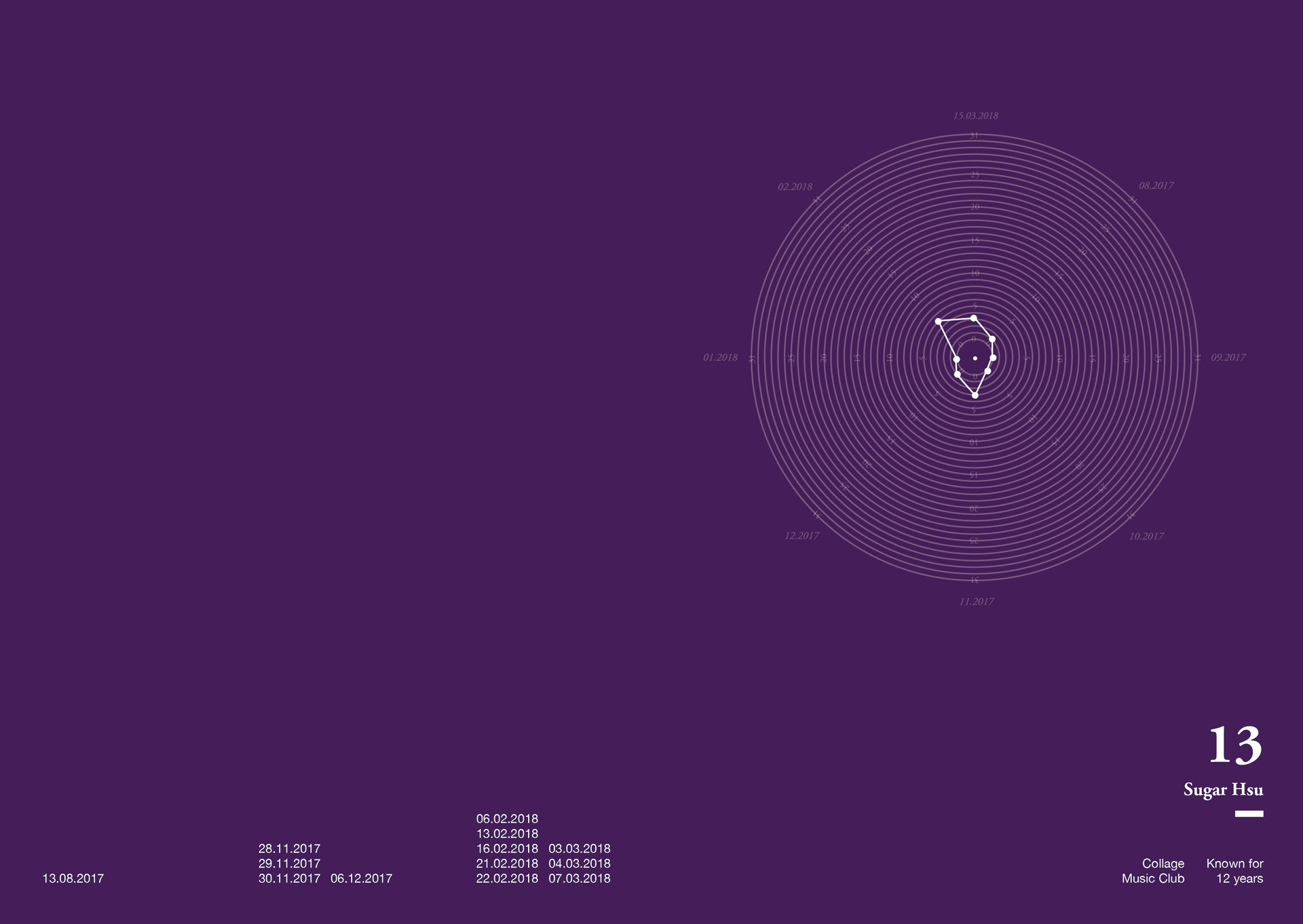
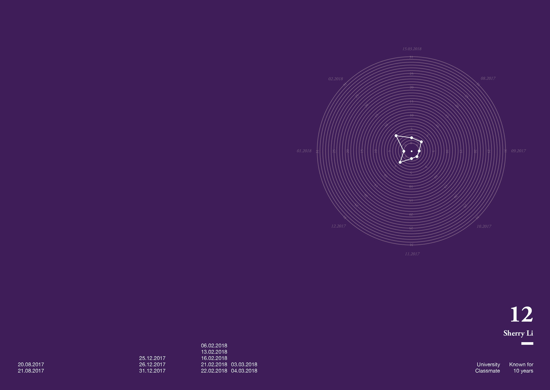
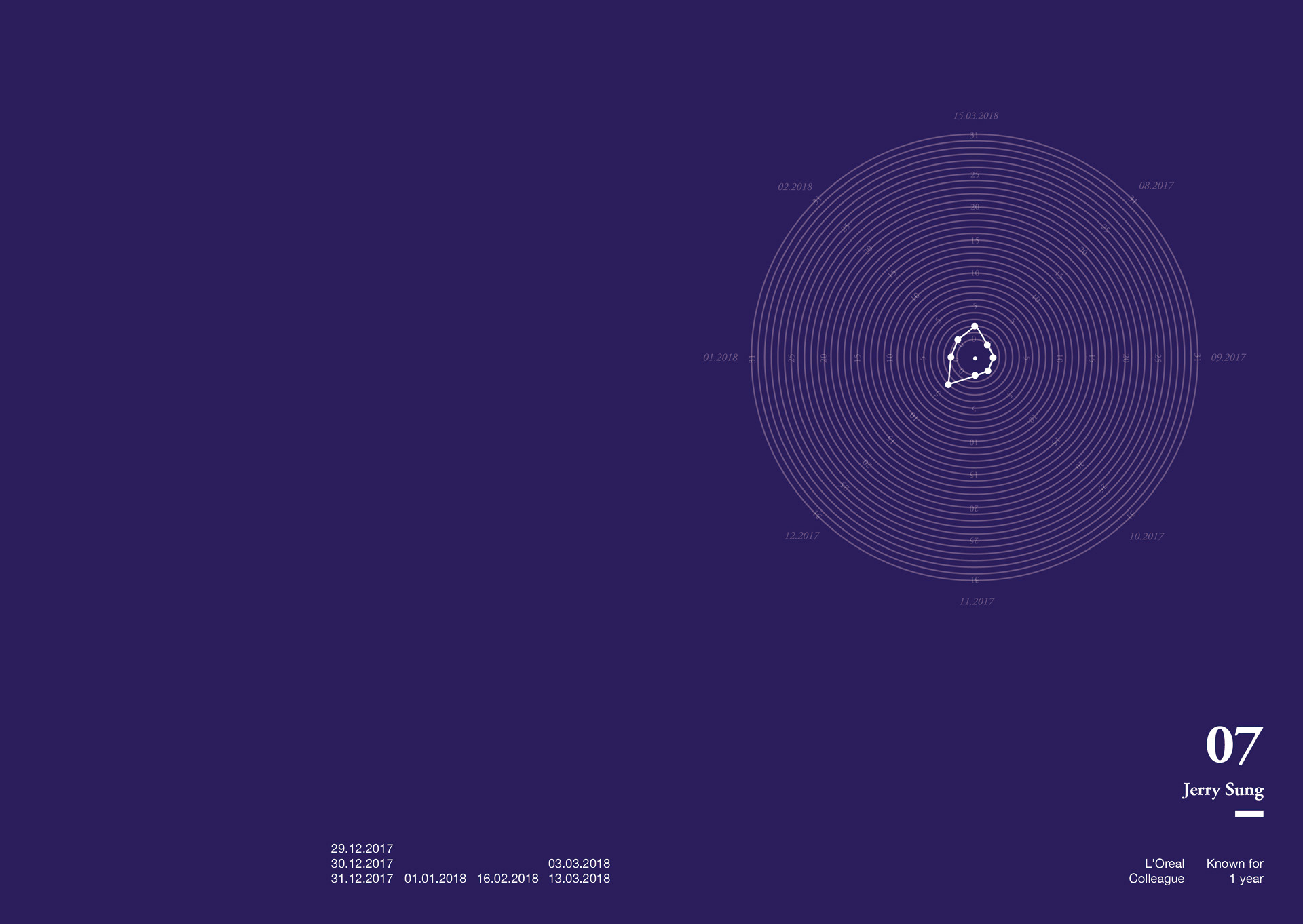
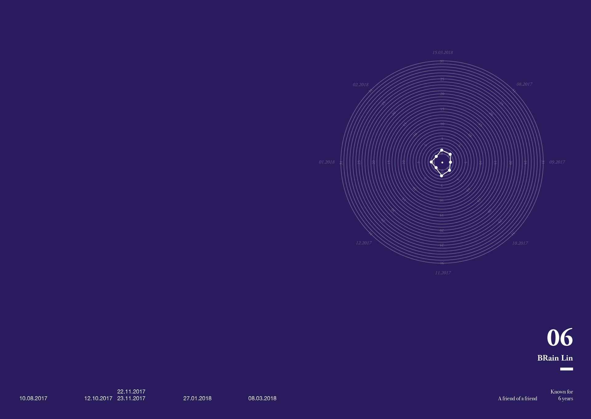
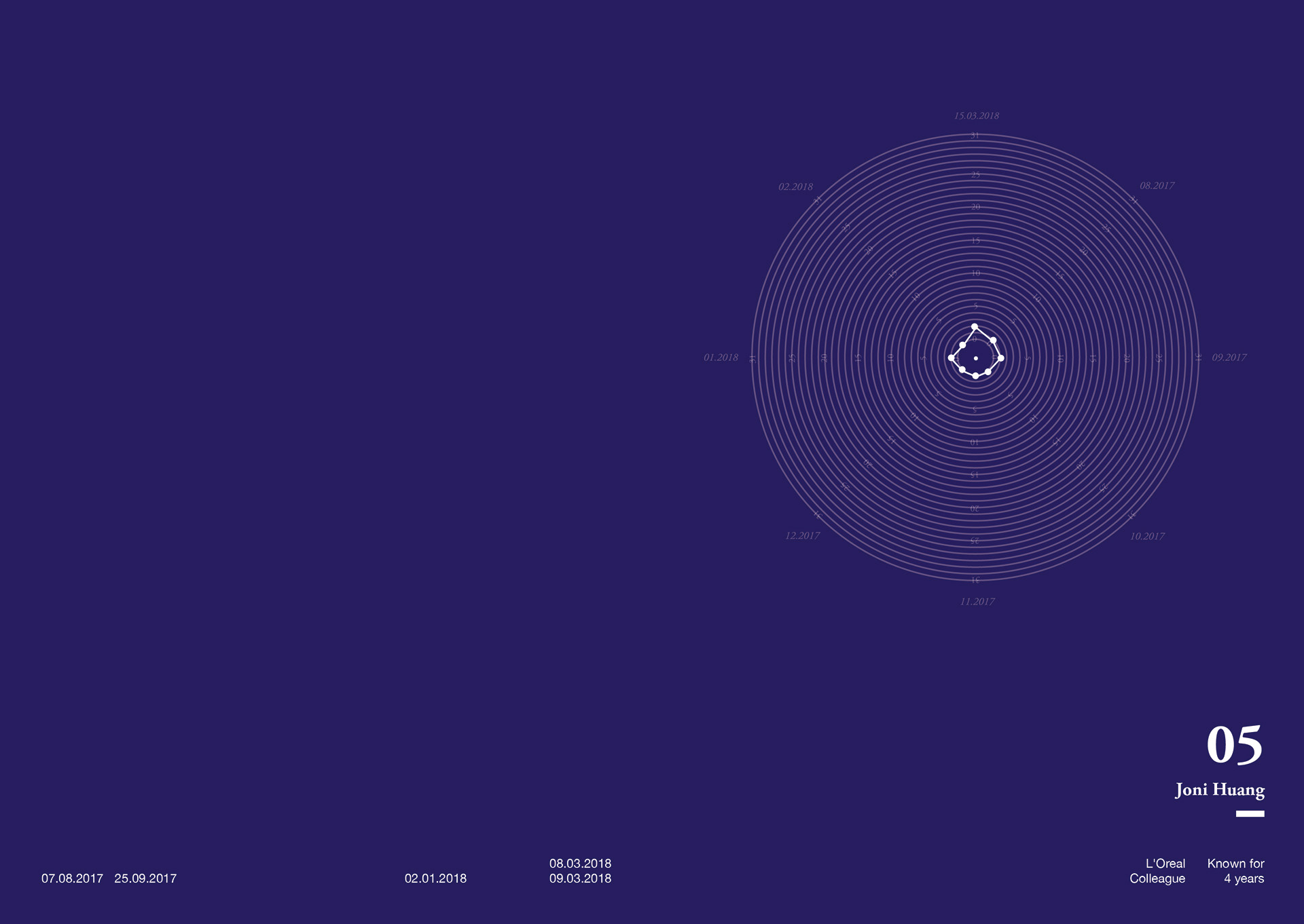
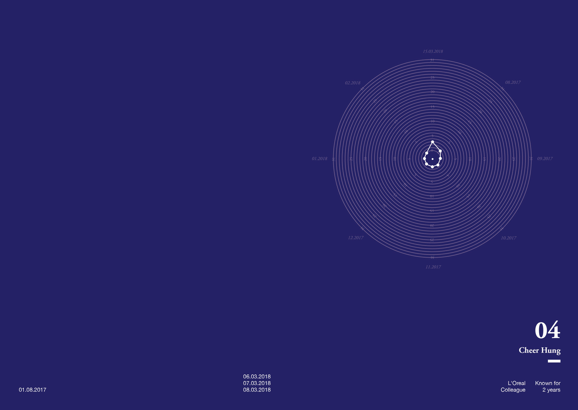
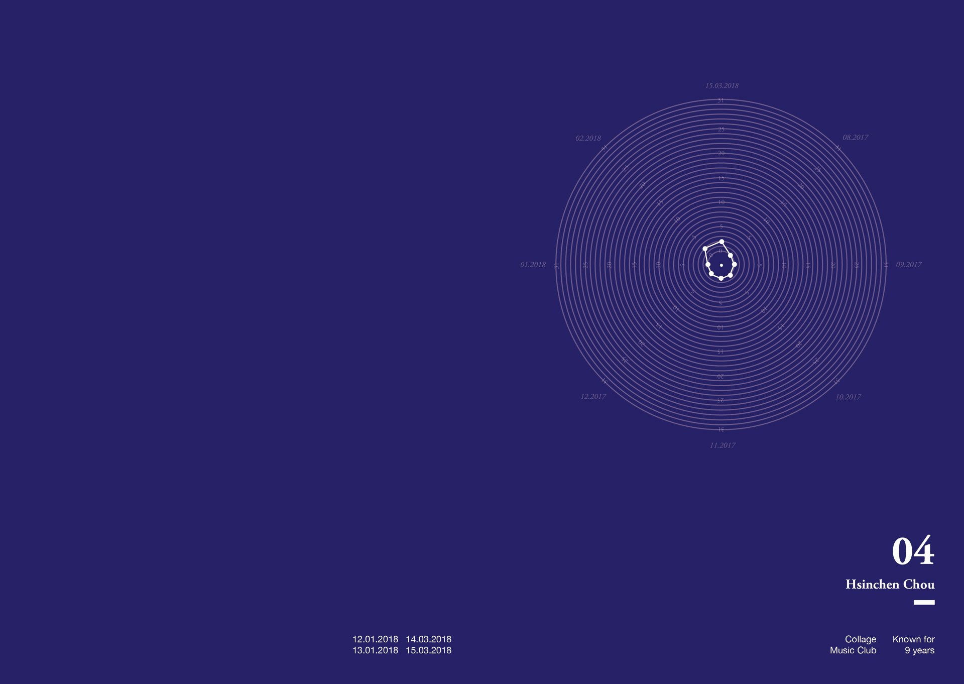
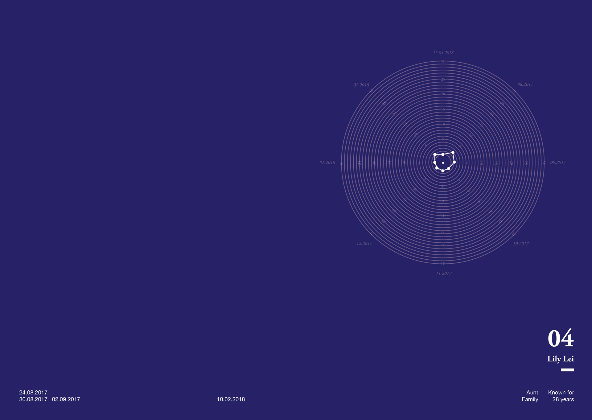
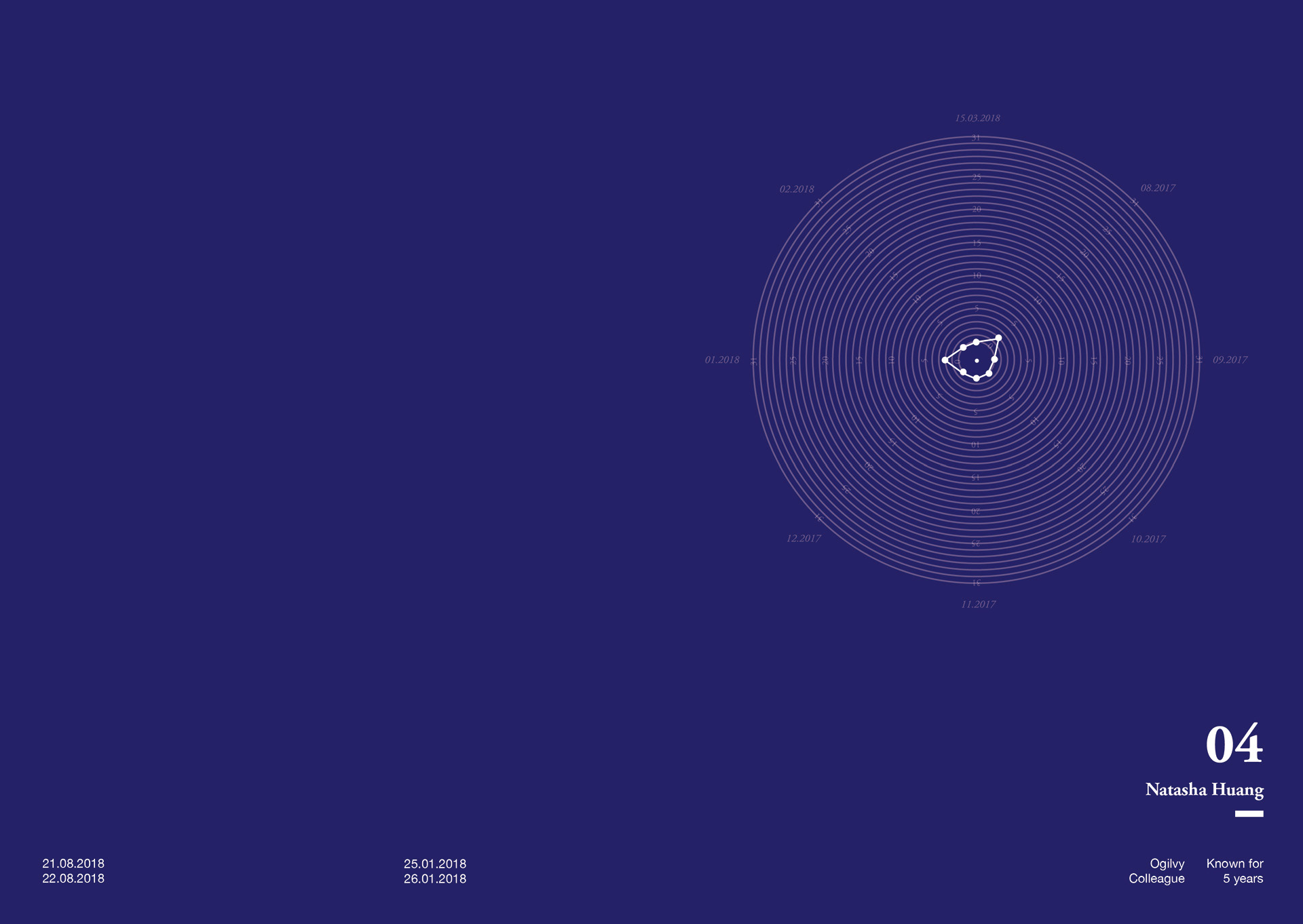
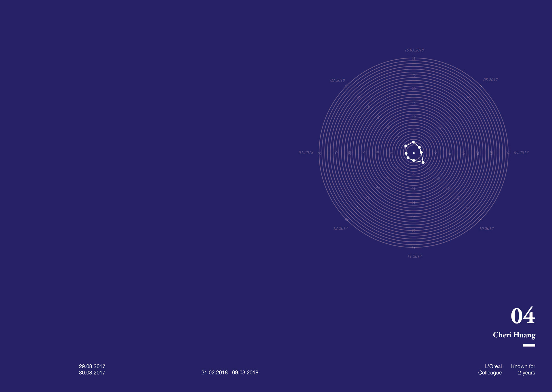
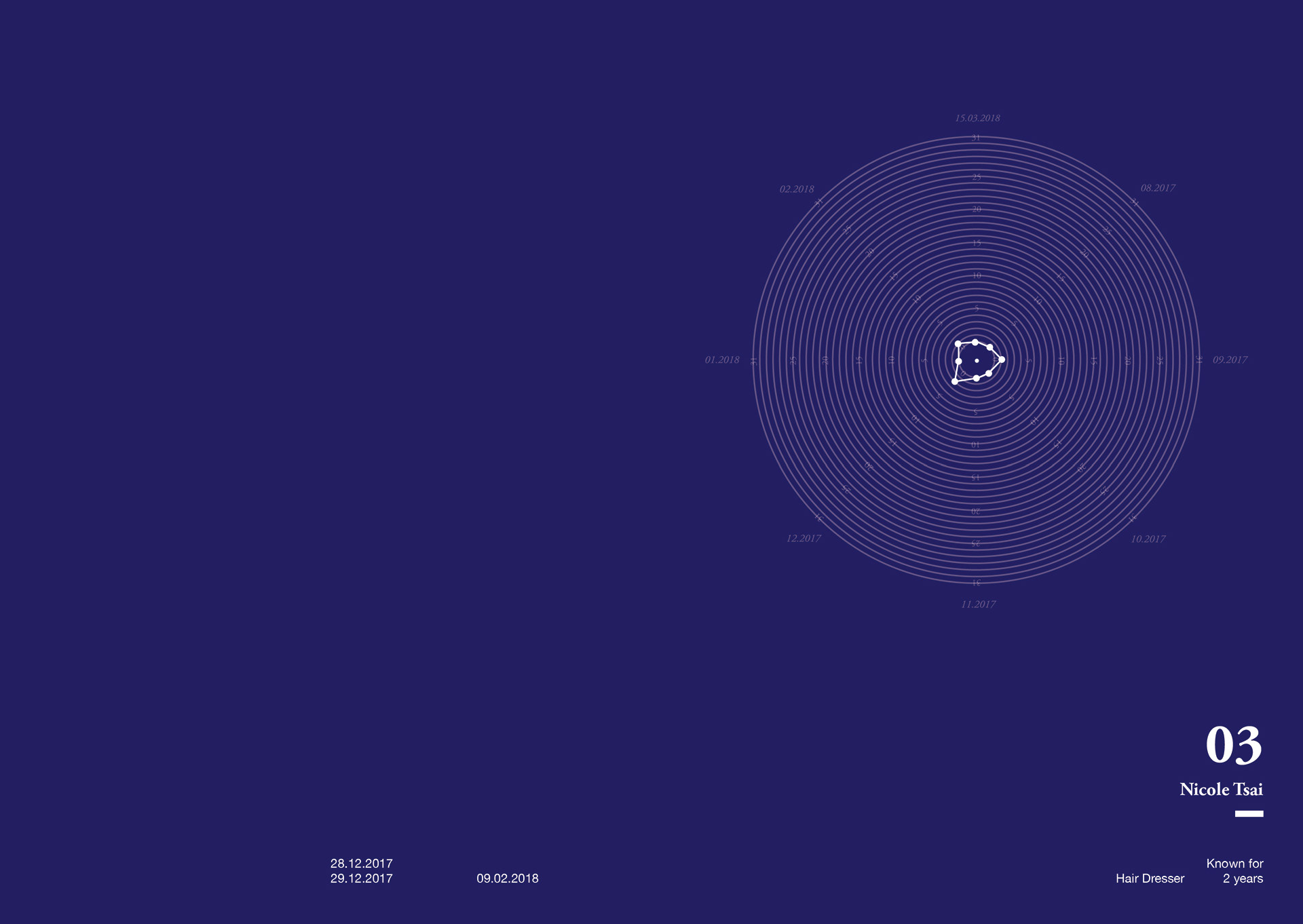
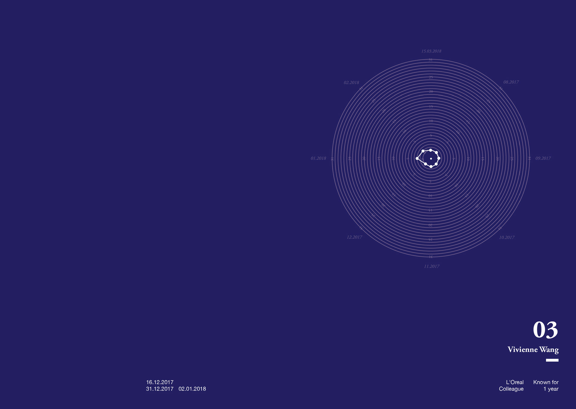
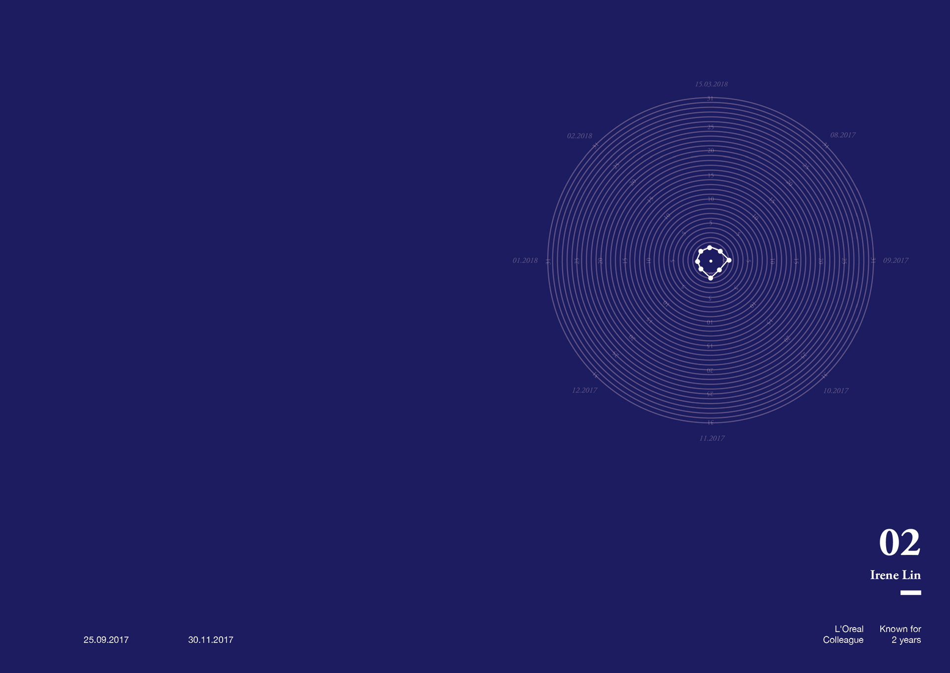
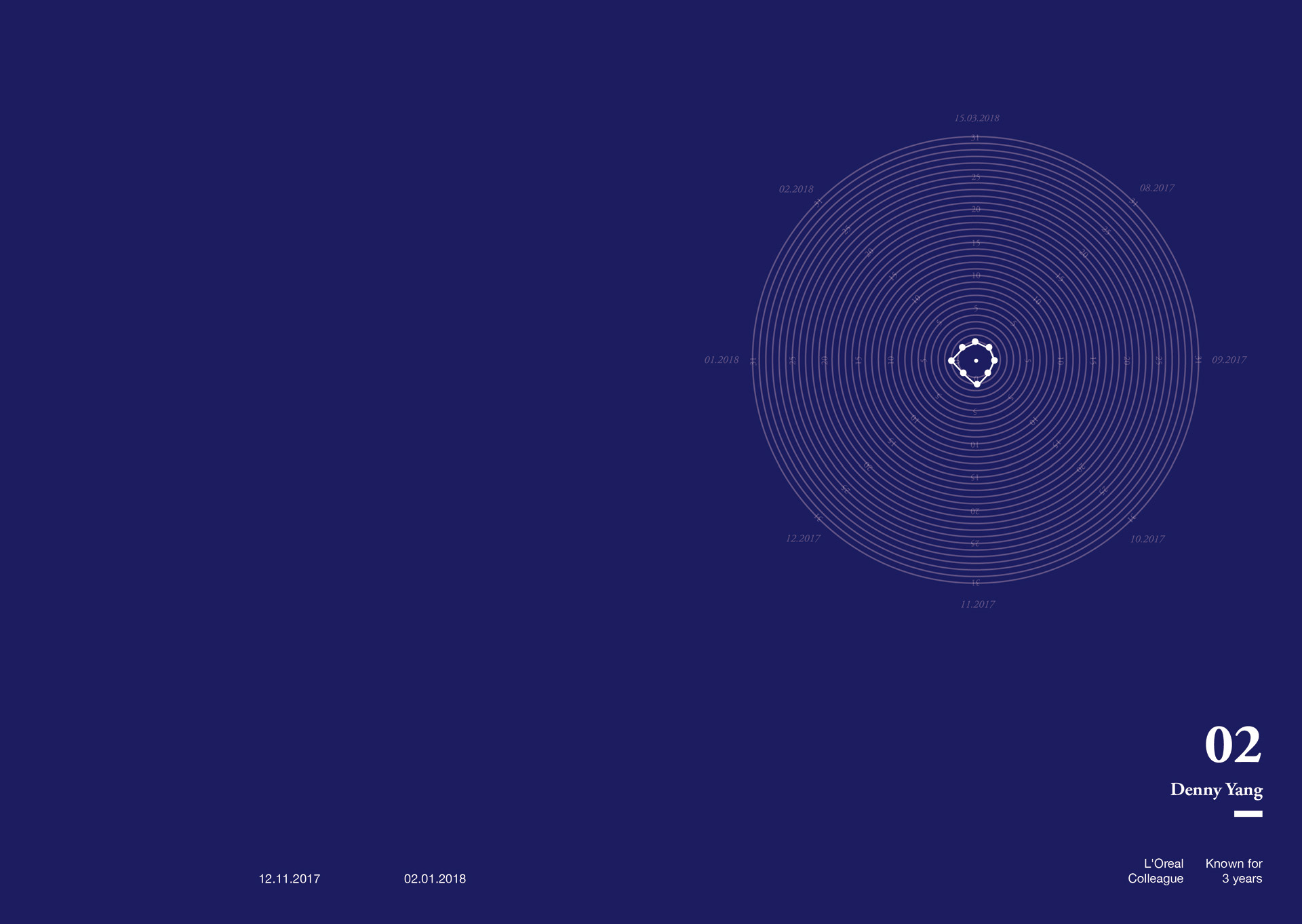

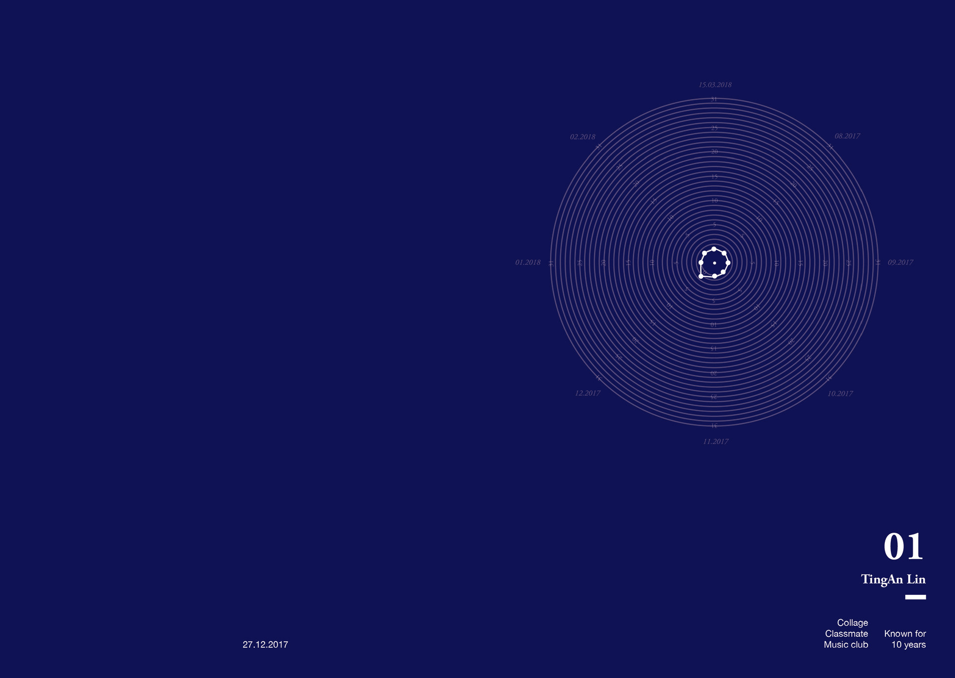

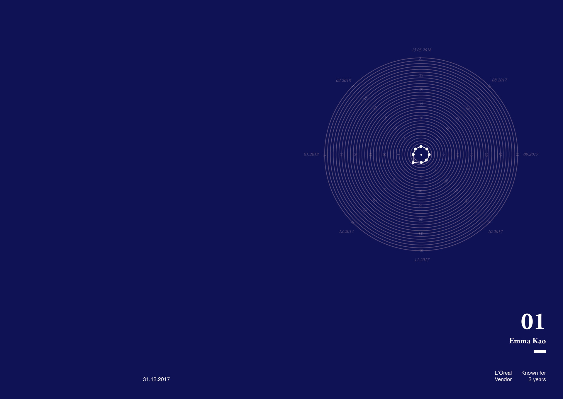
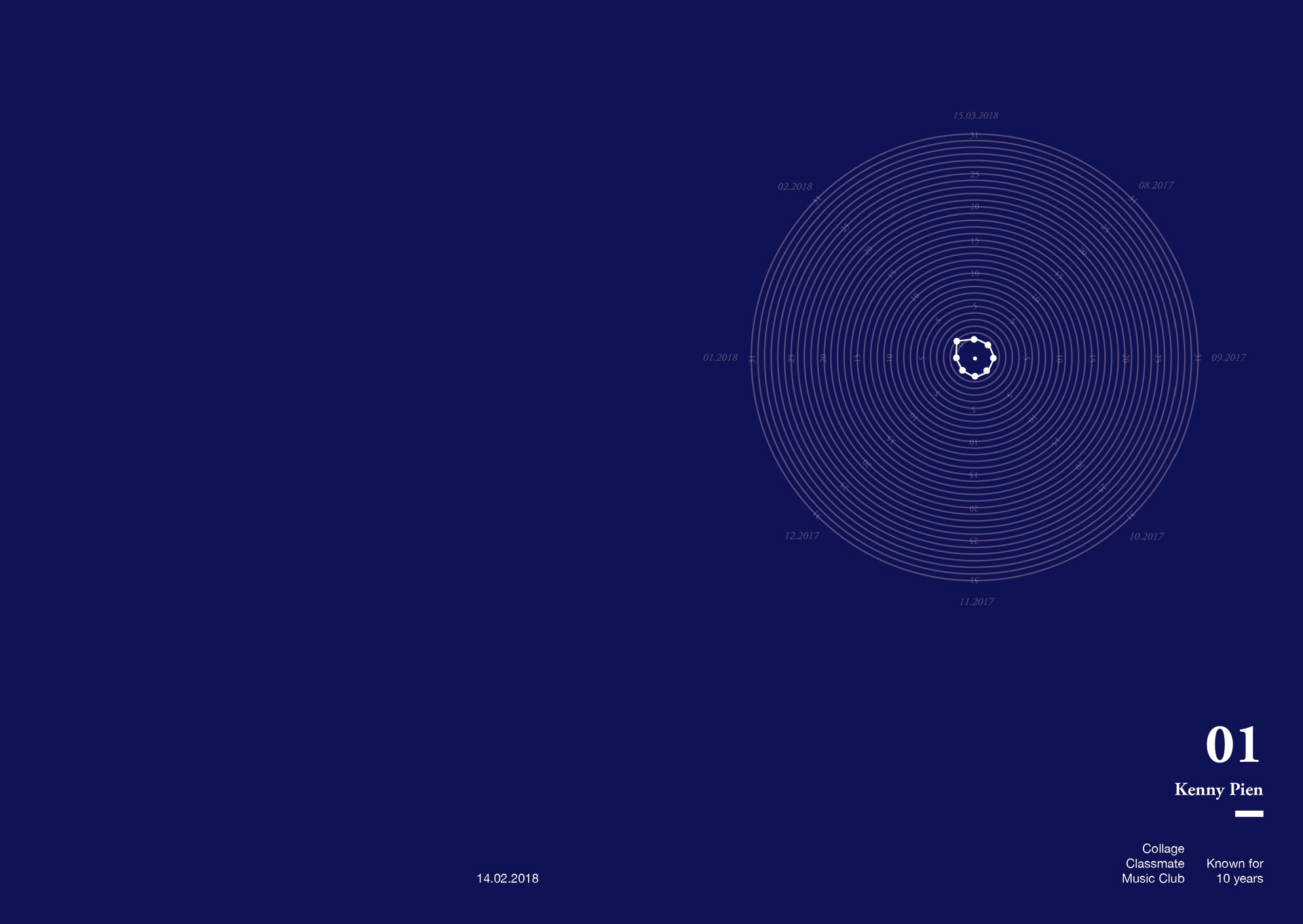

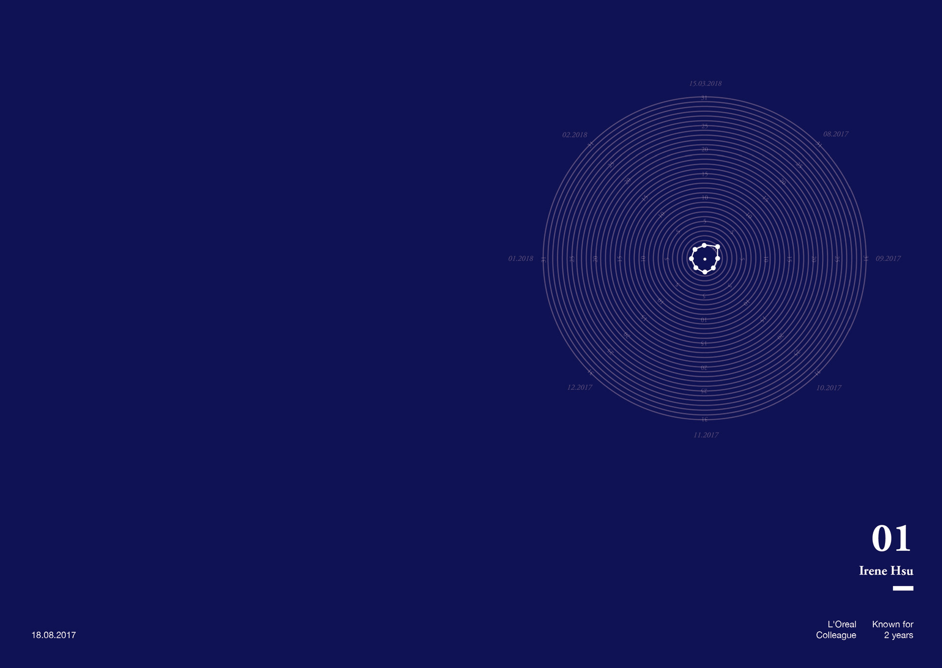
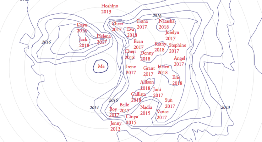
The choice of colour
I also used colours as background, if more often that person and I have contacted each other, the colour would be more warm. On the other hand, if the person and I did not really contact each other, the colour would be more cold. I also put details like how many years I have met them, how did I met them and my personal relationship with them in the bottom, to make the map which was so rational felt more personal and sensitive.
Final outcome
After the presentation, I found when I saw the shapes changing on the screen; it made the map more
interesting. I could see how the shapes changed from big to small, and the colour turning from warm into cold.
" Every visualization is an interpretation."
-Gestalten, The Data Flow
I was worried that the map would be too personal or does not show a ‘meaning’ in it. However, after I made this map, I found those I considered ‘friends’ when I was in Taipei, we were not really that close. Another example was my mother and my father. I thought I contacted my mother more then my father, but the numbers showed differently. It is a good way to look into the relationship I had with the people I met. The concept of this scale could be used on social media as well. Social media is the way that we contact each other the most nowadays, using this scale to see the relationship with people around you could be quite accurate.